


The story behind...
Designing is a complex process.
From the first glimpses of an idea, through sketches and finally working on some actual shapes in your program, to achieve what you have imagined on the beginning, there is a long way to go.
Sometimes you get across it with the speed of sound, but sometimes it feels like as if you were walking down the road on your bare feet for weeks, and you can't see the end of it.
And the second one pretty much defines this project.
The idea of it cristalized in mind subconsciously back in the days when i was a kid.
I wanted to figure out what my signature will look like when I grow up, and I took the pen, a piece of paper and began to draw. Automatically, i came out with something made out of my first letters J and K which are my first letters of name and surname. The funny thing about it is that through multiple attempts of drawing something which had to be cool and unique of course, I have always ended up with the same looking signature. And that's not all, when i have shown it to some friends, they could make identical one in their first try.
And i was like hell no, why is it happening to me.
That day was the first time that i thought, maybe i am not destined to have a "unique" signature.
When i have started my adventure with designing it was natural, that I will need a logo for myself.
Of course, I wanted to stick with my JK, and though it was like my first of doing vectors, I came out with something like this:
https://imagizer.imageshack.us/v2/477x955q90/829/98244268.jpg
And at first i even liked it.
But as the time passed by and my skills got better I was not satisfied with it at all.
It looked like a garbage i thought.
And i came out with this one below.
And at first i even liked it.
It looked way more professional, pretty representative, serious, for the first time i was proud of my work.
As you can imagine, not for long.
I have always felt like this logo is lacking something.
As the time passed by, and my knowledge and experience got bigger, I finally knew what was wrong.
My logo was looking fine, but it has not fulfill it's duty - it was representing letter JK, not myself.
There was no "me" in this emblem.

But to be honest I could not do anything about it, because even i some ideas were creating already in my mind, my skills were not fine enough to deal with them in reality.
Believe me, the struggle was real.
I have felt so unfulfilled and helpless about it.
Untill one day.
I thought - now or never.
I took the pen in my hand, a piece of paper, and began to draw, just like back in the days when I was trying to design my signature, but this time I knew that I wont be defeated.
Through billions of sketches I have came out with an idea that subconsciously i had in my mind through all those years, but I has never been ready for it. Untill that day.
I have took a picture of it, put in AI and the fun started.
I have worked on it for quite long now, this is the final effect, I hope you will like it.
1. Crocus
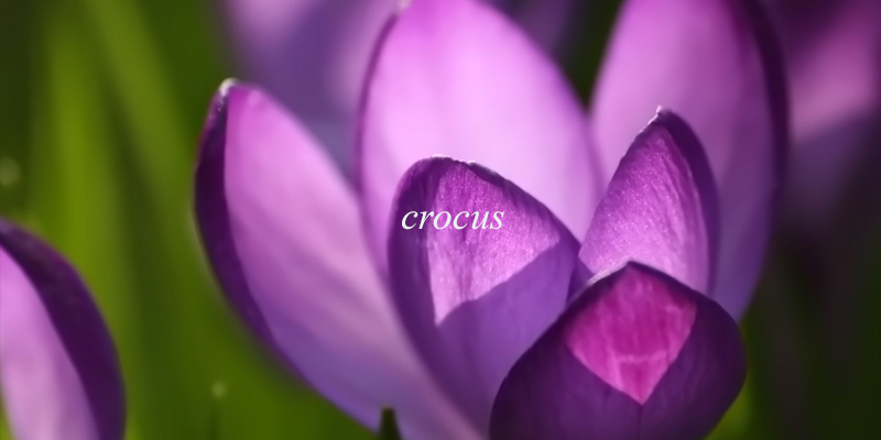
Why?
For me it is obvious.
As it happens most of the time, i got my nickname made out of last name, which is Kwiatkowski.
Kwiat - in my language means flower
For me it is obvious.
As it happens most of the time, i got my nickname made out of last name, which is Kwiatkowski.
Kwiat - in my language means flower
So it was obvious for me to put a flower in sign that will represent me.
I got inspired by two flowers, a crocus and a tulip.
I am from march, and i have always liked them, felt somehow connected.
2. Heart
I got inspired by two flowers, a crocus and a tulip.
I am from march, and i have always liked them, felt somehow connected.
2. Heart
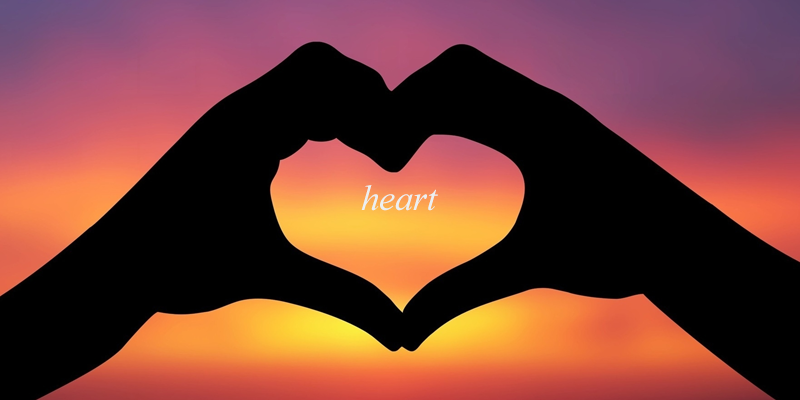
The idea of putting a heart in it came out not so long ago.
When I was trying to design my logo, I was very focused on it.
I mean, when I woke up in the morning, I've been thinking about it.
When I was in the shower, I was thinking about it.
When I was going to sleep I was thinking about it, and so on.
That was the moment when I have understood, that graphics have evolved from my hobby, to a passion, a vital part of my life. A heart represents a certain kind of commitment that i have for everything i design. Like i was putting a little bit of myself in the project.
3. Past

The last thing that I wanted to be in my project were those two letters, that have taken its toll on my life.
There was no other way.
I needed to build my design upon ruins of ideas of past.
That's why there is a JK at the "fundamental" part of my logo.
Grid
There was no other way.
I needed to build my design upon ruins of ideas of past.
That's why there is a JK at the "fundamental" part of my logo.
Grid
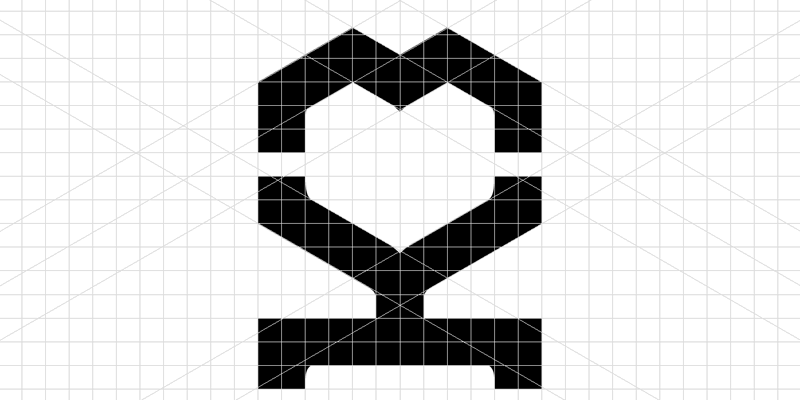
Untill i have came out with this particular one, I had many ideas about a form of the mark.
At first I wanted it to look natural and free. Free of any form.
But in time I have felt like this doesn't look good from the practical point of view.
So I decided to do it more "modern". Geometrical.
And i have ended up with 2 rectangles at the bottom, and a hexagon upon them, and i felt like meh. This may look "modern" but I lost myself in it.
The final grid is an equivalent of taking something from the first one and the second.
Which I believe, looks best.
Monochrome


Color


High contrast


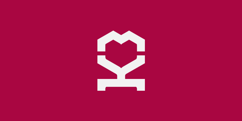
Logo
To be honest with you, at first I did not put a "whole logo version" in this presentation because of few reasons.
I wanted to focus on the sign.
I did not know what kind of typeface to use. (I am still not so sure, I will be glad if you could help me with it)
I am not sure about the motto.
Although I feel the need of having one, i am not sure about this one i perticular.
I went with "lovely designed" because it connects well with the mark, and it says that my projects are just looking nice. Simple as that.
I did not exepct it to be so long, but now i just can't do anything about it, my apology.
I hope you liked my presentation, and if you have read all of my shit that i wrote back there, I truly admire you.
Feel free to comment, feel free to giving advices, feel free to criticise, but feel obligated to appreciate, it doesn't cost anything and it will mean that you liked my project, or if not, I will now that you appreciate the shitload of time that i have spent on this project.
I WILL BE GLAD TO WELCOME YOU HERE AGAIN DEAR VISITOR!
THANK YOU FOR READING, WATCHING, COMMENTING, AND EVERYTHING YOU HAVE DONE HERE.
SEE YOU NEXT TIME.
SEE YOU NEXT TIME.


