
BERLIN, ICK LIEBE DIR
My favourite workflow - realized on mobile devices - plus tutorial Black&Gold style
About two weeks ago Adobe asked me - inspired by my speech at the Create Now 2014 in Munich - if I would like to show my favourite workflows and make a little documentation about it. Included in this question was the offer to test the Surface Pro 3 and Adobes new hardware Ink & Slide on the basis of the lately launched series of Creative Cloud Apps for ipad and iphone. Sven Dölle (Adobe) would go along with me and make photos of my creating process. And I said: Yes!
In the following you find the documentation and included - because a lot of people asked me - I reveal how I do my Black&Gold style - a great method to combine totally different visual elements in two colors.
In the end of this documentation some useful links and a link to download my goldpattern you need for that style. You are welcome to use it.
In the end of this documentation some useful links and a link to download my goldpattern you need for that style. You are welcome to use it.
I hope you enjoy my story and get inspiration for your own work.
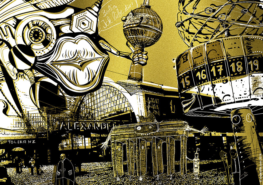
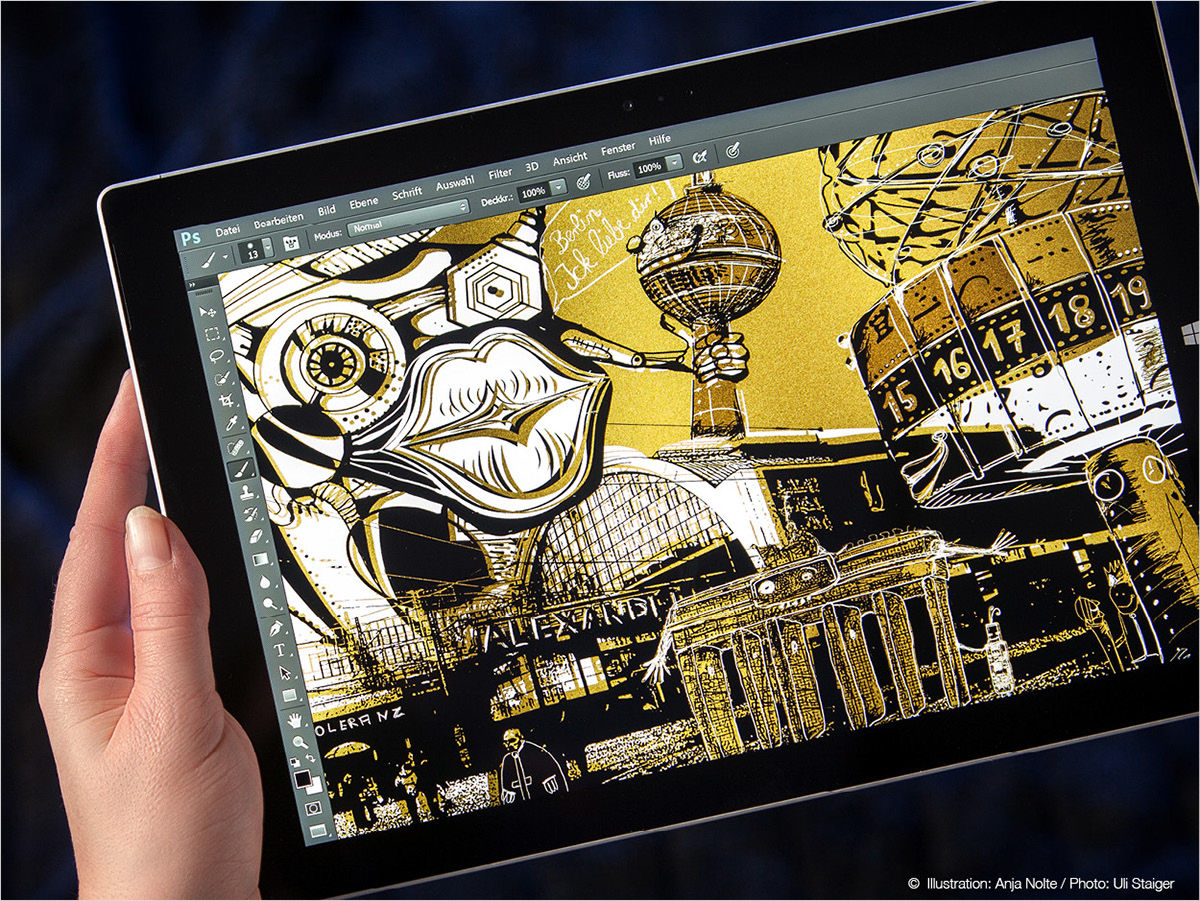
The final artwork. Hardware: iphone, ipad, Surface Pro3 Software: Creative Cloud, Apps: Adobe Shape, Adobe Brush, Adobe Scetch, Adobe Line, Photoshop Touch, Photoshop CC, InDesign Mindware: Good mood, phantasy & skills:-)
Location melting pot Alexanderplatz and my personal connection to it
The Berlin Alexanderplatz is one of my favourite locations in Berlin. Together with a lot of other creatives I had the pleasure to have my office in the „House of the Teacher“ at the Alexanderplatz. 54 metres high, 13 floors - built 1961 by the east german architect Hermann Henselmann. From 1998-2001 creatives filled the whole building, a great opportunity for networking in a special historical atmosphere. Me and some collegues residated in the 12th floor, on birds flying height. A beautiful sight to the Fernsehturm, french dome and Berlin. Besides our room a small chamber which ventilation machinery, but more important: One window with sight to the Karl-Marx-Allee, the street for GDR parades. Used by the Stasi to observe potential GDR-public enemis at the parades. In the basement of the house still the GDR wiretapping system. Unfortunatly - as it often works out- the city Berlin sold this house and we all had to leave in the winter 2001. On the „Alex“ itself I love the mixture of social classes. From punk to banker. Its really inspiring. A melting pot for everything in Berlin.

„Haus des Lehrers“ / the observation room / view out of my window / newspaper headline „Last hours in the house of the teacher. They all have to move out: architects, photographers, musicians and artist“ / view out of my window on the Alexanderplatz © Photos Anja Nolte, 2001
Station Alexanderplatz - Fundament of my artwork
To snoop into the scenery I arrived one hour before Sven at the Alex. First thing I did (and always do) - make photos. Ti have an aid memoire laterone, and because I planned to use parts of them in my artwork. Because of the Surface Pro I could directly change the photo of the station into my favourite 2color effect.

Surface Pro 3 / Photo / Photoshop CC: Open Photo in Photohop / increase contrast very much / select white areas with magic wand tool (contingous deactivated) / inverse selection / new layer fill selection with brown / new layer fill selection with black / move content of brown layer a little bit, that it looks like a 2 color print with wrong corner marks. Play with the adjustment of the tolerance of the magic wand tool te get different results. You can do the same process as well in Photoshop Toch on the ipad, using Wand Tool and Paint Bucket. ANOTHER technique I use very often to split visuals in two colors is the Photoshop Filter "Stamp"!
Meeting Point Weltzeituhr - making „Shapes“
Sven and me made the appintment to meet at the Weltzeituhr, which was in GDR times an still is nowerdays the best place on the Alex to meet each other. After having made some photos I had very much fun testing Adobe Shape.

Iphone / Ipad / App Adobe Shape: Captures life motives (or your photos), defines outlines and creates vectorgrafics, which you can use on your mobile devices / appear as well directly in your Photoshop CC / Illustrator CC library.
Getting familiar with my objects - warm-up scribbling
To get a feeling for my objects i make at first little scribbles, like warm ups. The photo shows me scribbling on the Surface Pro. Below a detail from the Photoshop file I am scribbling in, with the shape I just made. On the left a snapshot of my Photoshop library with the Weltzeituhr shape in it.
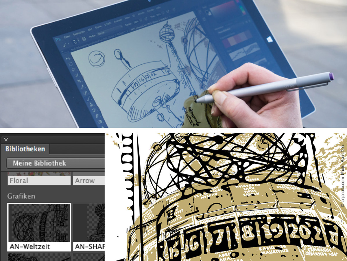
Surface Pro 3: Photoshop with library and my „Weltzeituhr“-shape.
High noon -blind date with a courier - time for Ink & Slide
After two successless tries of delivery the day before, we decided in the situation to phone the curier agency and made a date with the curier directly at the Weltzeituhr - high noon - darish timing! He came right in time and brought Ink & Slide. Quickly unpacked, Bluetooth connected and kick off :-) First another scribbel, next a rough composition of the radio tower bowl. And again transorm it in my two colors on the Surface.
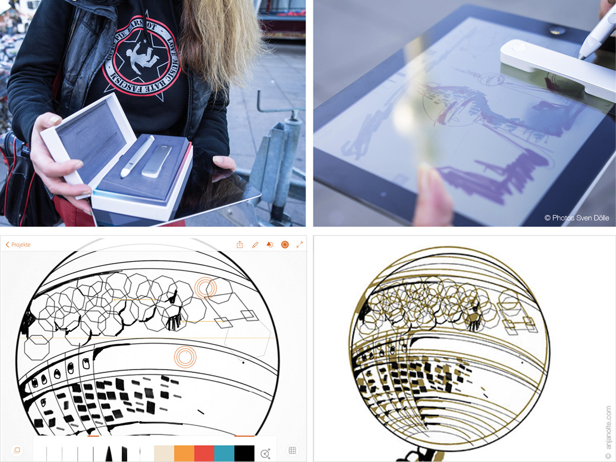
Ink & Slide / ipad / Adobe Line / Surface Pro / Photoshop CC: Ink & Slide is a couple of hardware from Adobe. „Ink“, the pencil, allows you to draw very precise. With „Slide“ you can work like with a normal ruler, draw exact lines. Both features have a button to control the navigation, and to choose out of a package of stamps, objects a.s.o
Always an open eye - a „Lovemark“ from behind the scenes
Its allways good to look behind the scenes. In this case, we left the Alexanderplatz and walked along behind it. Sometimes when I am really into it, if feel like a scanner - scanning everything around me. There are that much interesting signs and things - everywhere! I have a big photo collection which I use for my work. And a slightly stressed partner because I am photographing all the time :-) On the reverse of the Alexanderplatz I found the Cocktailbar „Knutschfleck“ (lovemark) with this beautiful engraving on the entrance door. And directly made a Photoshop brush out of it using Adobe Brush.
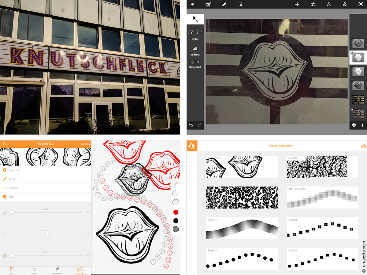
Ipad / Photo / App Photoshop Touch & Adobe Brush: Adobe Brush allows you to create Brushes (Pixelgrafics and Vectorgrafics) from your files from Creativ Cloud, your filmroll or directly via camera. The app has a lot of features to adjust your motive, f.e.x.Jitter. Brushes can be used as well directly in Adobe Sketch. In this case I first increased the contrast of my photo in Photoshop Touch (ipad) and rubbed away details I didnt need. Exported the file in my filmroll, then import in Adobe Brush. On the right a view on my brush library, with some brushes I did the day before.
Different approaches to the Brandenburger Tor
After ""Knutschflecken we went by bus to the Brandenburger Tor - the brandmark of Berlin. Especially right now in the 25th year after the fall of the wall. A perfect object for perspective drawing in Adobe Line, which offers tools helping you to draw in the right perspectice. You should though have a basic knowledge of perspective, of course. And again, some scetches.
After ""Knutschflecken we went by bus to the Brandenburger Tor - the brandmark of Berlin. Especially right now in the 25th year after the fall of the wall. A perfect object for perspective drawing in Adobe Line, which offers tools helping you to draw in the right perspectice. You should though have a basic knowledge of perspective, of course. And again, some scetches.
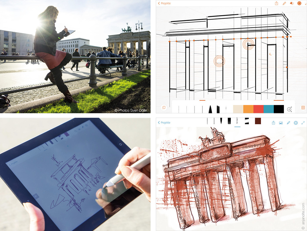
Ipad / Apps Adobe Line & Adobe Sketch: Adobe Line offers multiple tools to draw easily in different perspectives with Ink and Slide. For example the following rasters: Two point perspective, diagramm, isometrical and axonometrical - dont ask me what this means, but i love the word :-) Skteches in Adobe Sketch.
My loveaffair with technical trash, millimeterpaper and splashes
What a beautiful peace of trash! Right on the floor at the Brandenburger Tor: This damaged USB stick. I love electronical trash! Put it on my sketchbookpaper, made a photo and some minutes later I had a new fancy brush.
For the Millimeterpapersketch of the Brandenburger Tor I used a little trick. Made the day before a brush out of a scan of millimeterpaper (just a square) in Adobe Brush. In Adobe Sketch I used the new brush, just like a stamp on a canvas. Made my drawing on it and afterwards „masked“ the area around my drawing just by painting white on it. Besides I created splash and structure brushes: Spread ink on paper, photograph it, increase contrast in Photohop Touch, import in Adobe Brush.
For the Millimeterpapersketch of the Brandenburger Tor I used a little trick. Made the day before a brush out of a scan of millimeterpaper (just a square) in Adobe Brush. In Adobe Sketch I used the new brush, just like a stamp on a canvas. Made my drawing on it and afterwards „masked“ the area around my drawing just by painting white on it. Besides I created splash and structure brushes: Spread ink on paper, photograph it, increase contrast in Photohop Touch, import in Adobe Brush.
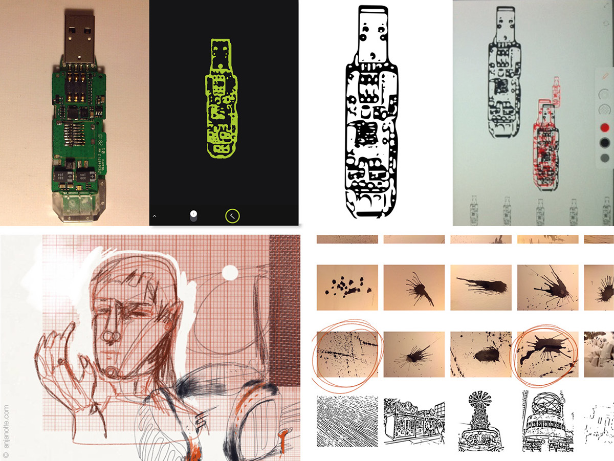
Above: USBstick becomes a fancy brush. Ipad / Photo / Adobe Shape / Adobe Brush
Below: Ink / Paper / Ipad / Photos / App Photoshop Touch & Adobe Brush: On the left my first testing with the new millimeterbrush. On the right a snaphot of my filmroll with photos of ink-splashes and below my new shapes from the Alexanderplatz (with christmas market there).
Below: Ink / Paper / Ipad / Photos / App Photoshop Touch & Adobe Brush: On the left my first testing with the new millimeterbrush. On the right a snaphot of my filmroll with photos of ink-splashes and below my new shapes from the Alexanderplatz (with christmas market there).
Bringing it all together - coffe and composition in a cafe
After drawing at the Brandburger Tor I went to my favourit bar - the Marietta. The pleasure of the moment of bringing all elements together! Find the best composition and add drawing details on top. Cause I had the feeling that something bizarr is missing I took some more time and drew - fascinated by the french corner tools - a kind of face in Adobe Line. By playing with the image composition it came up, that it looked best, just turned around with my lovemark-brushkiss on top.
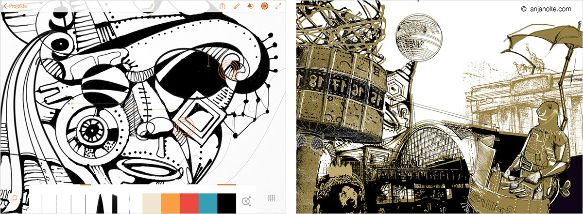
ipad / Adobe Line / Surface Pro / Photoshop CC: Drawing in Adobe Line with massive use of the french-corner tools. Right above an inbetween composition moment in Photoshop CC. (The grillrunnner and bear were elements I "collected" inbetween, but just left them out, its alllready quite a lot of stuff. Below the final composition. I added a lot of drawing details, as you can see.
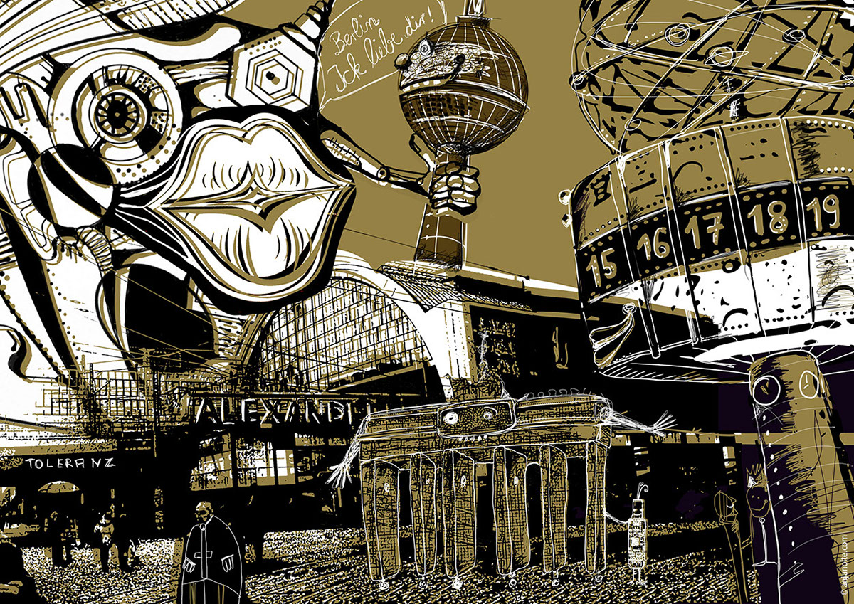
Finally - the gold plating
Below you find a description of how I did the gold plating. I develloped and used this technic for the whole Kavafis Book, which was printed in black and gold. For the simualtion of the printed gold I built myself a goldpattern. You can download the goldpattern here and use it wherever you want. Right in time for Xmas :-)
Surface Pro (or other computer) / Photoshop CC / Goldpattern
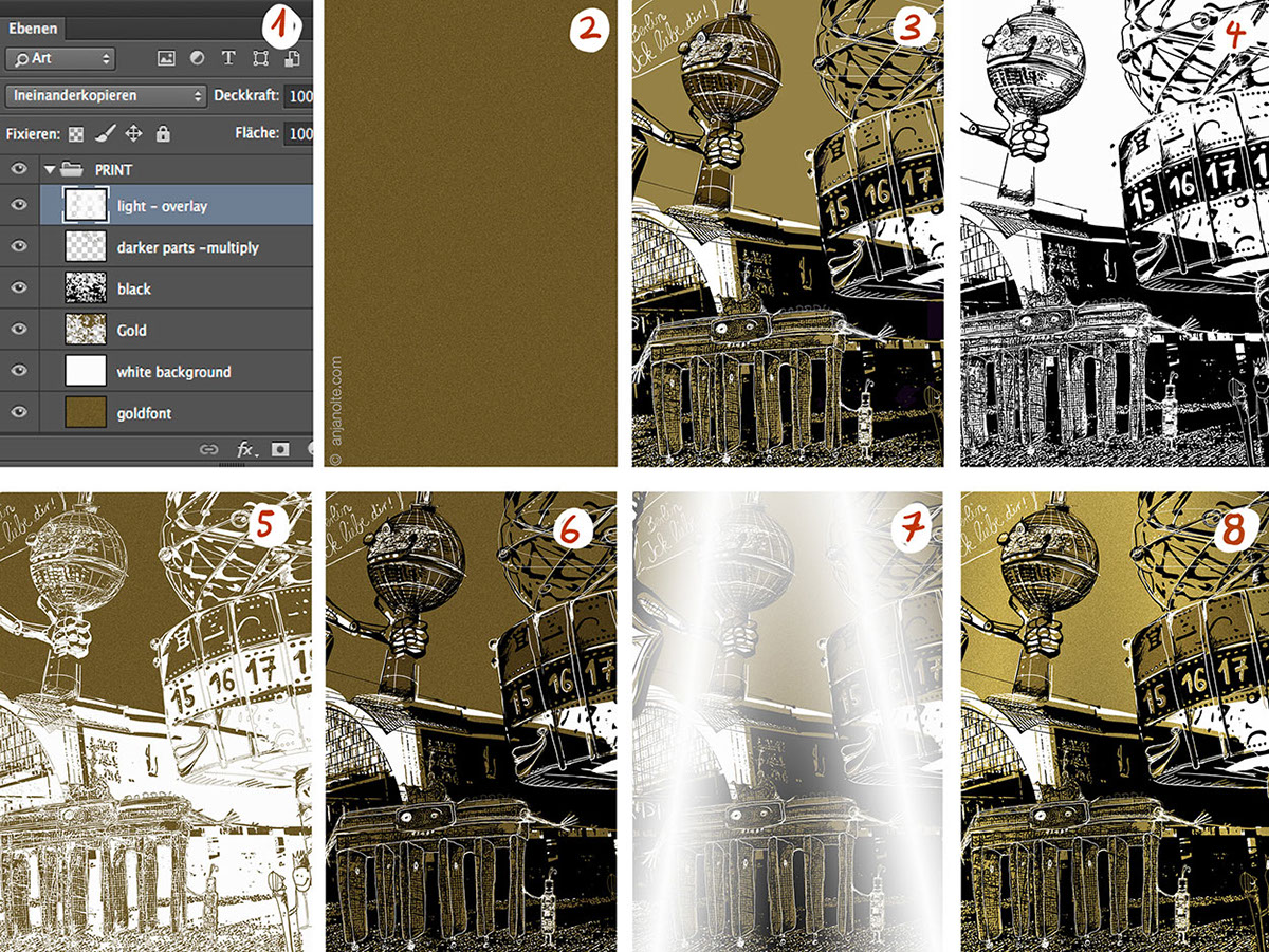
Image (1) shows the Photoshop Group „Print“ above the former image, with layers as they will look after the process. Preparation: Create a gnew group „PRINT“ above all your other layers and within a white background layer. Paste my Goldpatternfont in a layer above (2) My image in black and brown (3).
Step I: Magic Wand Tool (Tolerance 60 %, Sample all layers) -> klick in black area of original image -> new layer -> Paint Bucket Tool -> fill with black -> deselect. Layer for black color is ready (4).
Step II Magic Wand Tool (Tolerance 100 %, Sample all layers) -> klick in brown area of original image -> keep the selection and activate goldfont layer -> copy -> paste into same position - creates automatically a new layer (shoud be below black one) -> deselect (5). Check both new layers together (6)
Step III Adding lights: New layer (on top of all layers) put layer on overlay (!) -> Gradient tool white to transparent (or brush) -> add some light at the places you want to have lightened (7).
READY. You can add contrast to the complete picture. If you want to export the image for web - the gold tone is a little bit difficult to handle - adjust with Hue/Saturation. (PS: In the darker parts multiply layer is put some extra Gold to have some darker areas.)
VOILA! :-)
I hope you enjoyed my little trip!
Epilogue - some useful links
A list of links, tools I use and tutorials. I highly recommend to watch the tutorials for Adobes new Apps Brush, Line, Draw a.s.o. when you start working with them. I did not in the beginning, could have spared time, if I had done it :-) Remark: If you dont have Ink& Slide - you can use all Apps as well without them.
CARLOTTA`S PHOTOSHOP BRUSHES
Including a very good pencil brush (Carlottas HB Pen) I use for drawing on top of my creations and for a lot of other things. Here blog is a good recommandation anyway.
Including a very good pencil brush (Carlottas HB Pen) I use for drawing on top of my creations and for a lot of other things. Here blog is a good recommandation anyway.
MY GOLDFONT (free for all uses)
Works best on 28x28 cm, 300 dpi. Download here.
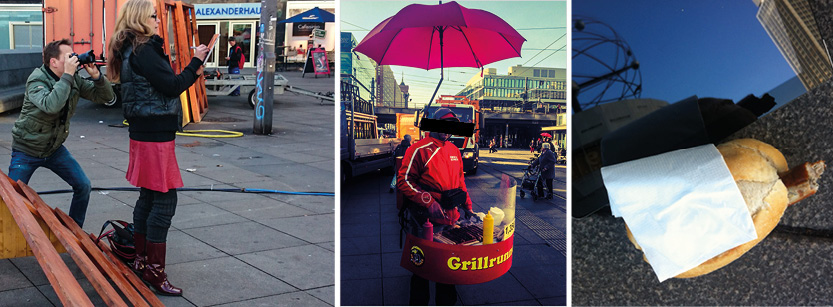
Sven Dölle and me at the Alexanderplatz / My favourites: the "Grillrunners" - had to buy a sausage from him, for the get the permission to make a photo :-)


