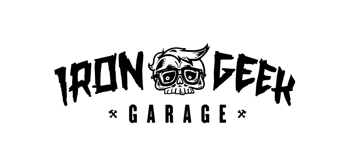
The "IRON GEEK" and the skull were already drawn up when the project came to me. The idea was to expand the branding, the look, the feel of Iron Geek.

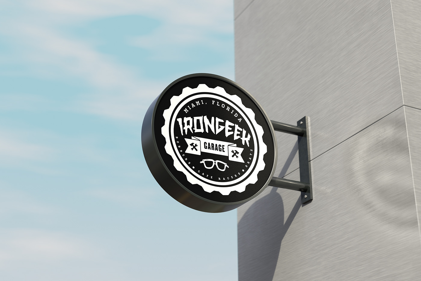
Going with the patch feel. The outside ring representing a motorcycle tire.

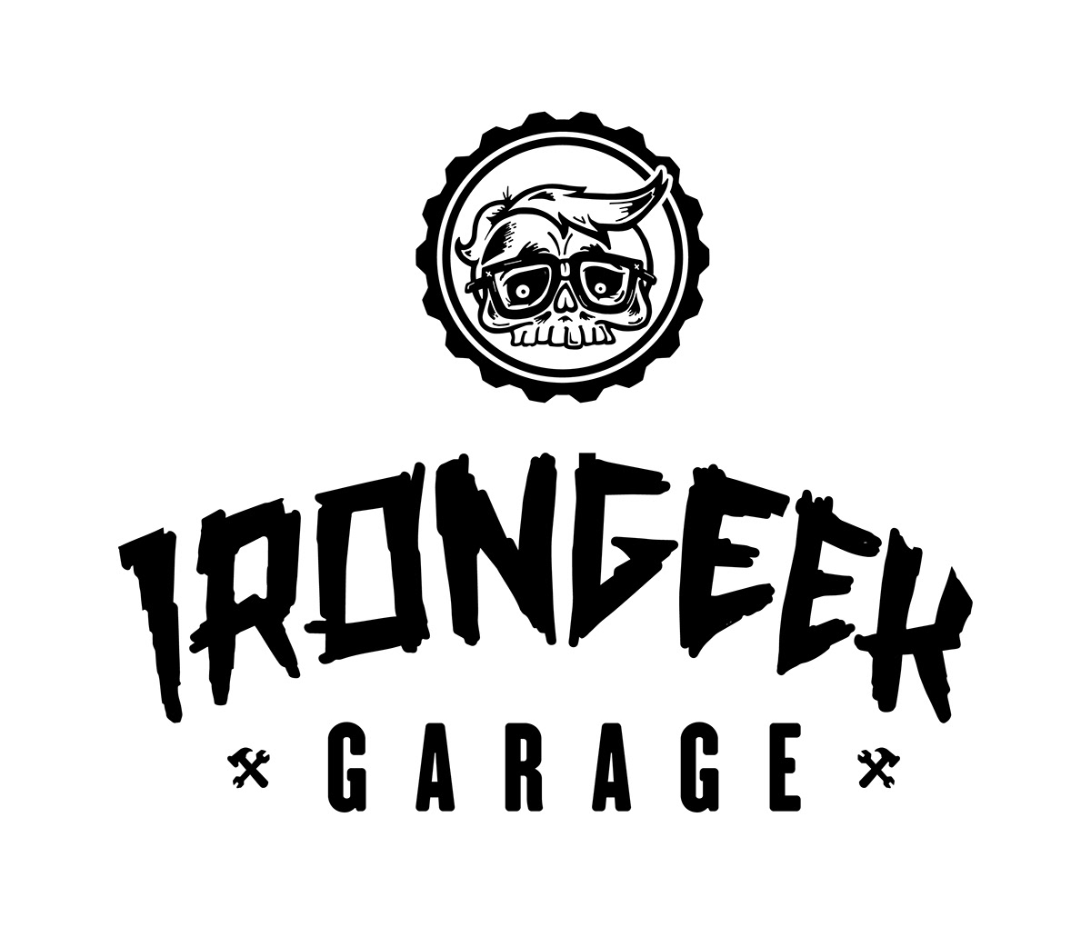
More patch-esque designs.

Here is the original artwork that was given to me to work with, drawn up by the incredible Chris Algaze. Check out his Miami printing shop Grizzly Print Parlour
