MediMax.de is a famous German website and chain of stores specialized in electronics retail.
Back in 2014 This project was self initiated to practice my UX/UI skills and knowledge, i took the journey from analyzing the current website ( www.medimax.de ) and finding its strong and weak points, and went through four of the well known competitors inside and outside the German market, trying to know how well they are done? and why are they better? then reached the point where i created a new vision for the website that can: maintain MediMax's ID, enhance its image, increase user engagement, and be modern and fun to look at for today's average internet shopper.
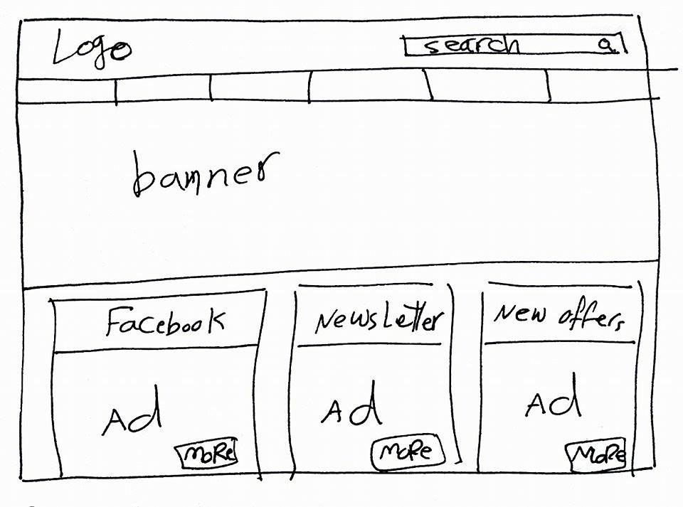
Studying the Current MediMax.de website, i came up with the following analysis:
Strong Points:
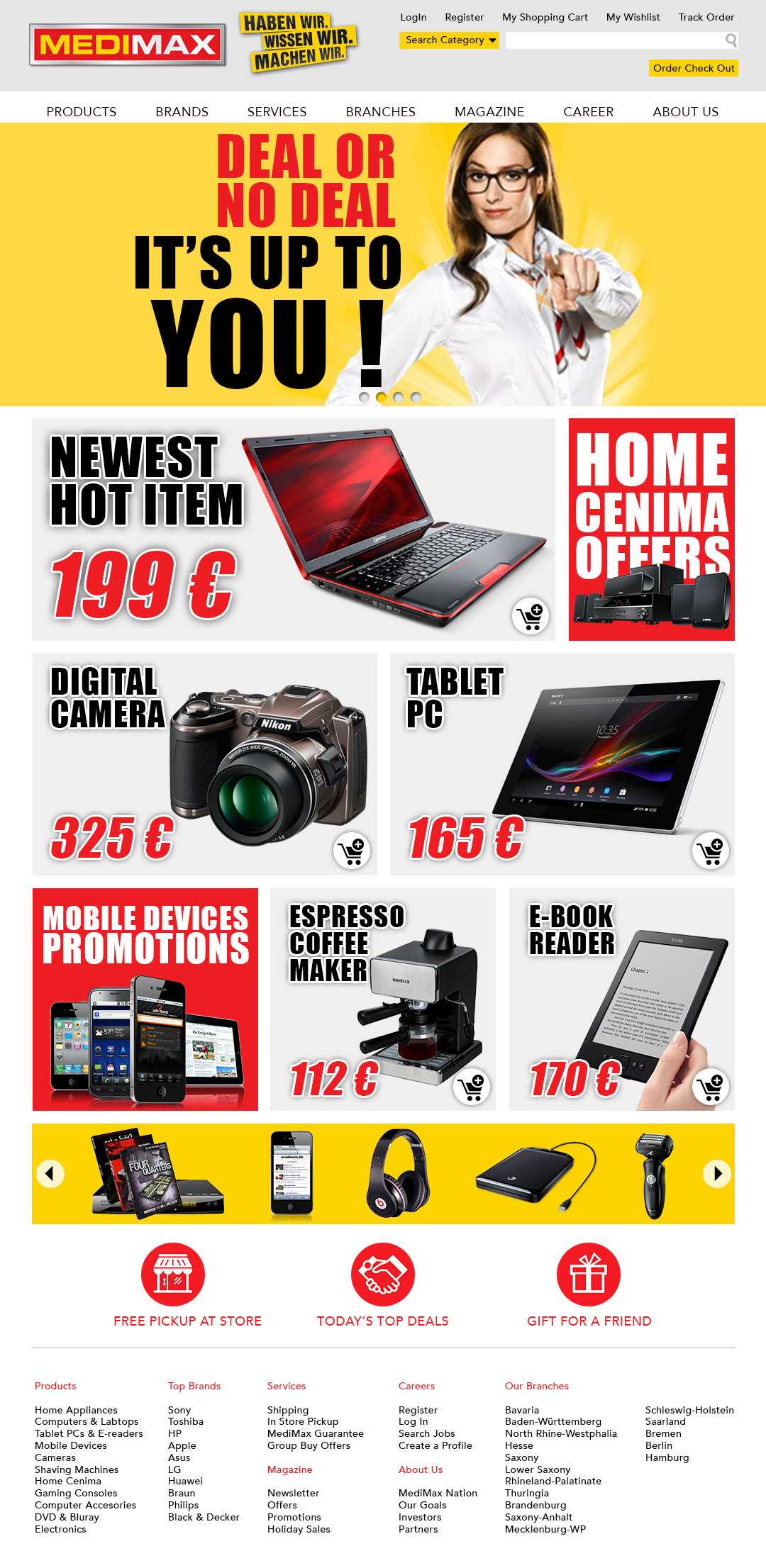
1) they have Good eye catching animated banner.
2) they have a very functional Main Menu if not a very usable one.
Weak Points:
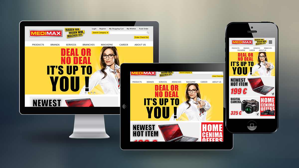
1) It is not Responsive which repels a big portion of today's users who like to shop on their tablets or mobile devices.
2) it follows a very old style based on images and textures, which is greatly problematic and slow for useres with slow internet connections or depending on average 3G bandwidth to access the website from thei mobile devices. Also may prove problematic for Secure browsing, because the more images you have the longer it takes to process data betwen Client & Server devices.
3) It does not show users "The Goods", the main reason a person would go to such a website is to actually Make Purchase, if they don't see the Goods, they might lose interest and go buy stuff on a competitor's website.
4) It does not evoke Action from users: it doesn't inform them about enough offers or promotions, nor at least ask them to buy anything.
5) the layout does not look Professional, and does not communicate a good image about MediMax, specially the lower section of the home page:
a) the 6 cell grid is not designed well nor does it inform the user about products that might interest him/her.
b) the More button is taking the place of a more needed "add to cart" button.
c) the page footer is not created or organized in a way that compliments the page design or keep the user close to what he/she might need to access.
Studying Competitors from outside Germany like:
BestBuy.com
Newegg.com
and Competitors from within the German market like:
Saturn.de
Mediamarkt.de
i came up with a list of common elements, and practices that are used almost through all of them:
1) Cross Plat Form (responsive design)
2) Info is the Key: What is available? and How Much does it cost?
3) Instant Buy Me button available on every item with a price tag on it.
4) Registration for an account so you can create wish lists, want lists, and other features that can make your purchasing experience more Easy and user friendly.
5) categorization of Display Areas: the Big display areas are for the hottest new item, the less popular the item the smaller its display area, this makes users recognize their needs immediately.
6) Minimalist, easy to read design that is based on a Grid, to make information more accesible and easy to recognize and follow.
7) the footer has to grant the user Full access to all areas of the website, in order to avoid forcing them to go all the way back up to the main menu bar.
Following those guidelines i came up with the below displayed re-creation of MediMax.de