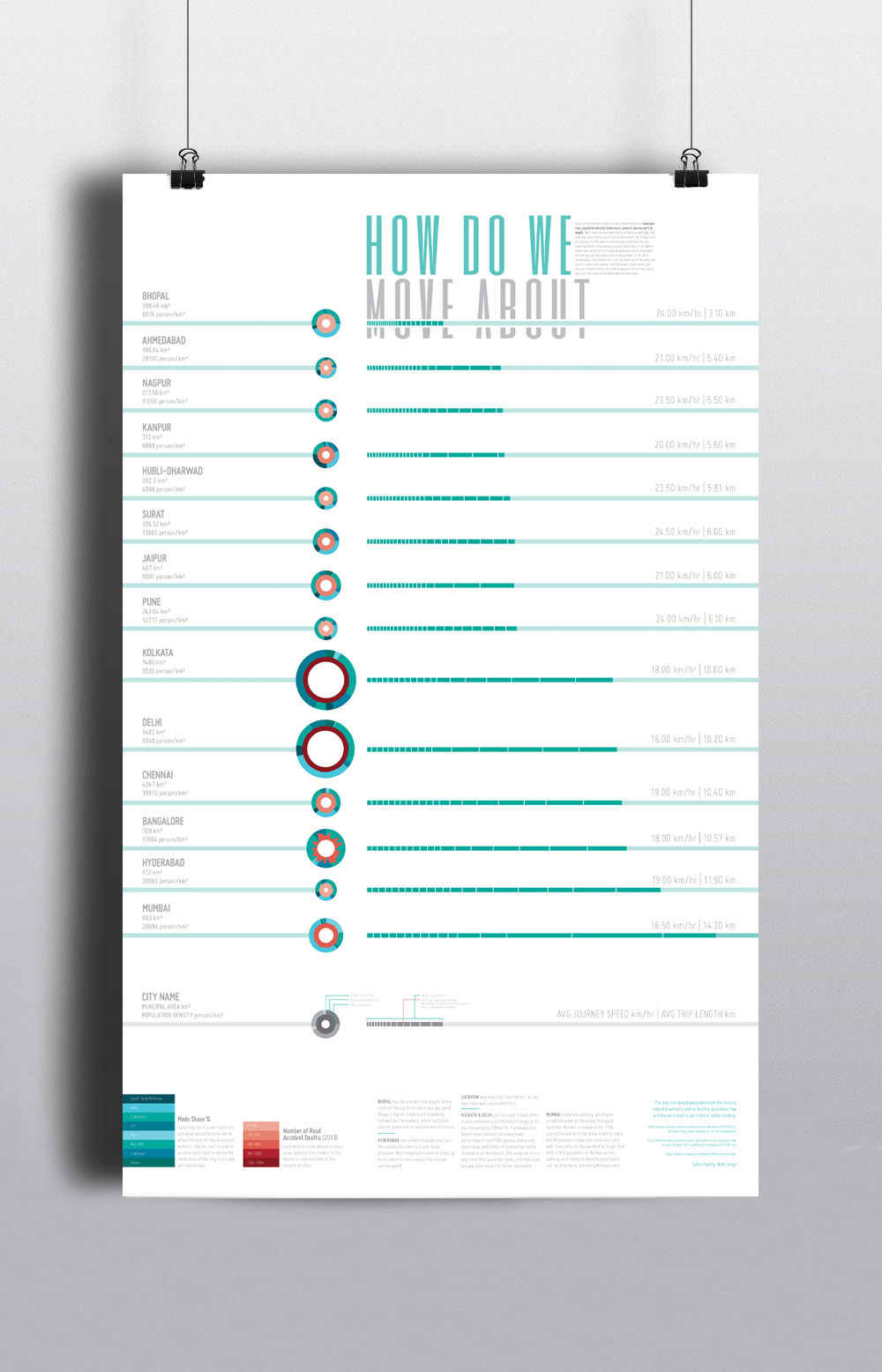
This visualization focuses on certain key aspects of how we move around in Indian cities, where the fields tend to affect each other. I chose to work with the municipal area, population density, mode share, speed of journey, and the trip length. There was a pattern in the plotted data, but few cities were standing out of the pattern and I tried to figure out the reasons for the same. While establishing realtionship between the fields, I realized how sometimes the city might not have a slow average journey speed, but if the highest mode share tends to move towards walking or public transport as the lifeline of the city, it drags it to a lower tier.
I analyzed the data in various ways to plot out differences and relativities. After a point, when I dealt with every single piece of information in isolation, patterns started emerging. In this data visualization, I’ve tried to focus on the relativity of the same and tried to show it in a manner that the viewer could relate the data, and discover hidden stories. I’ve mentioned parts of the interesting data alongwith the legend, but left some out intentionally for the viewer.
The data was provided by Urban Mobility India, Ministry of Urban Development, as a part of a competition for the 7th Urban Mobility India Conference, held in Delhi. This visualization was awarded a runner up position, under the Best Visualisation Entry.
How To Read The Data
Following are few details of the legends, which were mentioned in the visualisation for a better understanding of the data.

Each city has it's basic information represented in layer format, where the white circle defines the area of the city and the organic circular structure shows the population density. The disturbances are defined by the percentage of the population density. The higher the density, the more sharp differences will be observed in the form. It is in relative form and are meant to be observed alongwith the length and speed visualisation, to understand the relativity of the mentioned fields.

These bars represent the trip length of each city, along with the avg speed of the city. The darker part of the line shows the length travelled, whereas the journey speed is defined by the number of the vertical bars, which are used also to show the movement.

As mentioned earlier, each city talks about it's modeshare in the form of a piechart, and in the first legend you see the values of the same. In the second legend set you see the colour code of population density circle, which is in realtion to the number of road accident deaths.

Alongwith the legends, there were few keypoints provided to interest the viewer in understanding the hidden stories, and relations of the data visualisation. They were mainly about 5 significant observations about the patterns of movement in different cities.


