Molife is a mobile accessories company. The name molife came from: Mobility + Life. Its a seven year old business. On early 2014 the management was looking for a new look of the brand. They were trying to upgrade the brand to match with the level of other international mobile accessories brands. They also want their brand looked like more fashionable and fresh. And the responsibility to build that look was given to our team.
Important Guidelines from the management :
• Mobility + Life = Molife• Six year old Business Entity
• Changes of tag line with brand growth: Mobility is Necessity > Incremental Experience > Nothing But You
• Mobility related products.
• Products range Rs.100 to Rs. 2000
• Target people : ABSTRACT, ( not specifically defined )
• Mass Market > Selling Based on Distribution and Online Marketing
• Immature Market of Mobile Accessory
• Volume is important than value.
• Brand Driven Products not Product Driven Brand
• New coming and fresh brand
• Aiming for International Look and reputation
• Trying to without harming past goodwill match the identity with the level of International Mobile Accessory Brands without harming past goodwill.


We thoroughly go through all research and also look the works, other accessories company have done for their branding. And sum up the following detections:
• Accessory Company Logos are going to use in deferent mediums like leather, cardboard, plastic, pet, web, print etc. So it should be simple to execute and should be versatile.
• In modern days companies are using vibrant colors for branding.
• Most of cases playful font family are used.
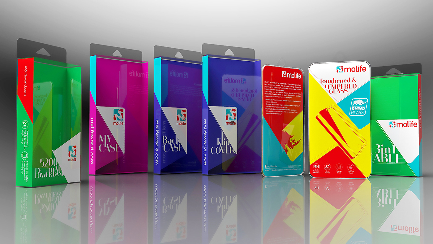
• Most of accessory package showing the product directly. Rest of the area of package occupied by brand color.
• In package box brand colors are used as product base or back ground color also.
• Different colors are used in product series.


The geometrical definition of the logo:

The color specification of the logo:

The looks of the logo in different mediums:


We not only create the new logo for the brand we also design the whole brand identity and create guide lines of the identity. For that we design from the basic things like PPT template, stationery etc, to entire collateral like in-shop artworks, outdoor artworks, etc. We create color theme according to product categories, and give guidelines to adopt that color theme through packaging and advertisements. We also create the web template for the brand. And propose editorial template for the artworks like product catalogue, paper ads etc. We suggest the Slate pro font family for general texting for the brand and Bodoni sans for the typographical works.


We create guidelines for both in-shop and outer-shop branding for Molife.


We create guide lines and templete for the colaterals of the company. We use the color theme according to the product category color.


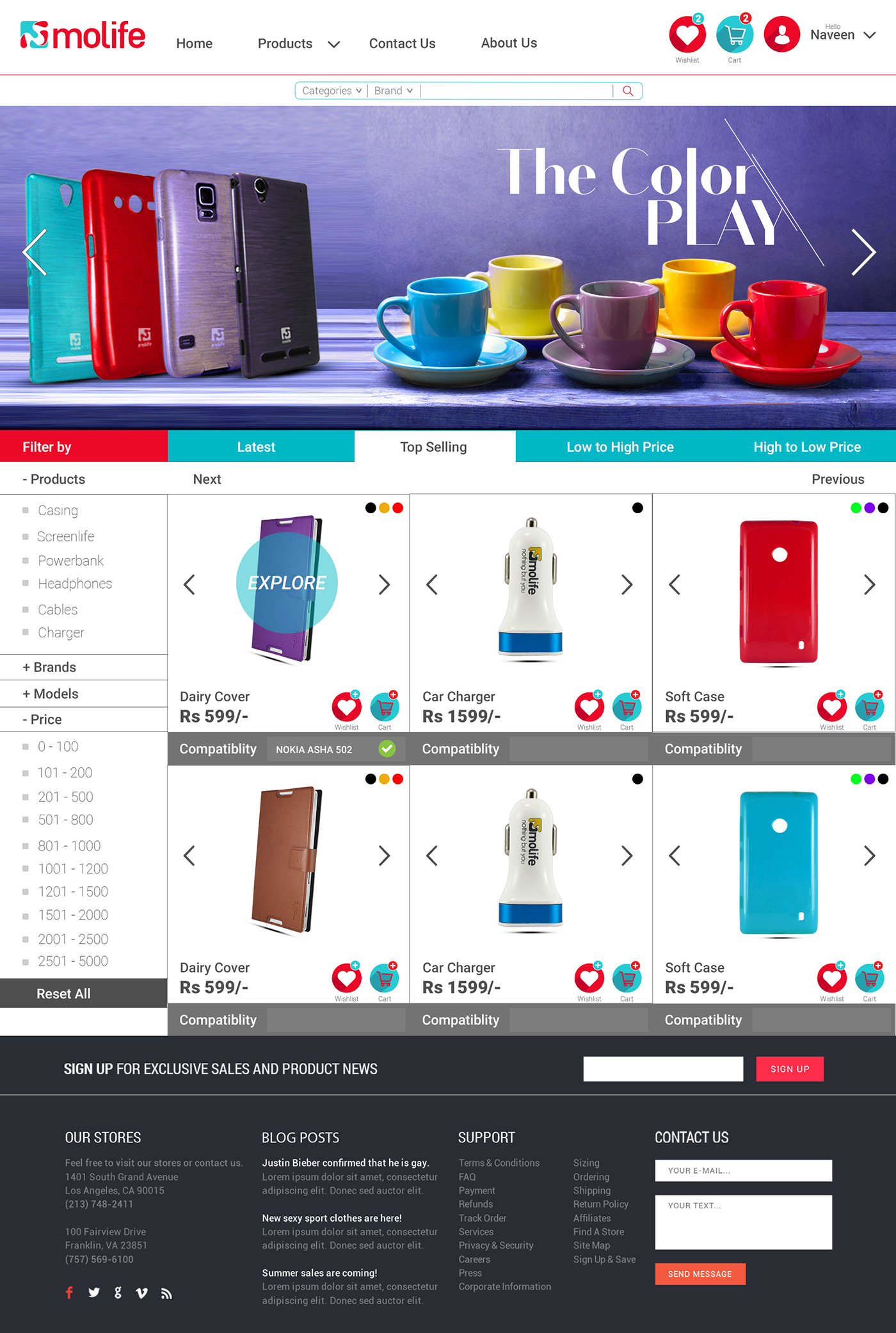
We also propose the web template which can be the best match with the branding, but for some reason we dont know what, this is not executed properly yet and they use a basic site with the new logo till now which is not really go with their branding. Hope they rectify it later.


Thanks for watching
if you like this don't forget to like..


