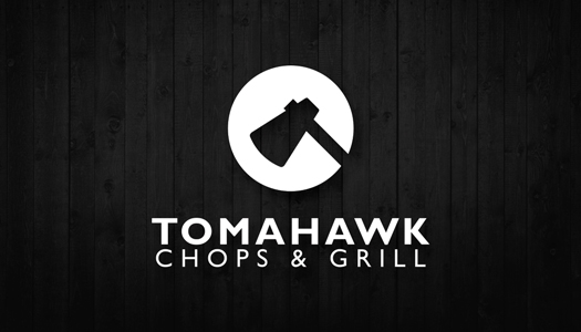
Tomahawk Chops & Grill Logo on white background
Project for Tomahawk Chops & Grill, a fairly new restaurant. The client wanted to play with the idea of using the tomahawk as an icon since it'll be their primary item on the menu and I wanted to give them something simple they could use for various mediums.
The overall aesthetic was designed to be modern, using only greyscales with hints of red and features a clean typography to give more emphasis to the simple logo.
The overall aesthetic was designed to be modern, using only greyscales with hints of red and features a clean typography to give more emphasis to the simple logo.
Calling Card side A
Calling Card side B

Envelope design side A

Envelope design side B

Sample letterhead design

Postcard design side B
Postcard design side A

Tarp design that's hanged in front of the restaurant for extra attention (and makes you hungry!)
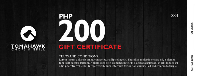
Gift Certificate design
Aside from their print collaterals, I also designed a few things they could use for their social media pages.
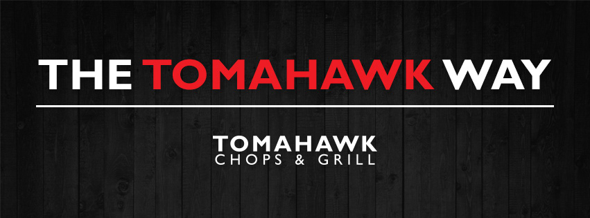
Facebook cover photo for the restaurant's page.
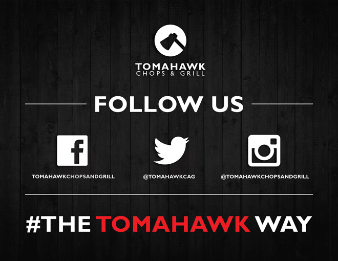
A design they can post and share on Instagram and FB.
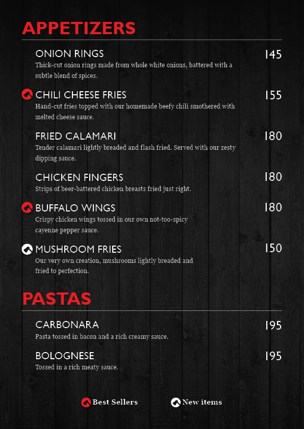
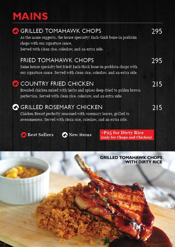
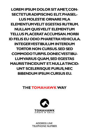
I'd definitely say that aside from their actual logo, the menu is the next most important thing in their whole visual identity package. The menu would be printed on back to back sheets, laminated, then binded by simple ring clips. This was the design solution we came up with since they wanted a menu that could be edited in the future without making it too permanent.