The City of Chicago + Alta Bicycle Share was looking to develop a Chicago-centric bicycle brand that would appeal to first-time cyclists and regular riders alike. IDEO Chicago and Firebelly partnered together, IDEO leading research and naming and Firebelly leading design and branding.
In the beginning the project was called Chicago's Bicycle Share Program. Our brief was to create a brand, that needed to be named, trademarked, developed into a visual identity and rolled out across a standards guide in less than three months. Much more than brand standards, the guide was to include 40-plus touchpoints (bikes, stations, vans, stationery, event environments, clothing, website, etc.) each to be designed, rationalized, revised and set up for production. This would allow for two months of production and installation to meet the five month deadline of having the system operational with 750 bikes on the street.
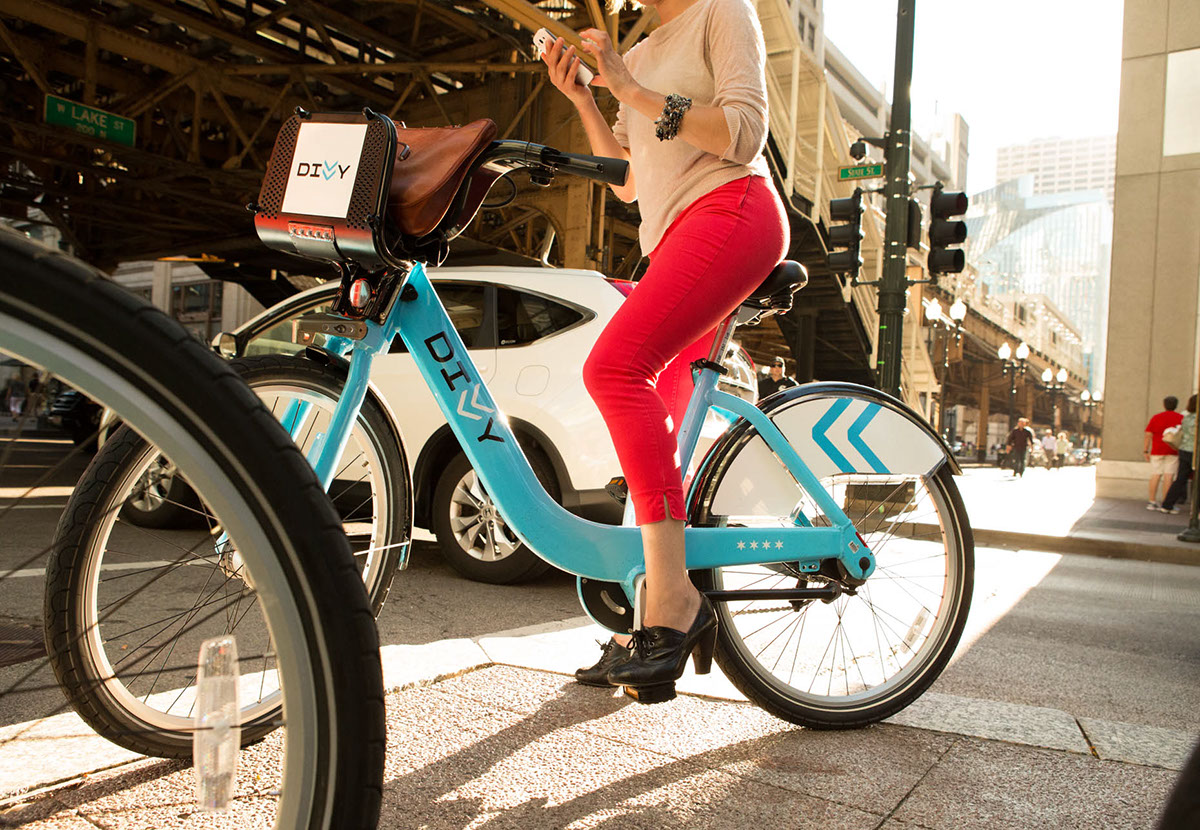
Photo by @saveriotruglia saveriotruglia.com

Photo by @saveriotruglia saveriotruglia.com

Photo by @saveriotruglia saveriotruglia.com
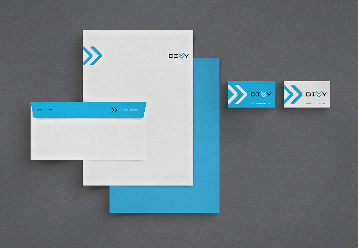
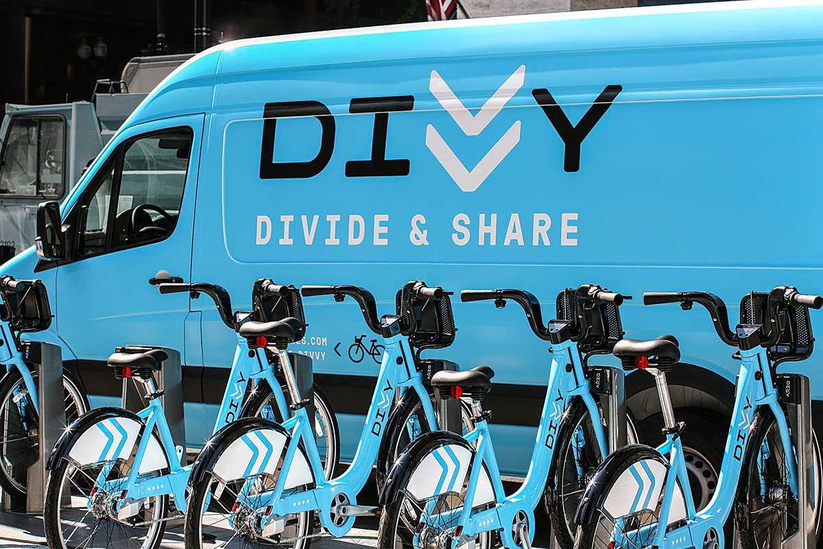
The brand we created is Divvy, equal parts entity and state of mind. Divvy is Chicago’s forward-thinking, city-minded transportation service, aimed at making bicycling practical, painless, and convenient. Instantly recognizable and universally understood, Divvy’s good nature transcends cultural and language barriers by finding its form through familiarity.
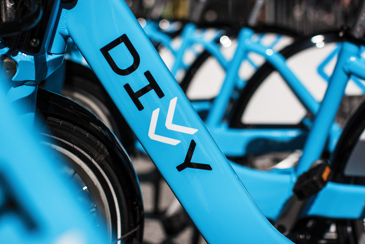
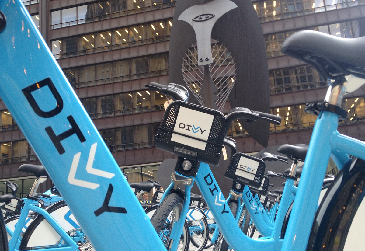
The double-V ligature, is based on the guillemet or angled quotes. In typography this glyph is traditionally used to indicate direction and motion. Marked onto streets across the world, this double arrow symbolizes the shared use bicyclists and motorists have of roads. In transportation vernacular, this marking goes by the name sharrow. Our custom logotype was inspired by monospaced alphabets where letters and space share a common width to define themselves. This is akin to people defining themselves through the mode of transportation they choose on the shared space of the road.
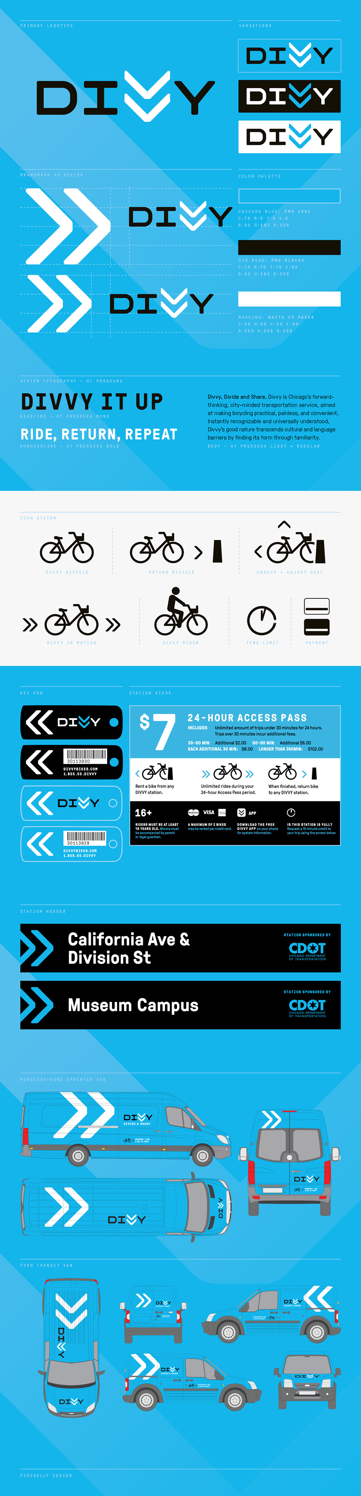
Constructed with right angles and geometric curves, the identity is built upon the grid that defines Chicago’s roads. To soften the sharpness of the characters, all edges have a slightly rounded curve likened to a smooth ride of the bicycle. Together the weight of each character and their rounded ends offer a trusted utilitarian feel that holds a direct connection to the city and a comfortable position within its urban environment.
Grilli Type's GT Pressura offered a rich voice with a distinct articulation that perfectly complemented our identity. Divvy's system towards messaging includes both the monospace and proportional sans serif, enabling Divvy's voice to hit a wide range of tones. Both of GT Pressura's variants have rounded corners embracing the soft and friendly side of the Divvy logotype.
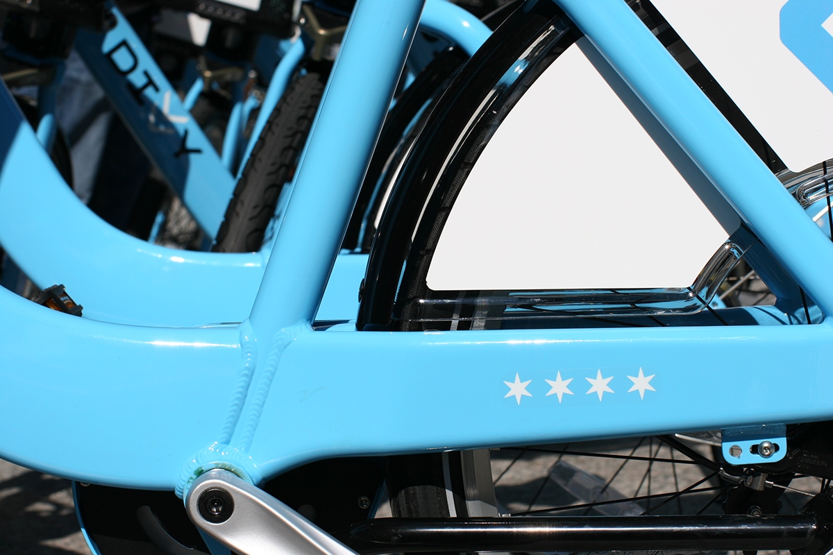
We wanted this project to honor the great civic pride in the people of Chicago. In the identity we do this with the row of four six-pointed stars found on the bike's chain lay and through Divvy's primary color. These elements are derived from Chicago's iconic flag. Here the stars have been updated to match the geometry and roundness of the system. While Chicago's usage of light blue seems to vary quite a bit, we found Pantone 298c to be the perfect color to provide a visual connection to the flag while greatly increasing cyclist presence to the passing cars in our busy urban environment.
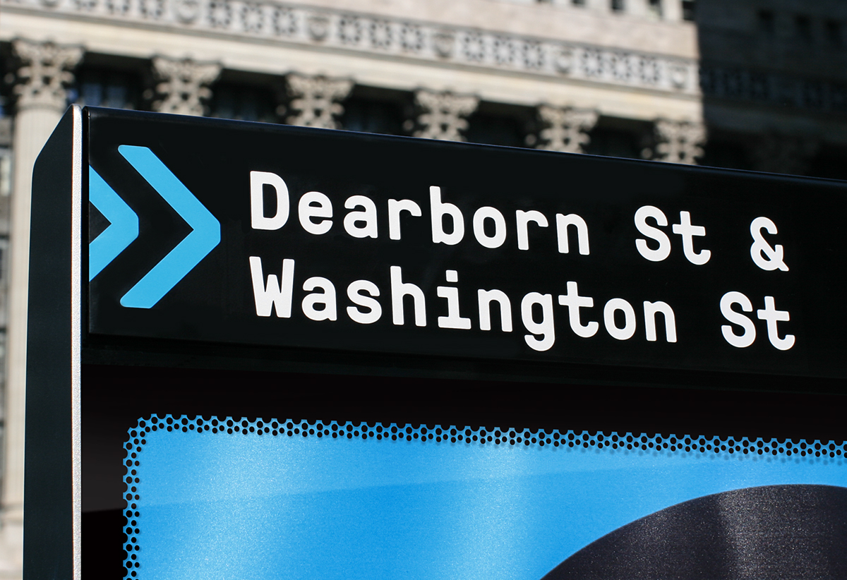
Maintaining a keen eye towards type and developing a branding system that utilized the the brandmark as a navigational devise allowed each touchpoint to look organized yet dynamic.
Naming and brand development was approached with a human centered focus to gain an understanding of the emotional and behavioral values of the prospective audience.
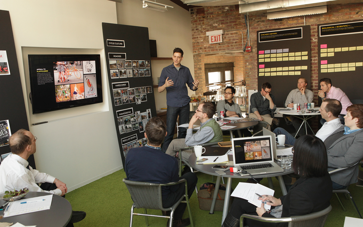
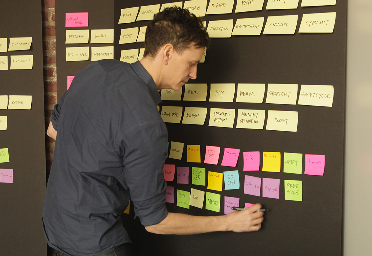
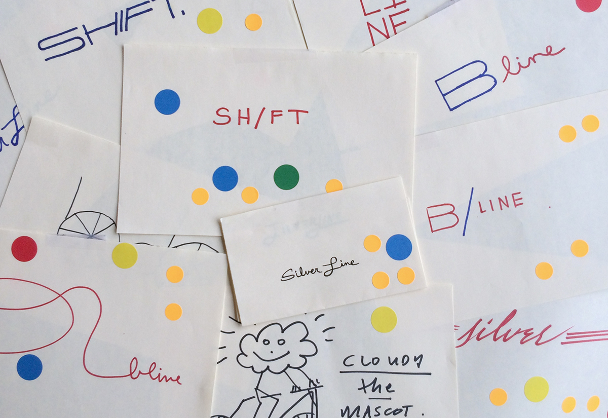
The process was one of inclusive collaboration. Together, designers and clients would meet to conduct design charrettes generating potential names and early ideas. Based on early conversations with Chicagoans, we came up with and discarded hundreds of names. While plays on regional vernacular like "Da Bike", "Cycle Jordan", "Bike Ditka" or even "The Rahmbler" didn't make the preliminary cut, they did keep the room lively and moved us toward more appropriate names.
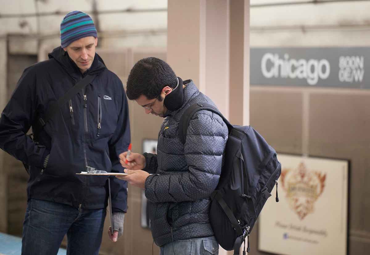
Visiting numerous Chicago subway stations we spoke with over sixty commuters about their perceptions of a bike-share program. We picked twenty-six names to discuss with them. The goal was not to crowdsource the naming decisions, but to look for patterns of interpretation that would reveal consumer values.
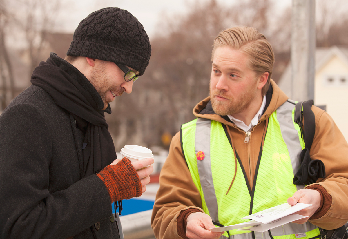
Through several rounds of research and exploration, we learned that Chicagoans and tourists alike desired a balance of convenience and light-hearted spontaneity, while needing confirmation that the system was safe, secure, robust, and most importantly, supported by the infrastructure of the city itself.

We also learned that people in Chicago valued the joy of riding. They wanted the bikes to feel “official,” and part of the city and wanted using the bikes to be fun, spontaneous yet safe. Based on how the names spoke to the values we uncovered, we narrowed down our list to five recommended names.
The final designer and client design charrette was a quick sketching session. Leadership from Chicago's Department of Transportation and Alta Bicycle Share joined designers from Firebelly and IDEO in a side-by-side session generating hundreds of immeditate iterations of the potential names. While these sketches did not directly inform the design, they allowed the designers to see the space the client's mind was occupying.
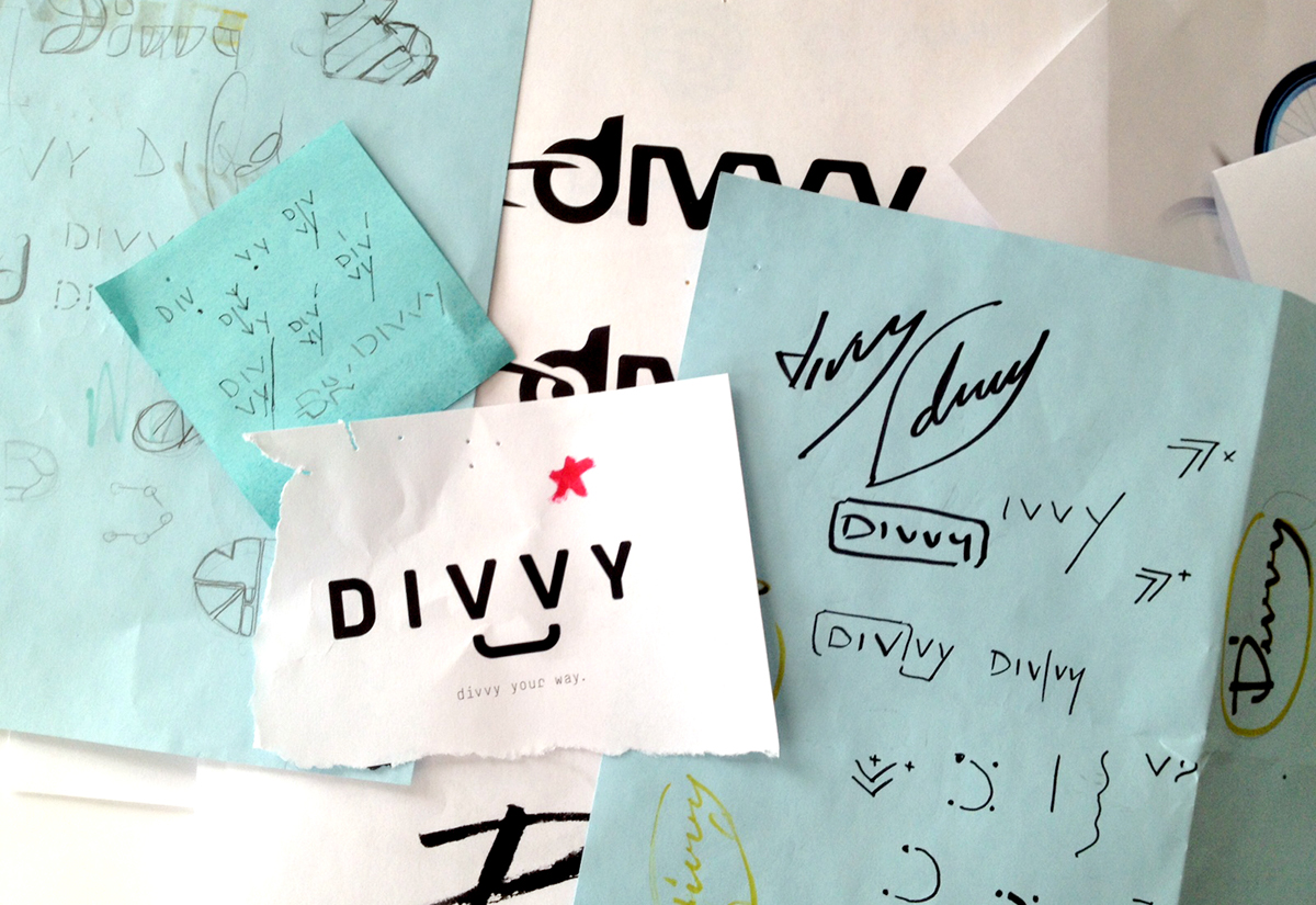
The final name, dubbed Divvy, reflects the shared nature of the service. It's was chosen not only for it's relevance to the product and reflection of consumer values, but because it had staying power. The potential for the name to be used as a concise-noun, an adjective or a verb meant the name could survive on the bike and materials as an identity or on it's own as a language system.
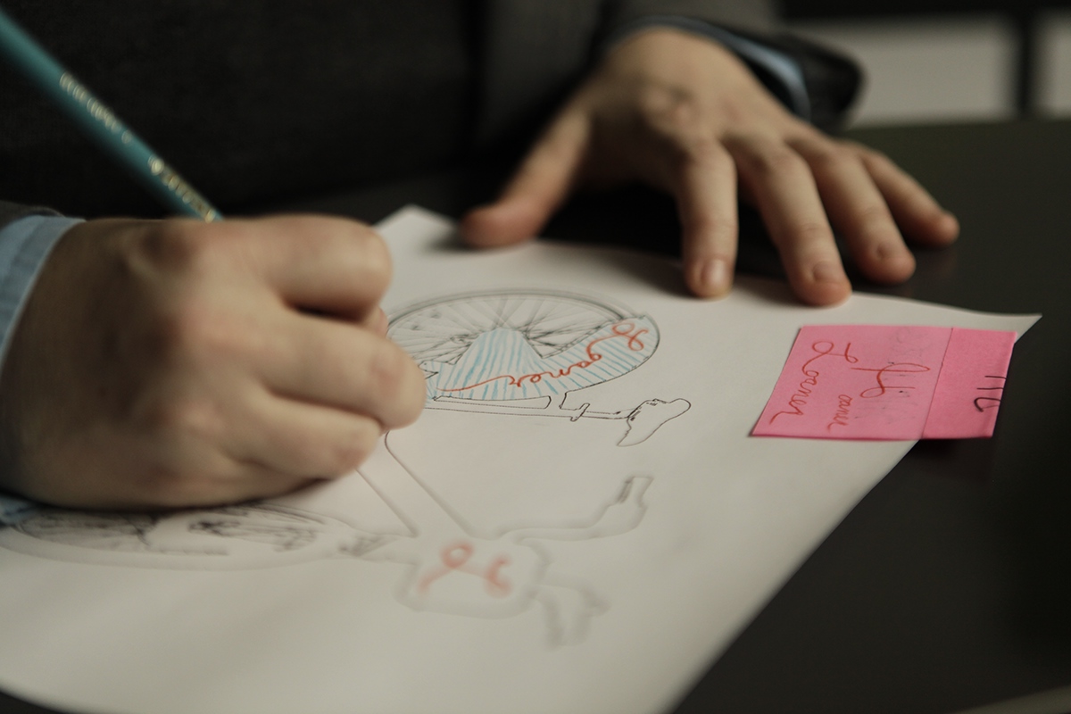
Once the final name was approved, design began. We pursued a variety of directions, often starting with loose sketches moving into rough variations across many different concepts.
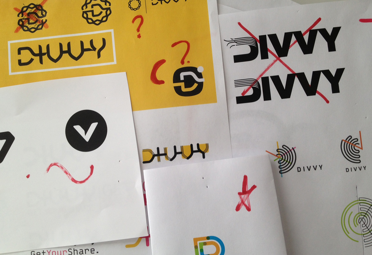
While developing the proposed identities and their systems we focused on the presence, balancing respect of the content with the context.
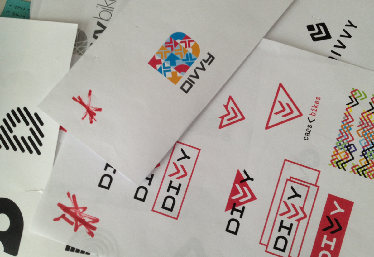
Once the bicycle-share program would be in operation across the city, the Divvy brand would appear on top of thousands of bicycles and tens of thousands of items in the context of cycling. We felt it was important not to be redundant with our brand. We worked to avoid literal bicycle references.

The final direction made Divvy feel like a part of the city. The double Vs in the logo refer to the sharrows painted on bike lanes. It's a nod to how the city prioritizes bike safety, paving the way for new riders.

We explored a range of color options. The Pantone 298c light blue became the perfect choice as it honored the city's pride by referencing the Chicago flag and increasing bicycle visibility.
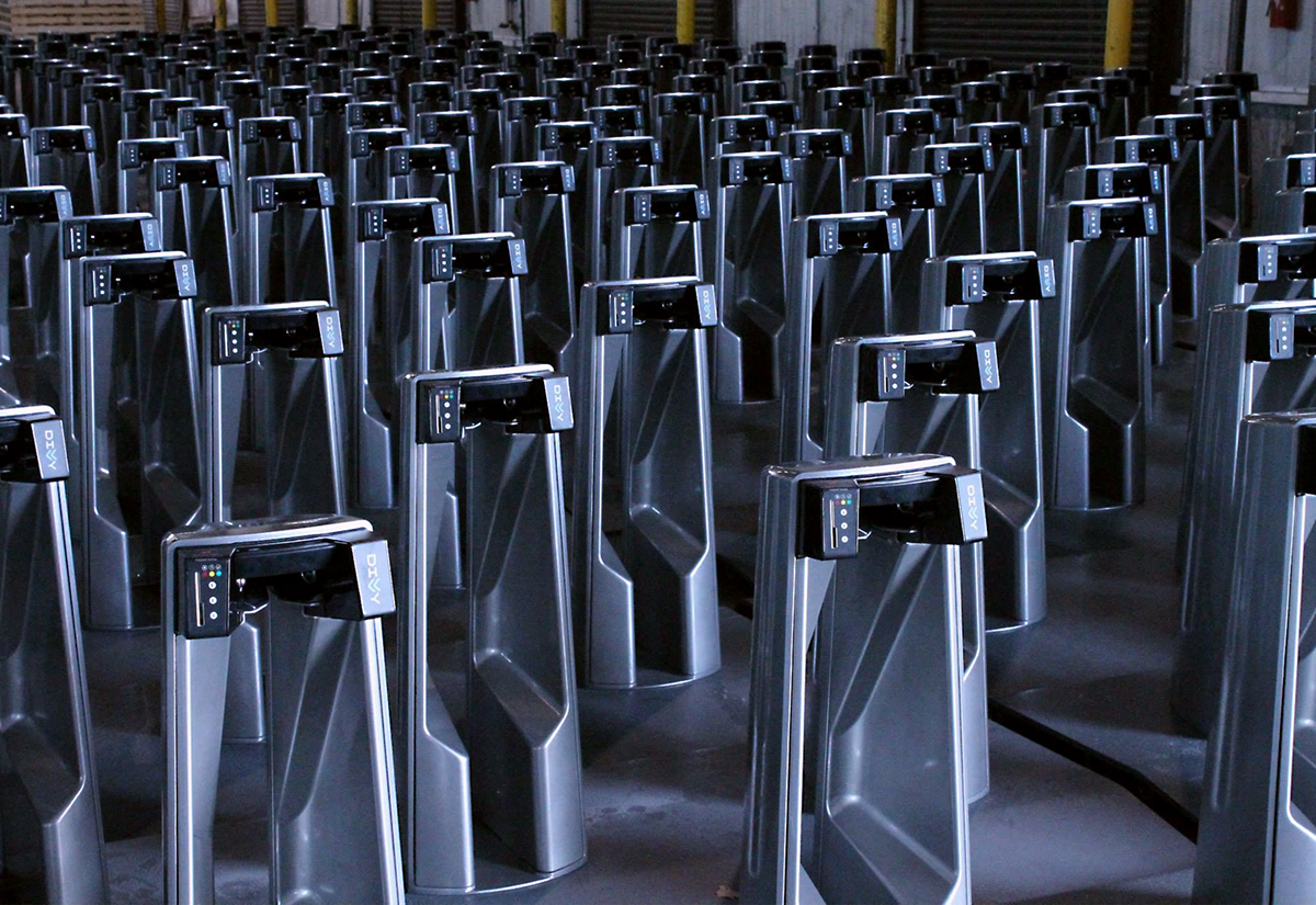
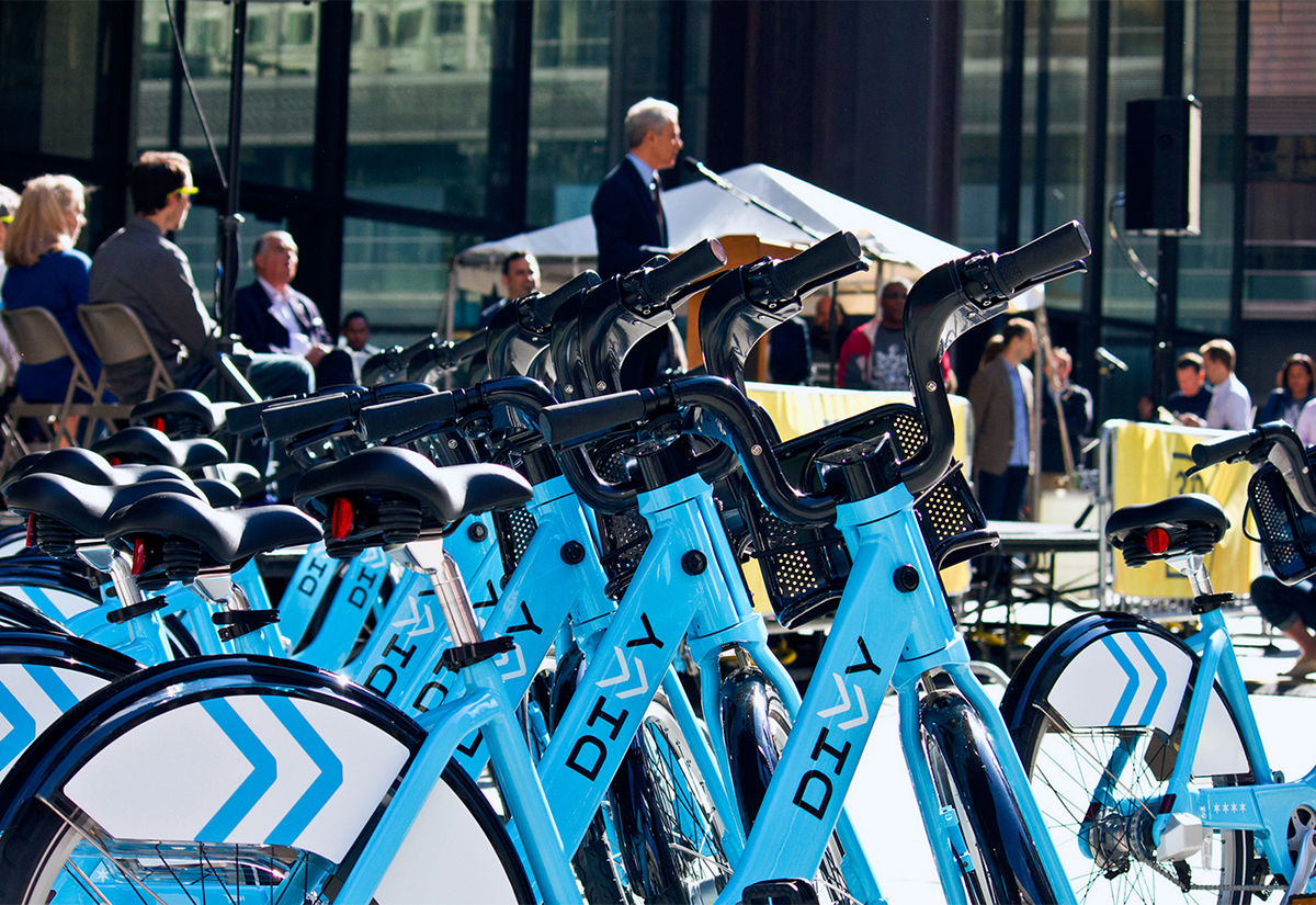
Durring the two months of production and installation our vendors began sharing behind the scenes photos of the process.

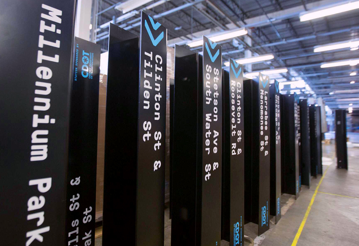
At the site of seeing the Divvy station headers we realized that we were watching our city's newest transportation system being born.
Divvy—as a name, a brand, and a system—was immediately adopted into Chicago’s everyday routine, and quickly expanded as a core component of our citywide identity and culture.

Photo by @saveriotruglia saveriotruglia.com
The brand is approachable and simple, yet speaks directly to its purpose and its ability to empower riders to engage in our collective ever-growing sharing culture. As a brand, it speaks clearly to how we feel, rather than where we are.

The concept of Divvy was born out of understanding the people and the City of Chicago. Divvy speaks to the down-to-earth, collaborative and quirky nature of our city. It celebrates the emotional and behavioral importance of bike sharing, and allows the strength of its home to serve as an understated foundation.
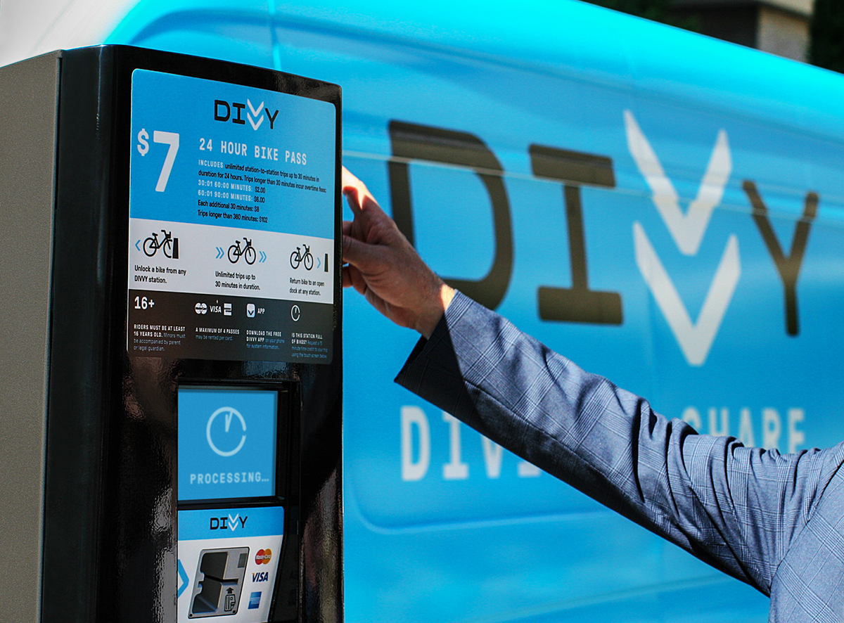
The Divvy bikeshare program was operational and installed across Chicago two months after the project wrapped up. It launched with 750 bikes at 75 stations. In the year and a half since launching it has grown to 3000 bikes at 300 stations.
Just three weeks after it launch, Divvy was the busiest bike-sharing system in the world. Six months into the service, cyclists racked up over 780,000 trips and 1.7-plus million miles and over 12,000 Chicagoans have become members. As of November 2014 Divvy has grown to over 23,000 members, these members have made over 2.2 million trips durring 2014.
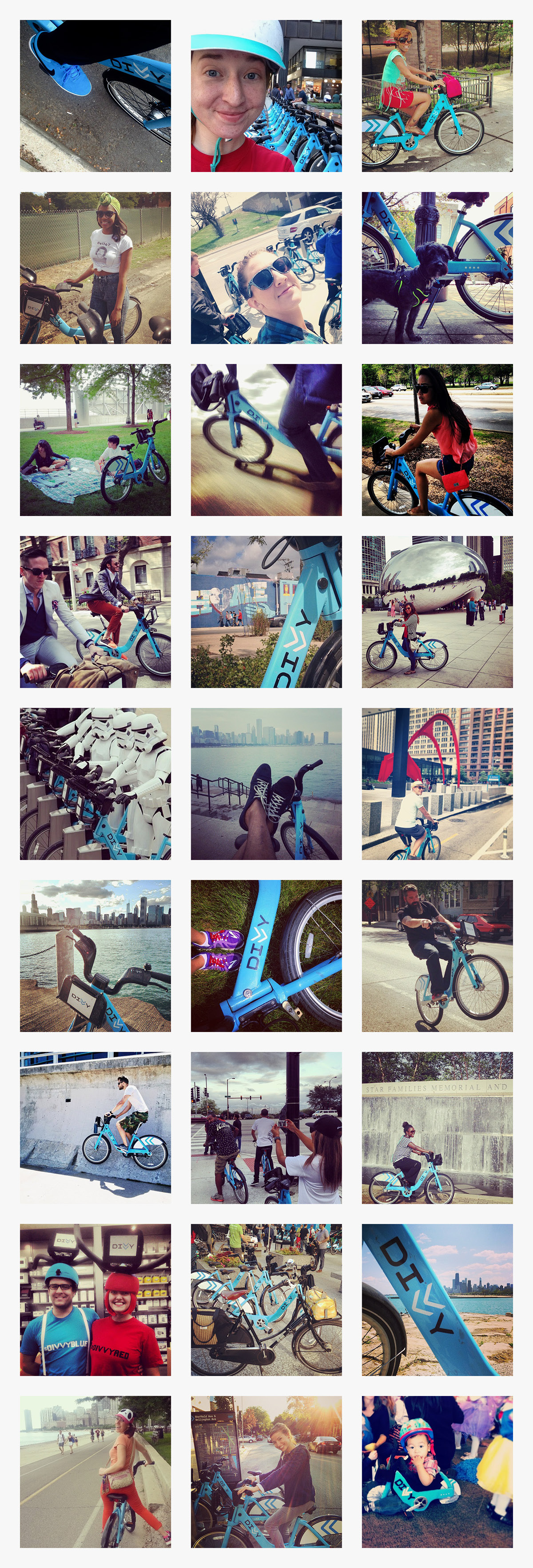
Within weeks after the launch Divvy became an integral part of the Chicago landscape with such phrases as “Did you Divvy?” “Divvy on!” and “I’m a Divvier” becoming part of the city’s vernacular. Members often proudly show off their Divvy key fobs and take selfies with the bike, as proof that they support and believe in Divvy as a brand and a system.
We love our city of Chicago. The place, the people, the get-it-done attitude. We were inspired by the riders of Divvy and their pride in our newest transportation system.
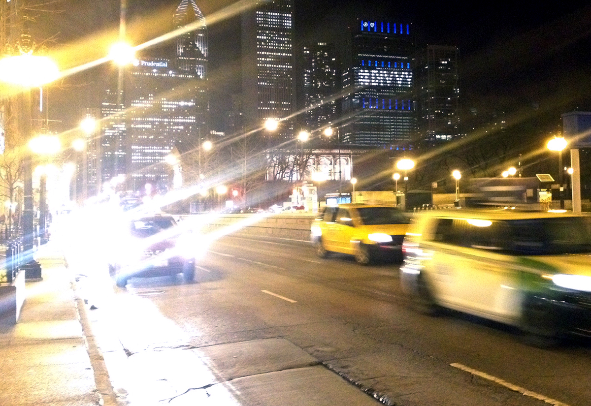
After nine months of being in operation, the Blue Cross Blue Shield Tower (BCBS) at the north end of Millennium Park lit up its windows in celebration of their $12.5 million sponsorship of the program. Mayor Rahm Emanuel has said, “this means there are more bikes for riders, and more value for our taxpayers.”
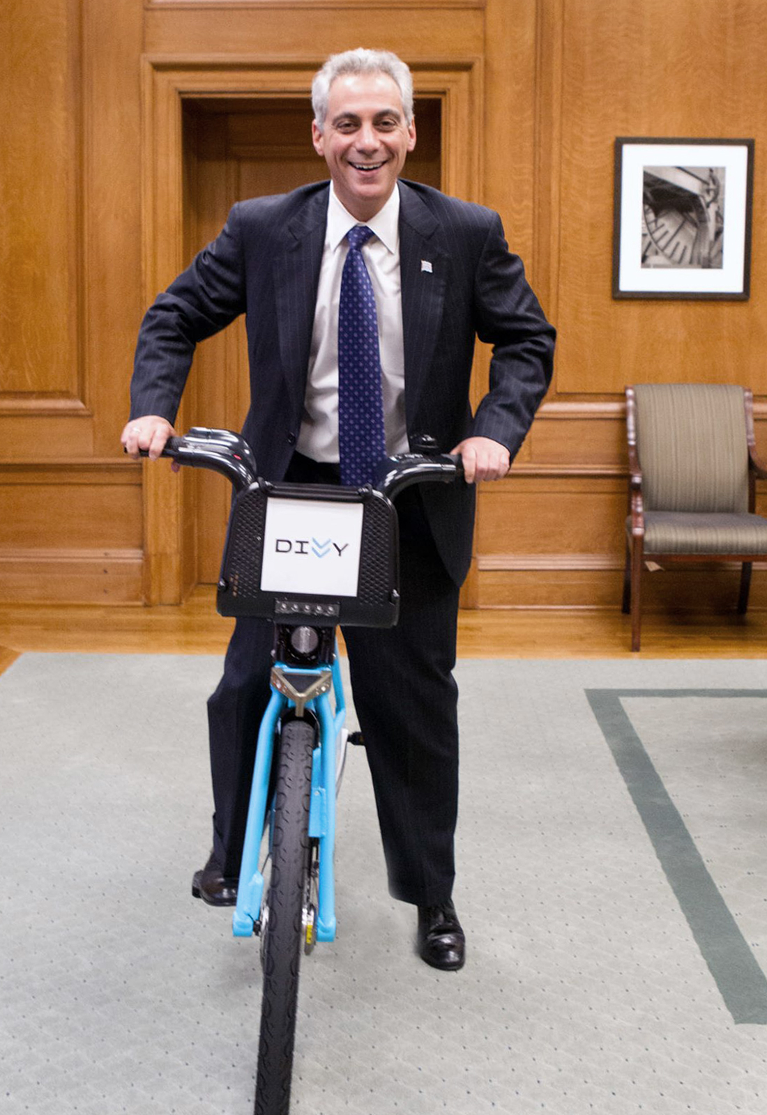
It was also nice to see that the Mayor approved.
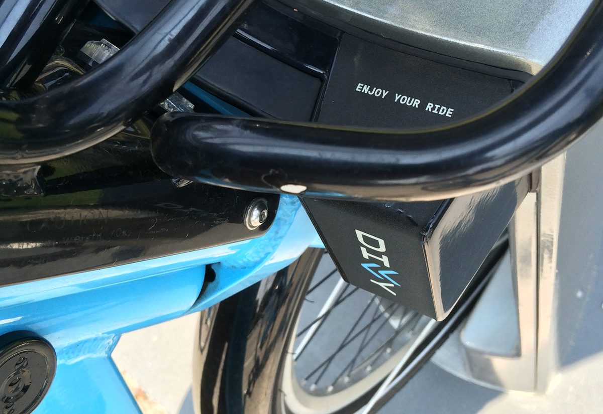
Enjoy your ride.
Enjoy your ride.


