There's blood in the water.
The studio's 5th TYPEFORCE title-wall was conceived with passioned vision, executed through an unrelenting process of hands on experimentation and discovery.
As designers we know that easy projects are rarely worthwhile. They lack awe-worthy impressive qualities that a process of learning and experimentation delivers. A simple task is an easy target. While the impact can be large the execution contains a level of mechanized predictability that is underwhelming. This belief can be compared to the nature of sharks. While feared and fierce, sharks are highly ritualized and predictable, taking an easy approach to hunting by attacking at the scent of blood.
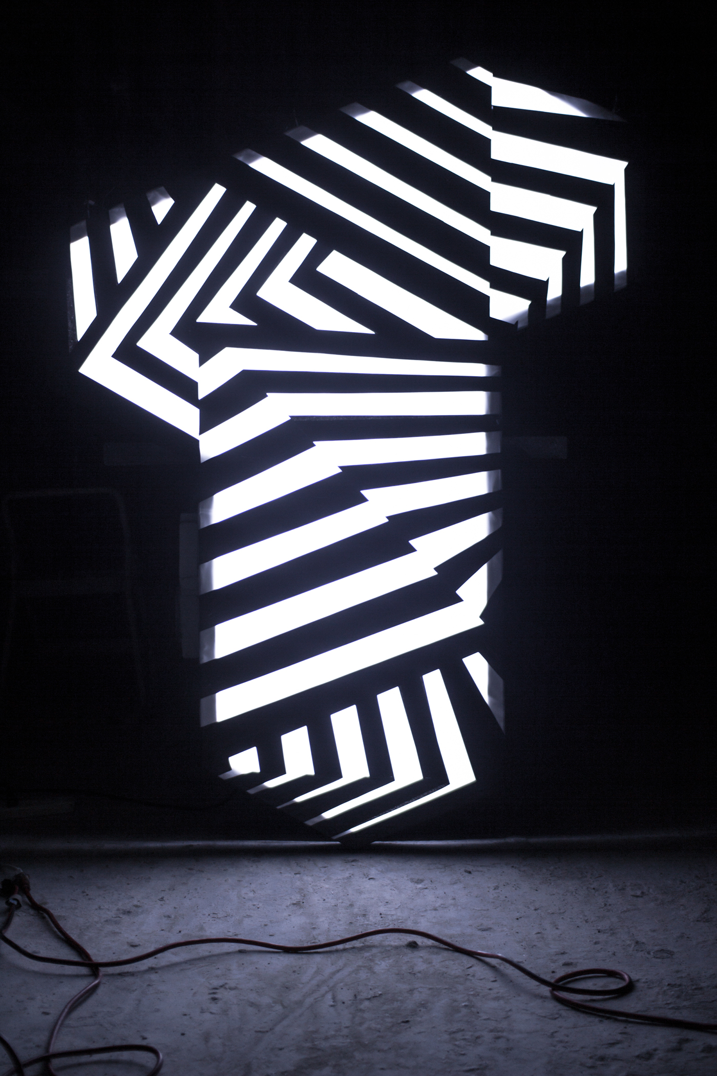
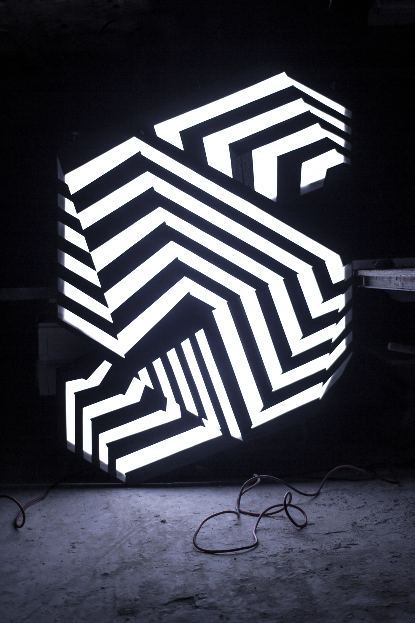
Seeking inspiration through the deflection of easy targets we found British artist Norman Wilkinson's 'dazzle painting', also known as "razzle dazzle" or dazzle camouflage. Unique to each vessel, this patterning was intended to protect merchant ships during World War I by distorting perspective, masking form and hiding direction. It was adopted by the British Admiralty and the U.S. Navy to help safeguard their fleets.
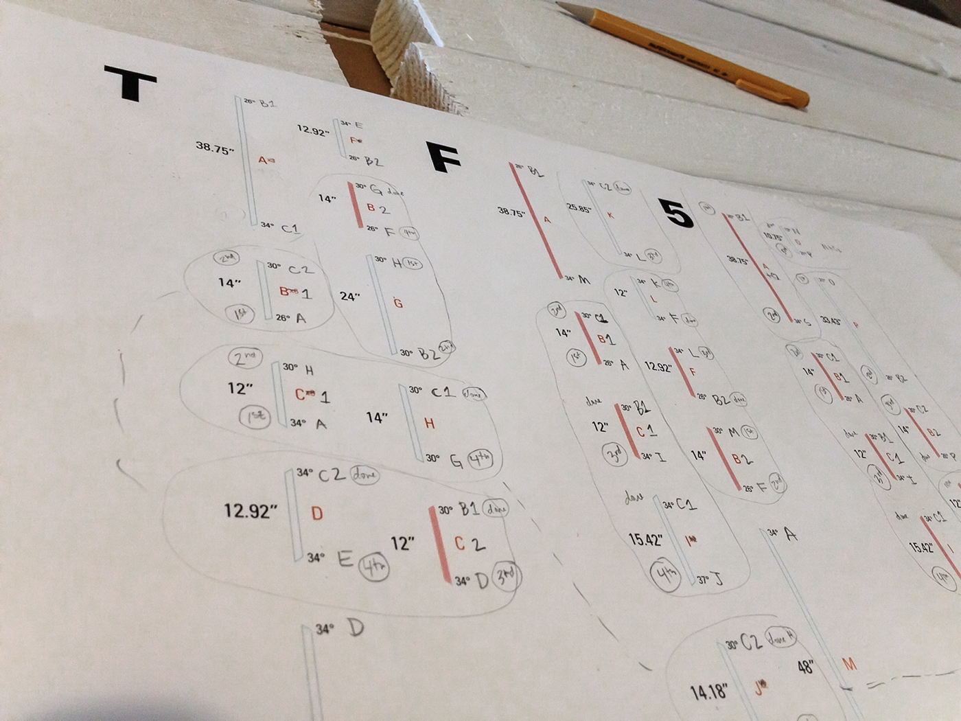
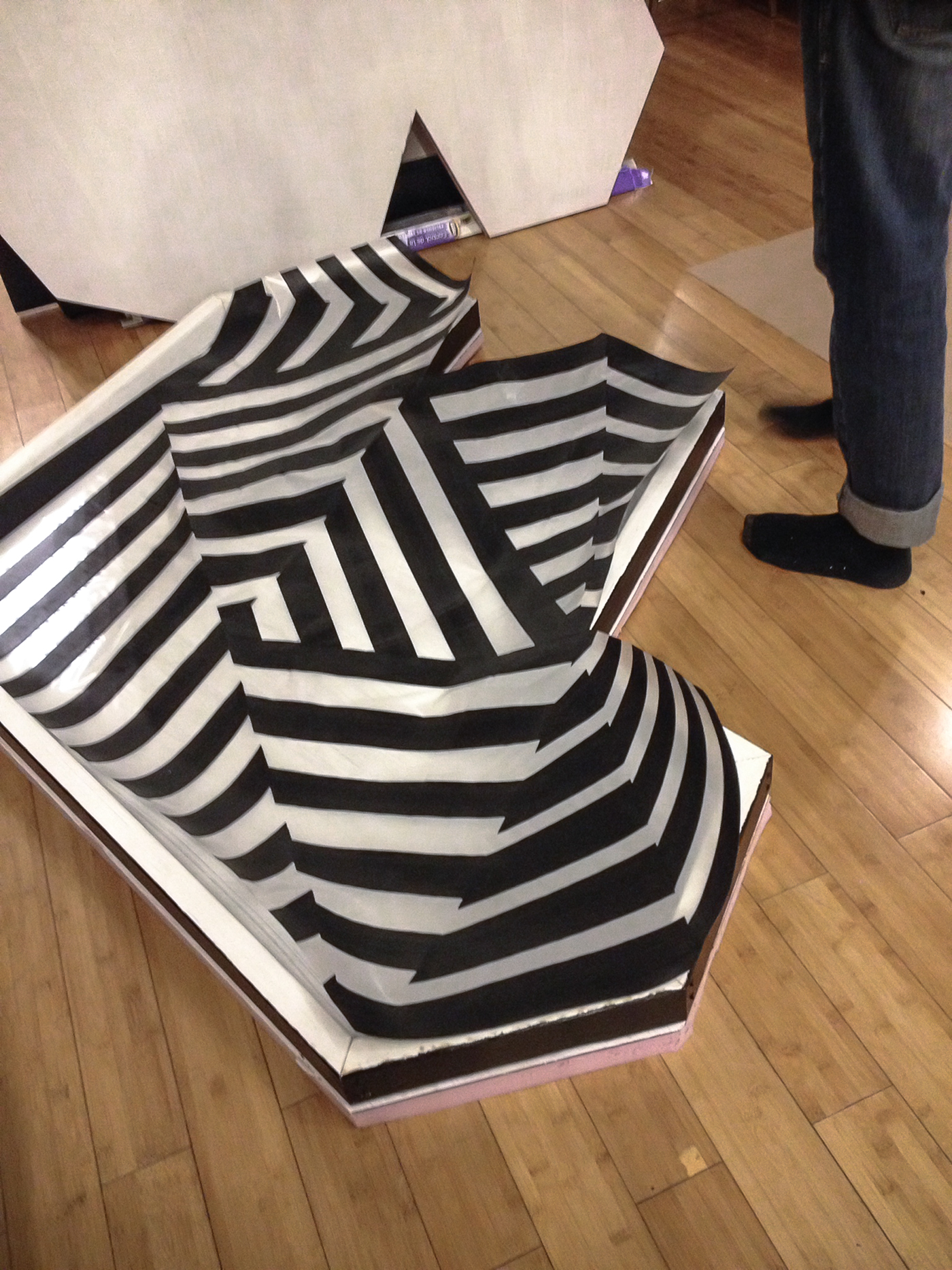
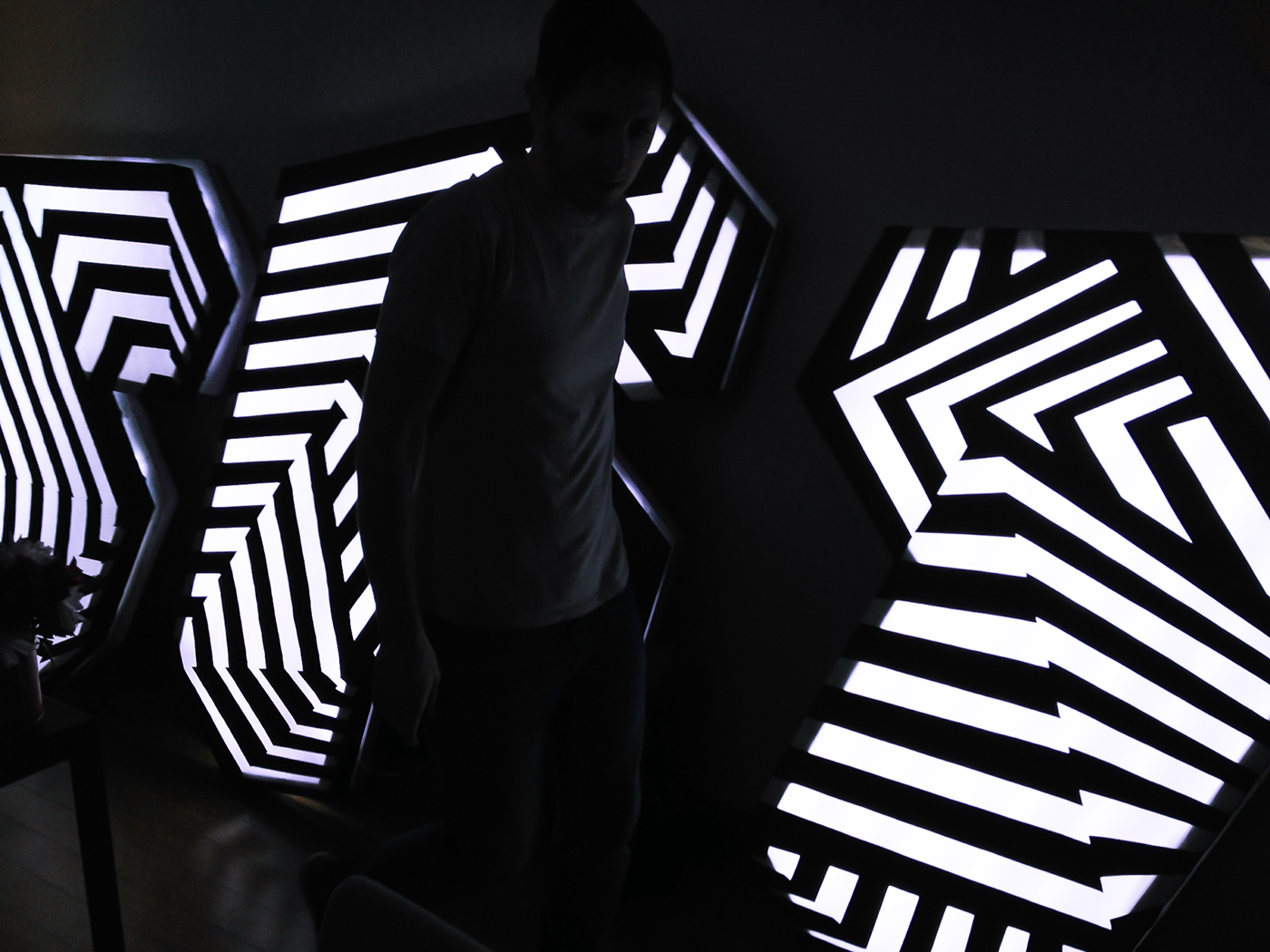
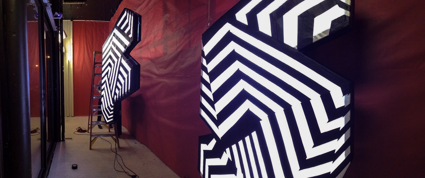
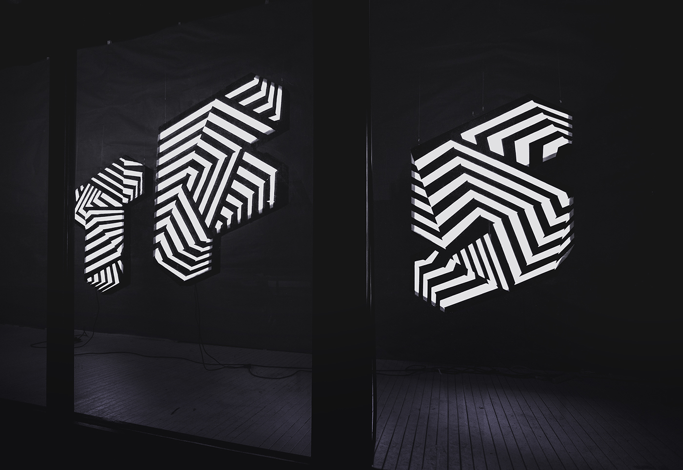
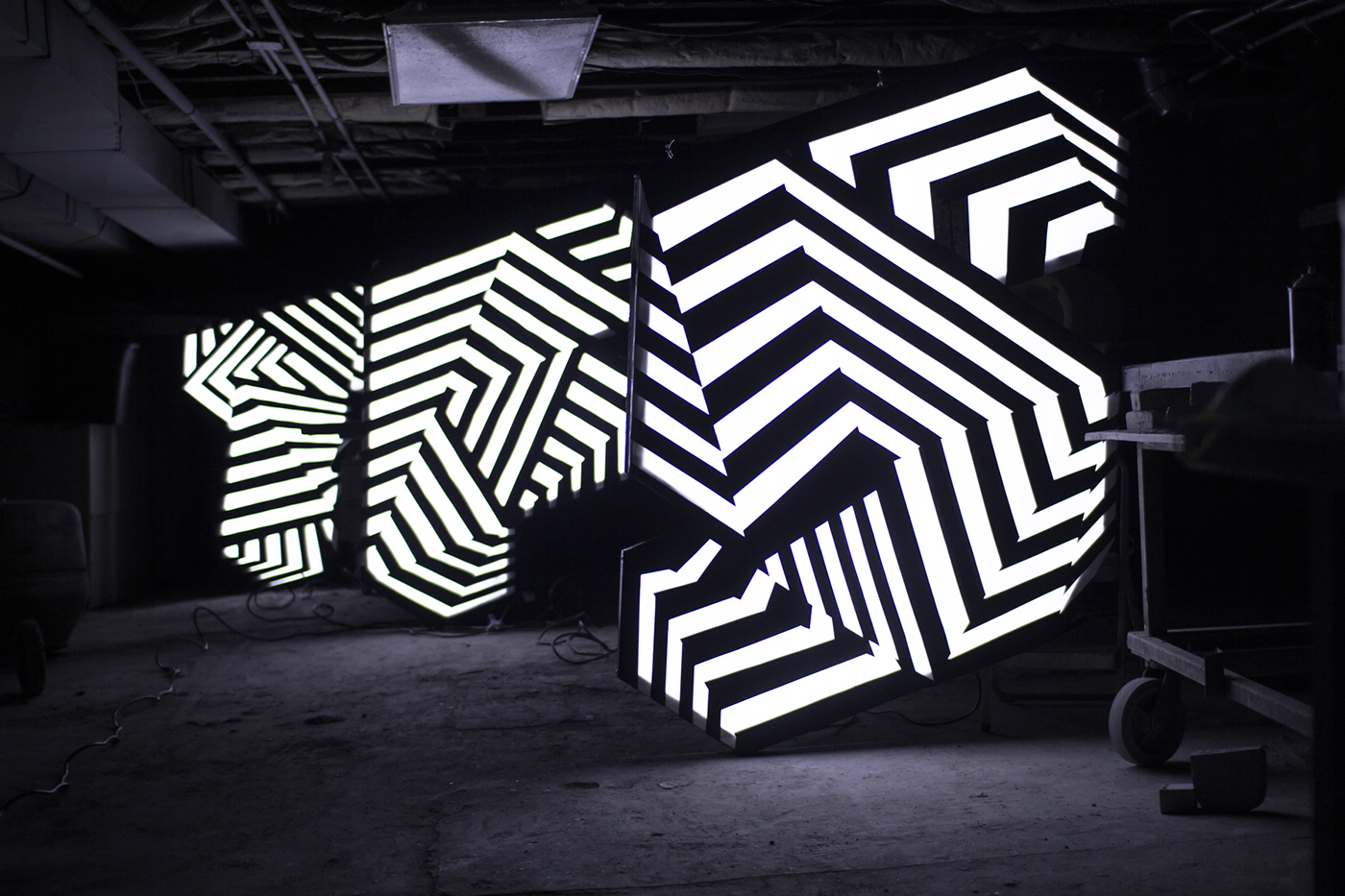
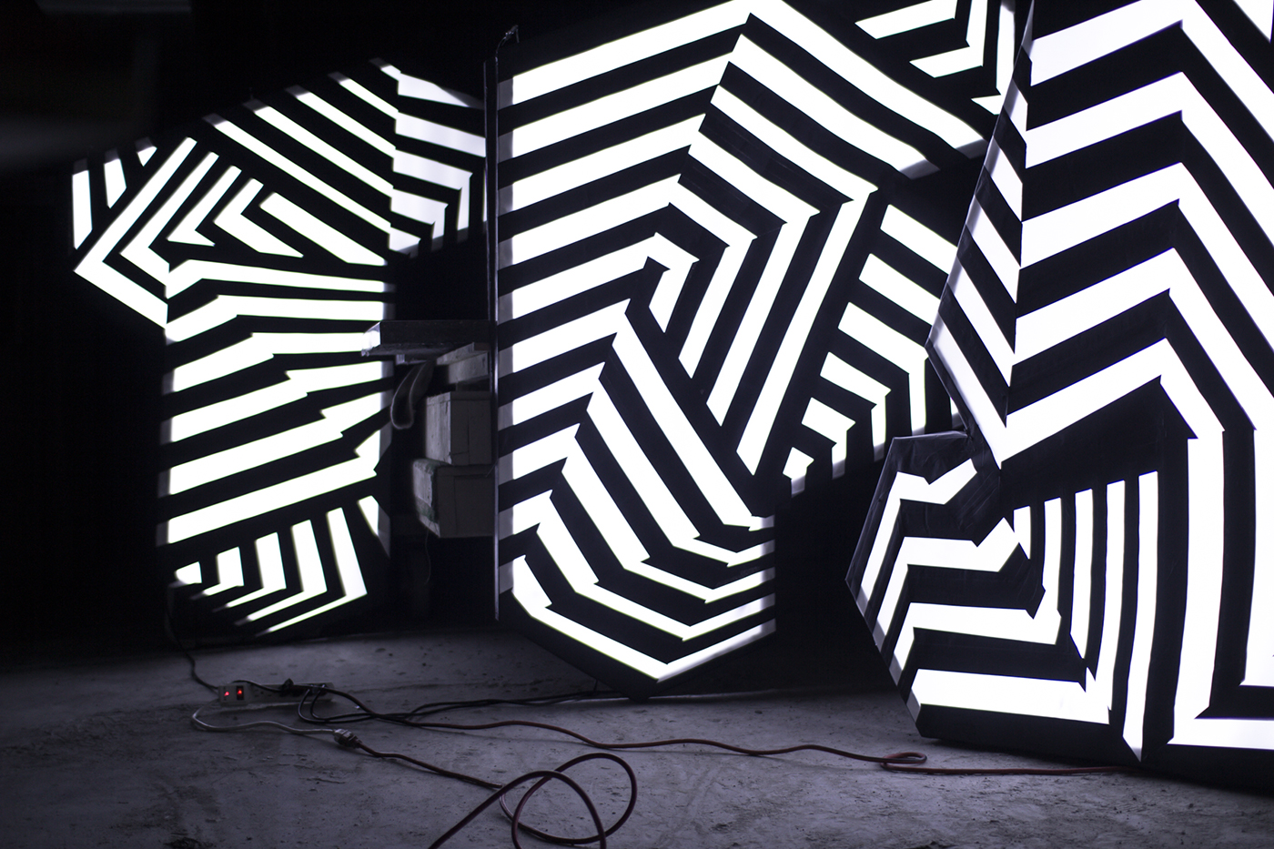
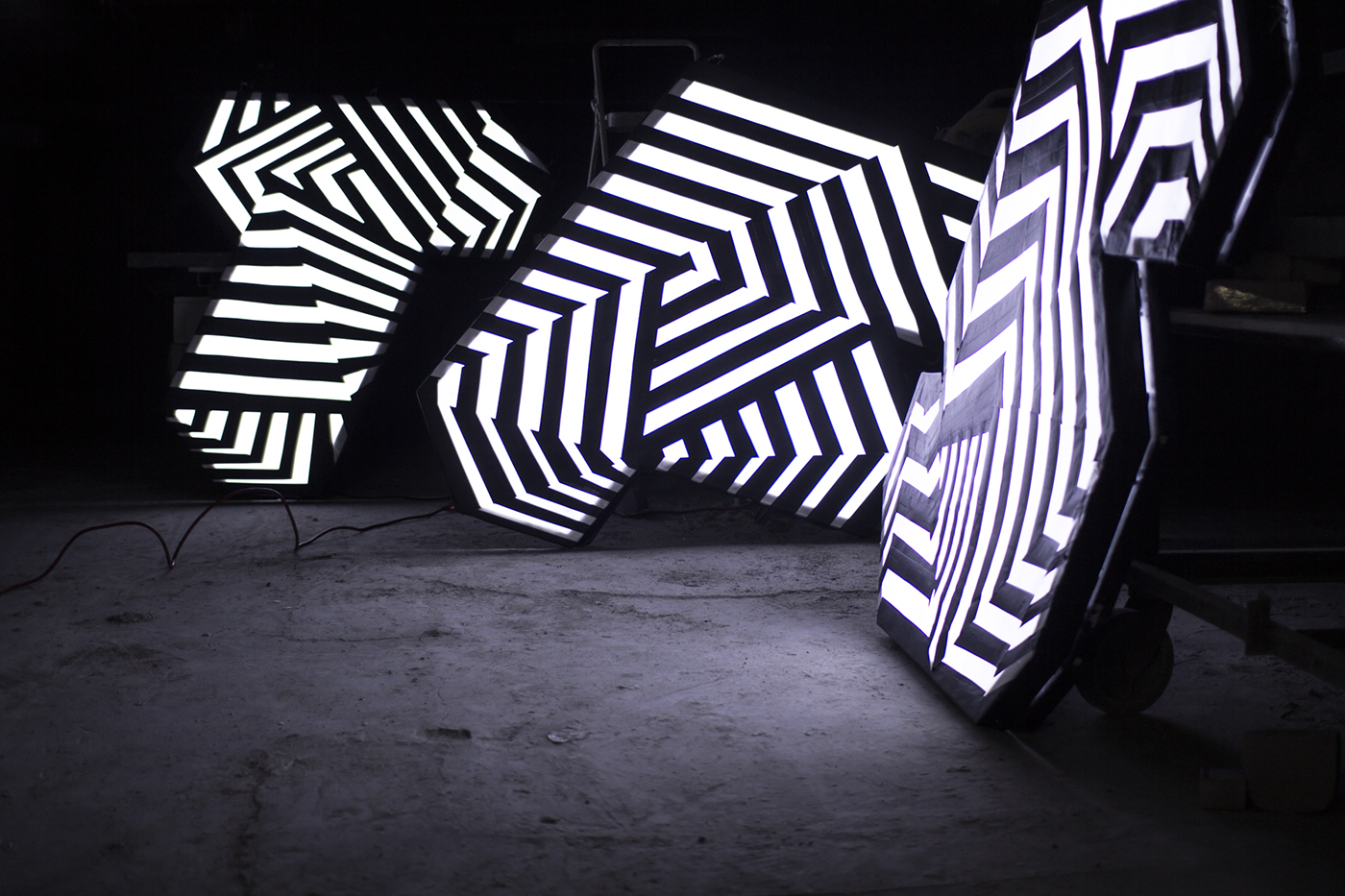
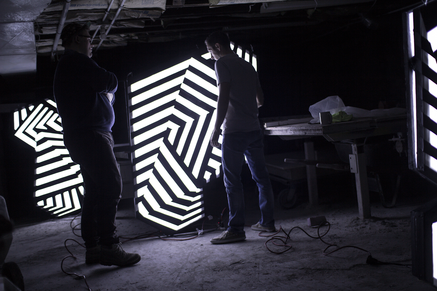
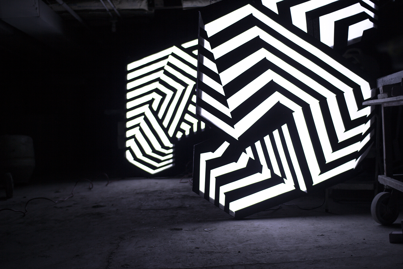
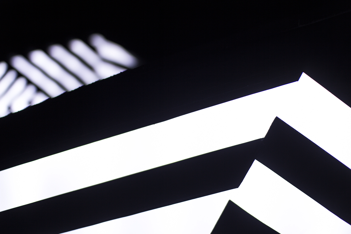
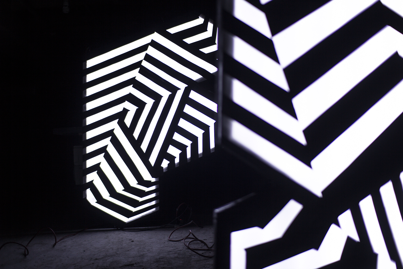
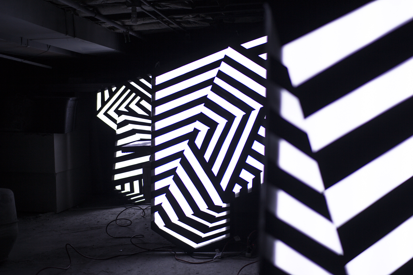
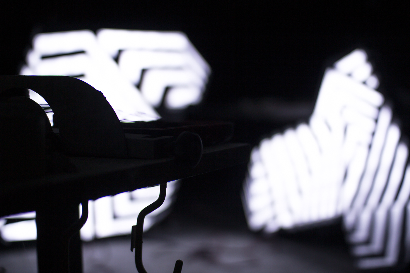
We began by sketching and designing letterforms built upon an isometric grid. The T, F and 5 were created as floating italic forms representing the vessel to be cloaked. Defined by the contour of these forms we designed high-contrast geometric patterning built from numerous multipoint perspective grids interrupting and intersecting each other. The effect successfully confuses the eye and misleads onlookers as to each letter's spatial and dimensional qualities.
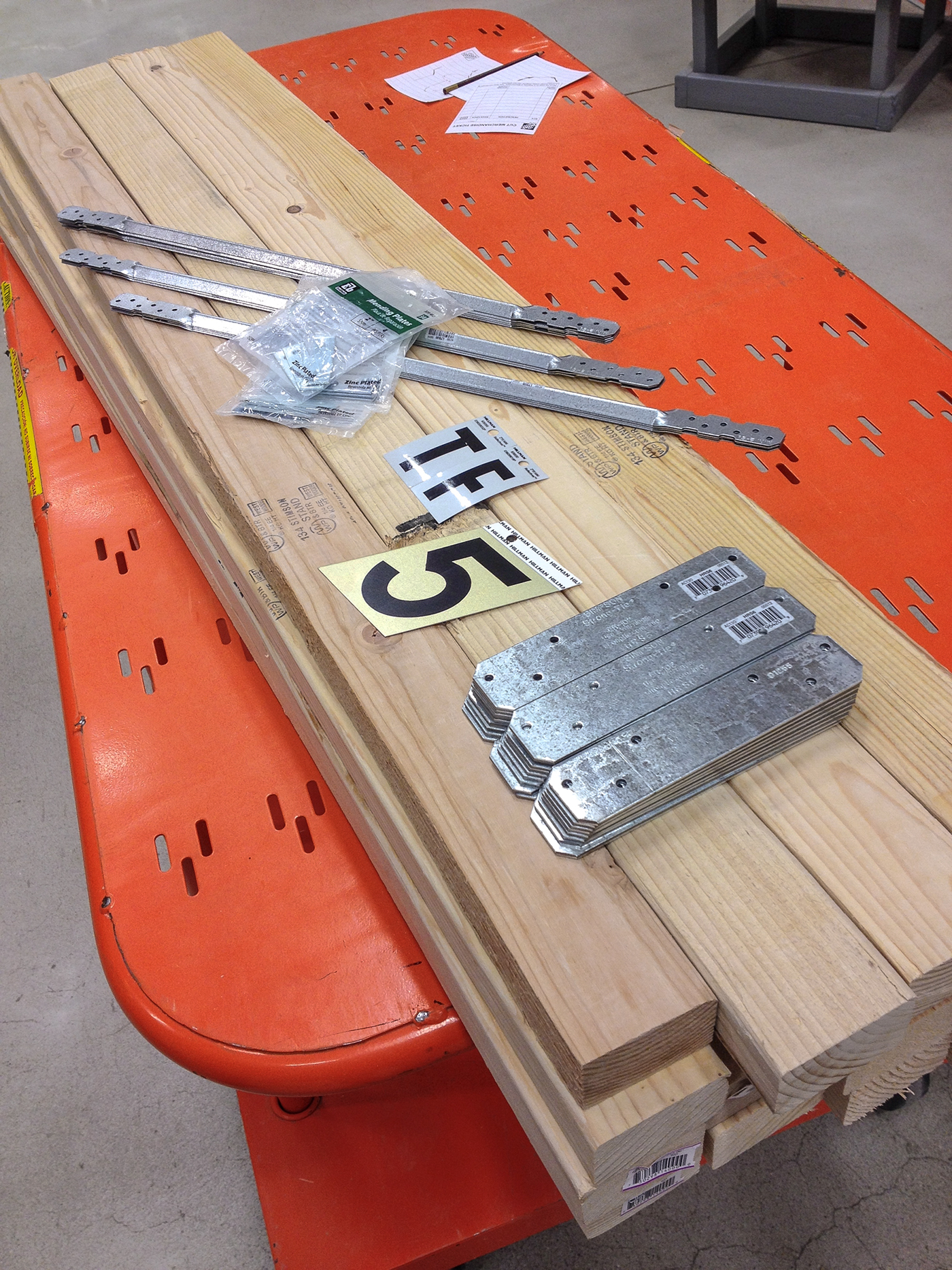
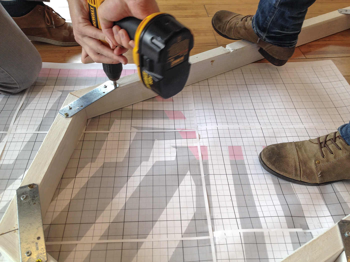
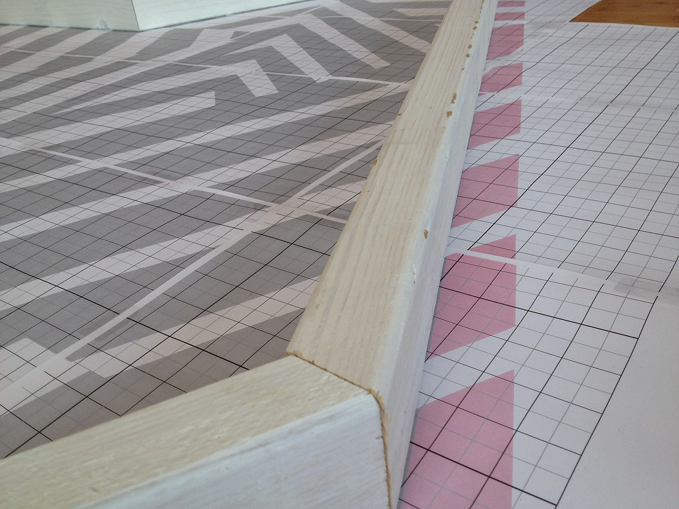
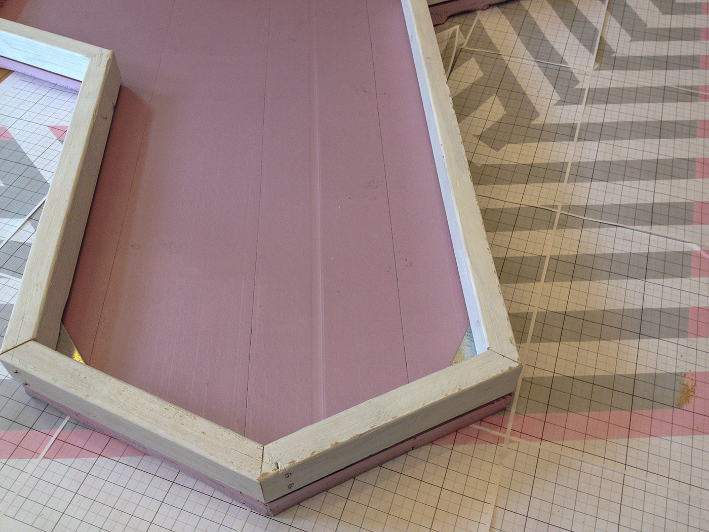
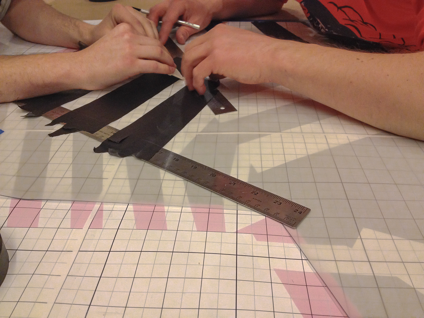
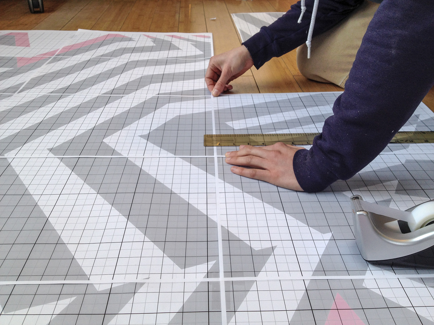
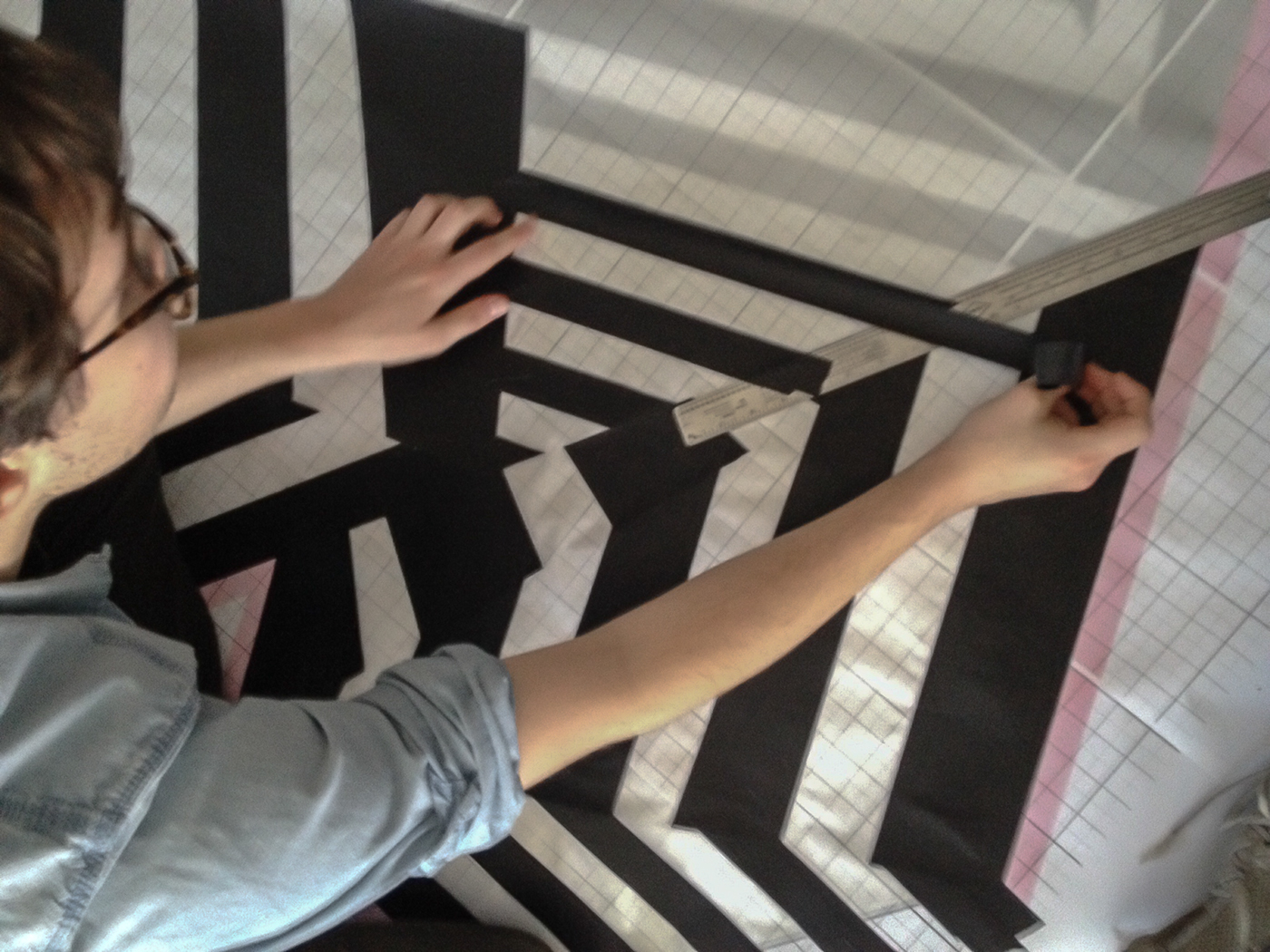
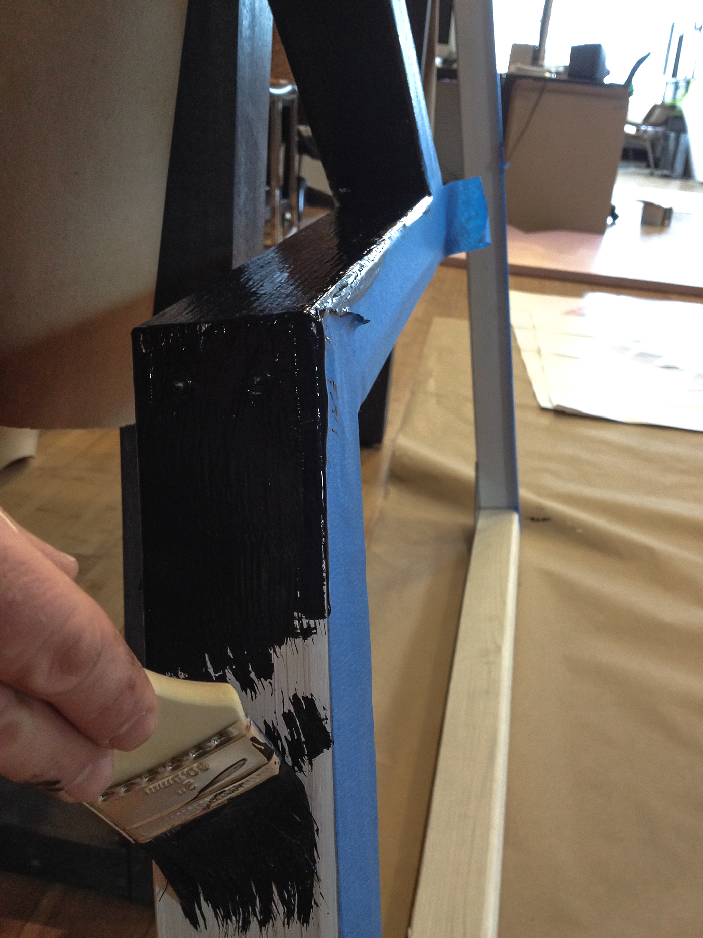
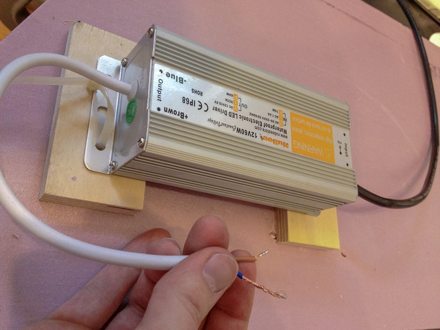
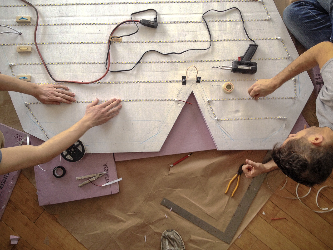
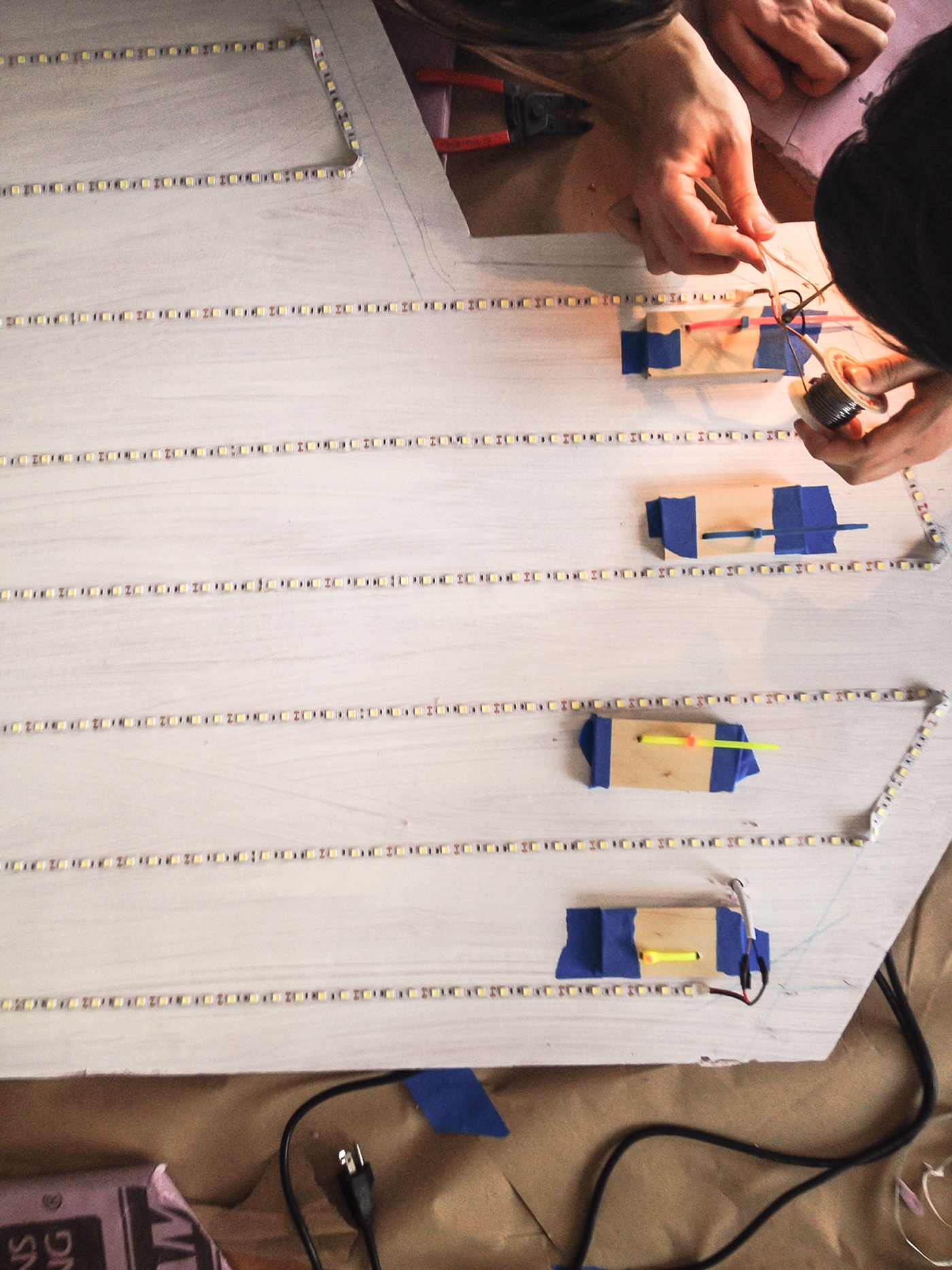
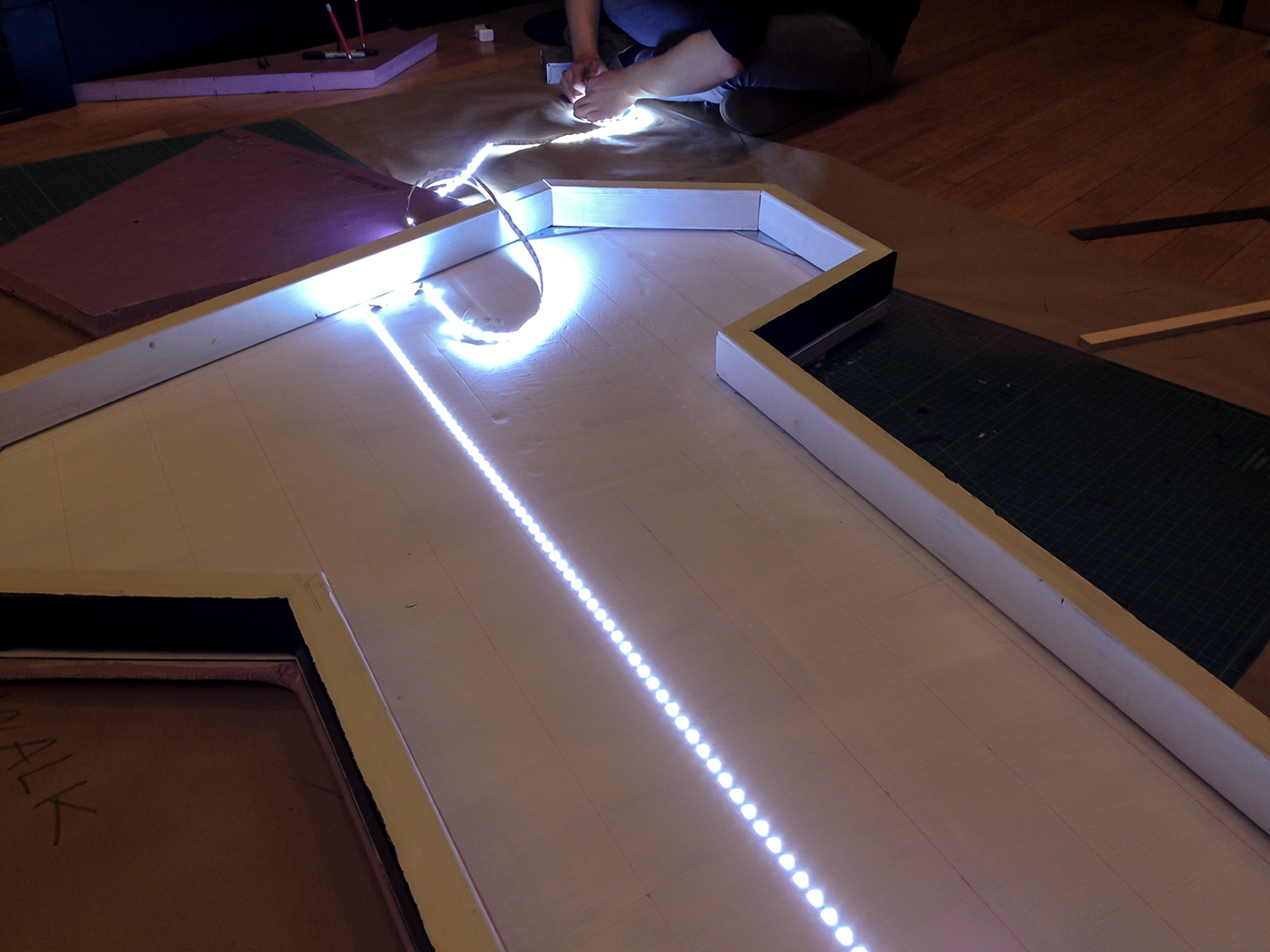
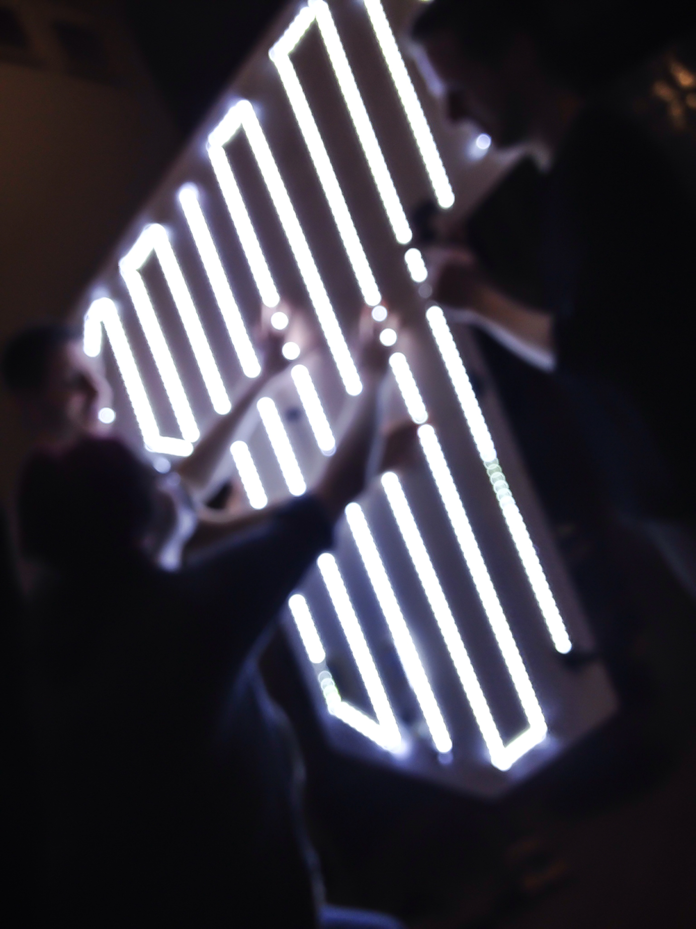
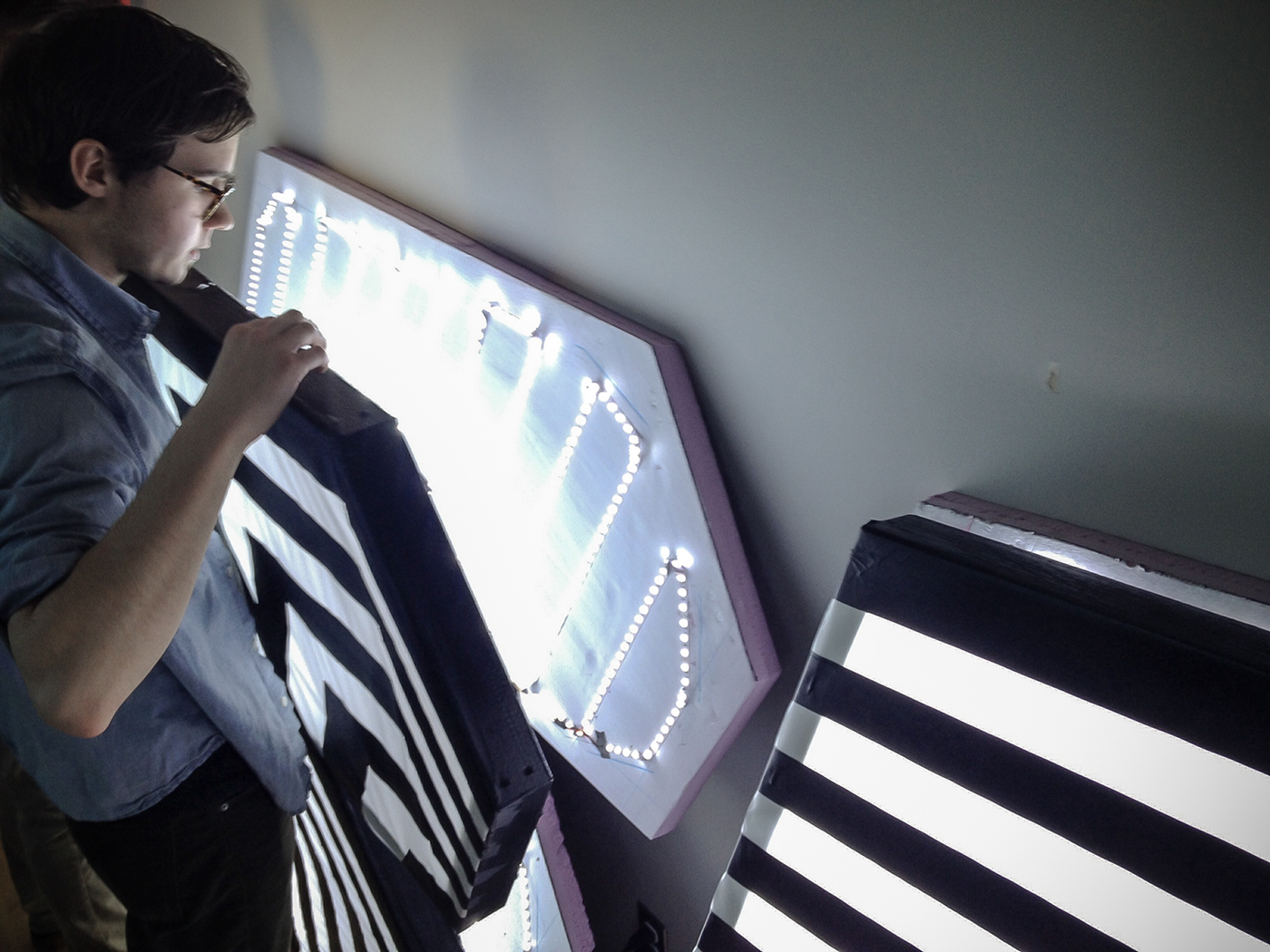
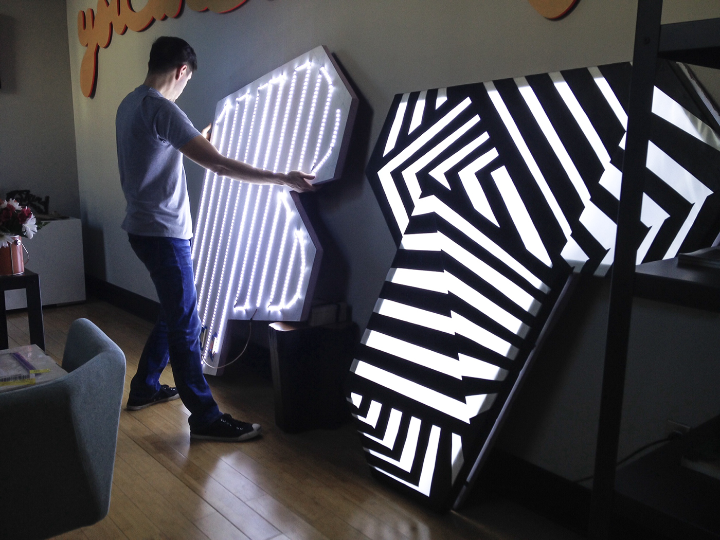
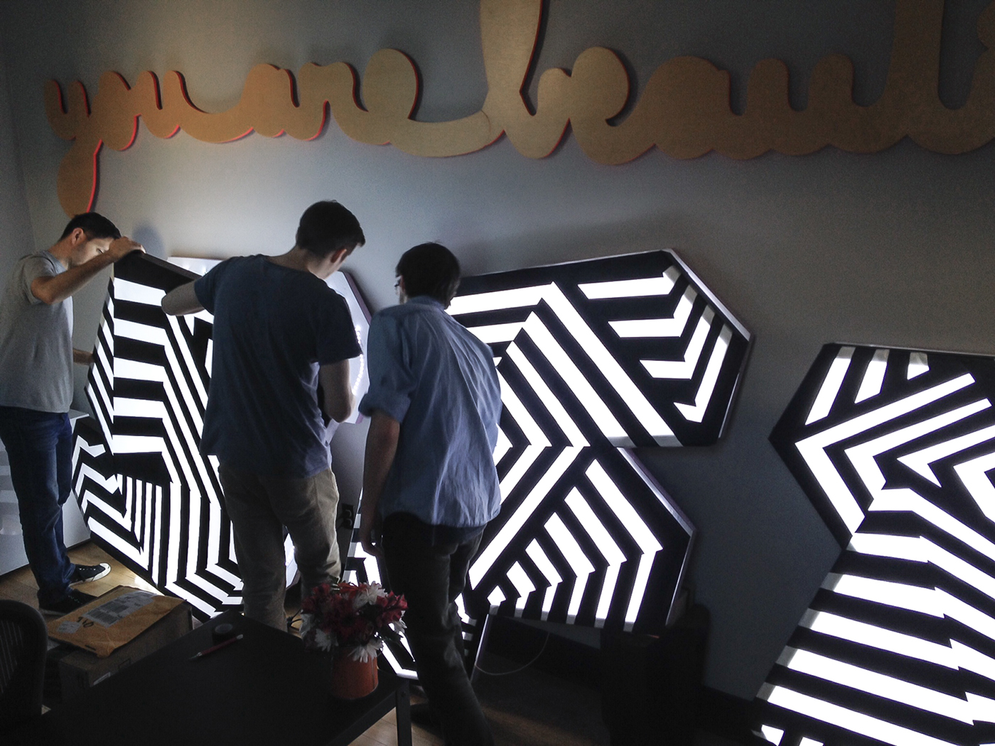
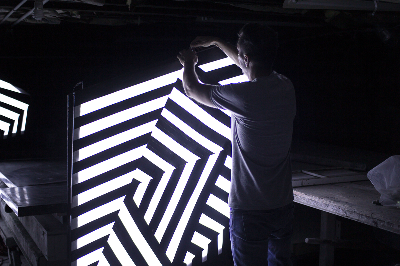
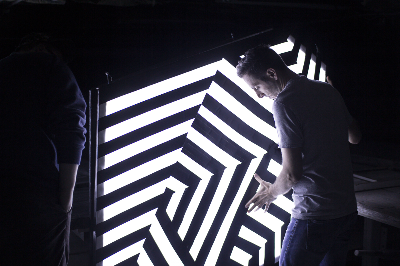
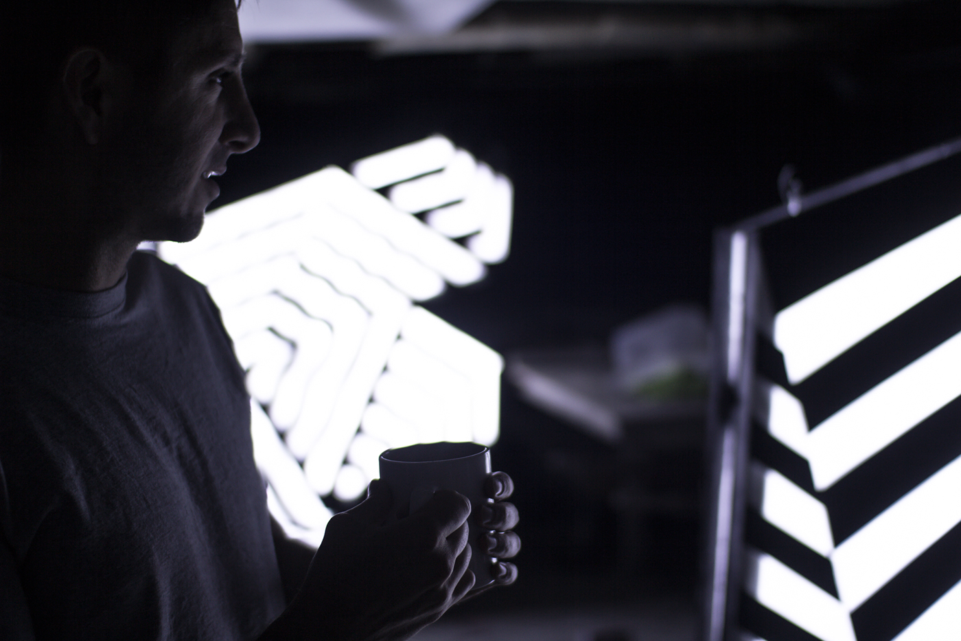
A wooden frame was built from 2x4's which held 3 layers of oversized frosted vellum sheets. On these sheets we applied black masking tape dazzle patterning from templates created with Adobe Illustrator. The tape was cut, applied and stapled in layers to the wooden frame. The LED lit backs were carved from foam insulation board, painted and rigged with with rows of soldered LED strip lights. Each letter was powered by two power supplies, helping to prevent power drop-off. The final step was to suspend and power each letter in the exhibition window announcing the fifth show had begun.
Typeforce is the annual exhibit Firebelly Design and Public Media Institute curate and host. Every year the exhibit showcases works from talented emerging lettering and type-based designers and artists. Across the gallery's walls, mediums, methods, craft and style vary widely. The constant of each piece is the presence of letterforms that communicate through exceptional execution.

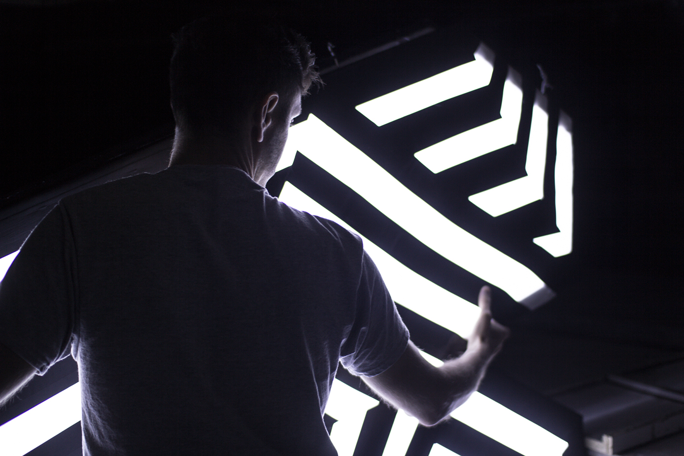
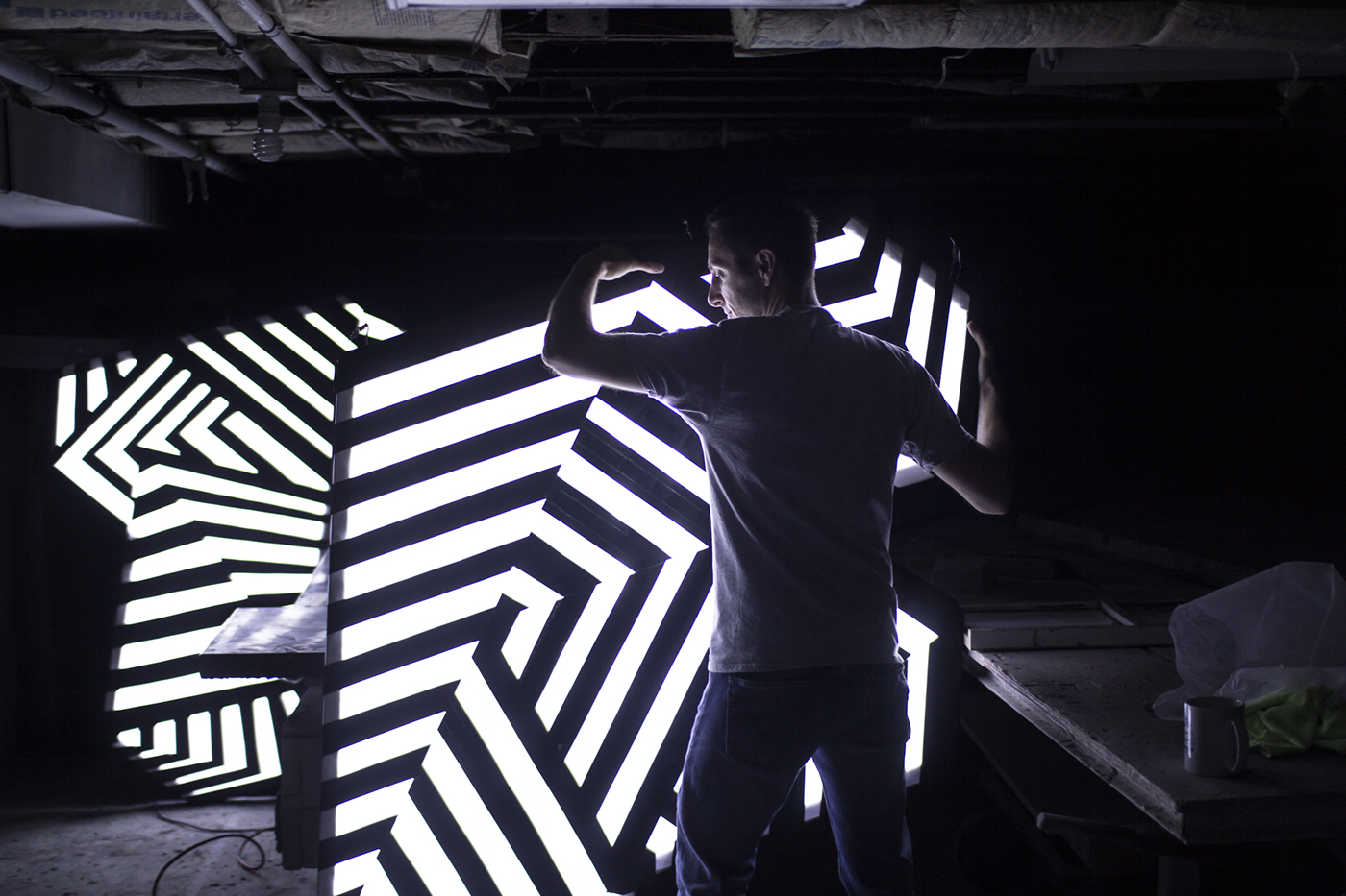


The Process