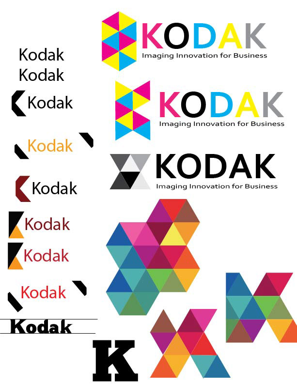
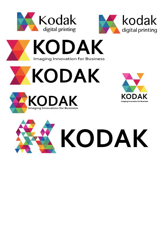
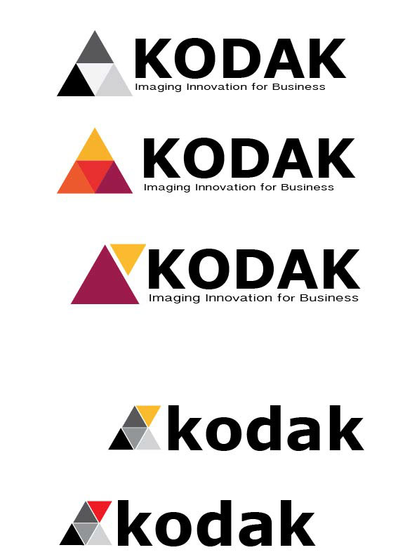
Kodak has pivoted from B2C to B2B and celebrating this, I have decided to give them a whole new look. The name "Kodak" was formed due to the belief that the letter "K" is the strongest letter in the alpabet and the name should start and end with it. Holding true to this heritage, I chose the strongest shape - the triangle - and repositioned it to form a "K" shape. The colors hold true to Kodaks history yet with an updated look.
Here is my processs:


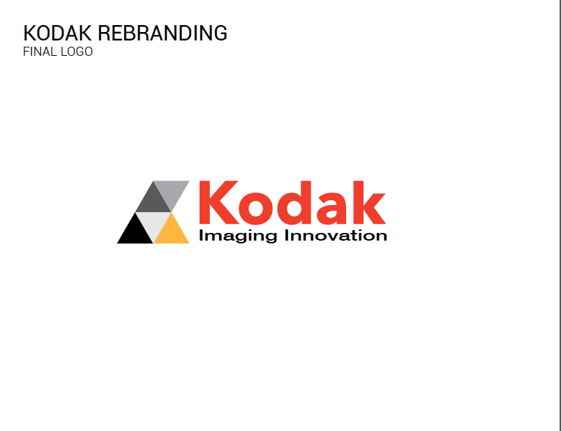

Thanks for looking!

