Australian Tourism Campaign Concept Collaboration with
Shaun Woodward and Kasey Lewis


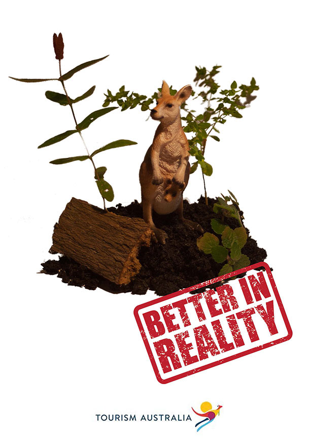
Our idea came from the fact that we wanted to avoid the generic landscapes and beaches style that Australia is usually advertised with.
We settled on using a kangaroo because it is such aniconic image that it instantly brings thoughts of Australia to the viewer. By using a toy, we added a layer of difference by making in not real. The viewer sees this and notices something is not correct, which then leads them to the tag line of “Better in reality”. With the only other information given being the Tourism Australia logo, we hope to create a sense of intrigue in which the viewer wishes to find out more and see just how much better in reality Australia is.
We decided on three different images for the A4 ads, being desert, beach and forest themed. These contrast against each other whilst also targeting different groups who may have different interests. The billboard uses close up of just the kangaroo because it would be seen quickly when driving and therefore needed the “fake “factor increased.
The logo stamp is red to invoke feelings of “Red Australia”, as well as to provide contrast and colour. A stark white background reduces the image to its key components forcing focus to these areas. We decided against adding real kangaroos or landscapes because as they are already so well known, we felt it would detract from the novelty and impact of the campaign as a whole.