Every year I pick at least one project or activity where I can use my skills for the greater good in my community. This year I chose to be one of 6 team leaders for AIGA LA's event Design for Good L.A (DfGLA).
Design for Good L.A. (DfGLA) is a 24 hours design blitz — that's right, I said 24-hours — where 25 Designers from around L.A. come together to create good for local area nonprofits in honor of Pro Bono Week. I led a team of three designers: Sarah Luna, Margarette To, Maggie Hicks. We were paired up with a nonprofit known as "A Window Between Worlds," who were in need of a new logo and a style guide. My team and I had never met before and none of us had heard of our nonprofit before that day. At 11:00 AM in the morning on Saturday, October 4th, 2014, we had 45 minutes to meet with our client for the first time to learn everything we could about them, their orginazation, their needs and the project. Then we had 23 hours to create a new identity and style guide for them. Ready... set... go!
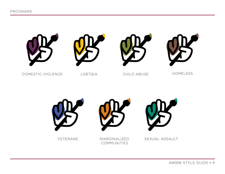
For 23 years A Window Between Worlds (AWBW) have centered their work in helping survivors of domestic violence, providing art interventions for women and their children. They began in L.A. but have been so successful that they are now located in 20 states, in over 300 shelters — 50–60 of which are located here in L.A. — and they now offer over 500 workshops and programs. Their organization has expanded to share their workshops with new partners and populations, in and beyond domestic violence, including sexual assault survivors, veterans and their families, the LGBTQIA community, marginalized communities, survivors of child abuse, the incarcerated, homeless and men, women and children of all ages, races, ethnicities and sexual identities.
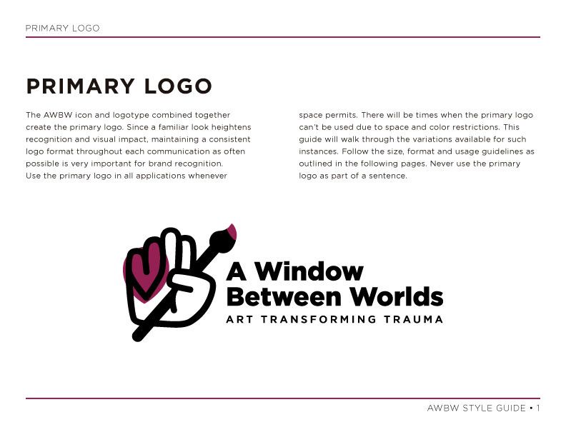
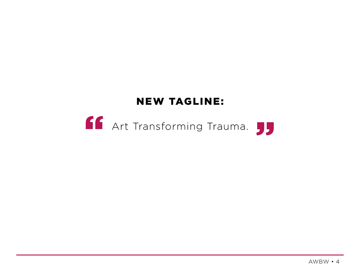
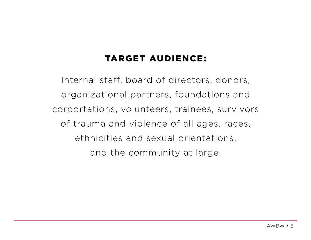
They recently worked with Taproot to help them redefine who they are as an organization and where they would like to go. Through this work they created a new mission statement, target audience and a new tagline (see slides below for all 3). Now they needed a new logo, branding and basic guide for how to use them to help guide their internal marketing team. AWBW went several rounds with quite a few other designers but their re-branding efforts had not reached a place they liked or felt comfortable with. This is when they decided to apply to participate in DfGLA.
When we sat down with them to discuss their creative brief and what they were looking for out of this event, we were asked to focus on two things:
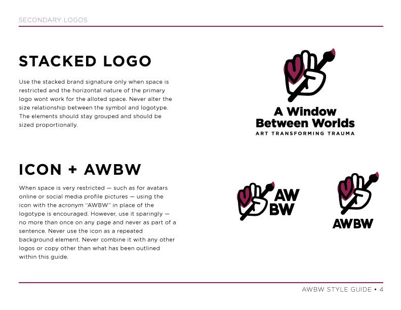
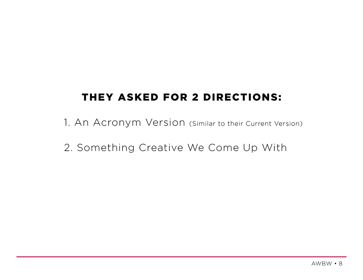
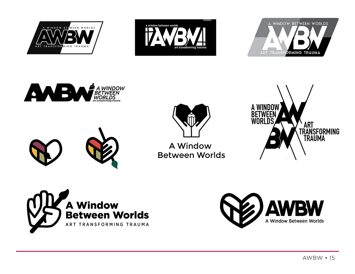
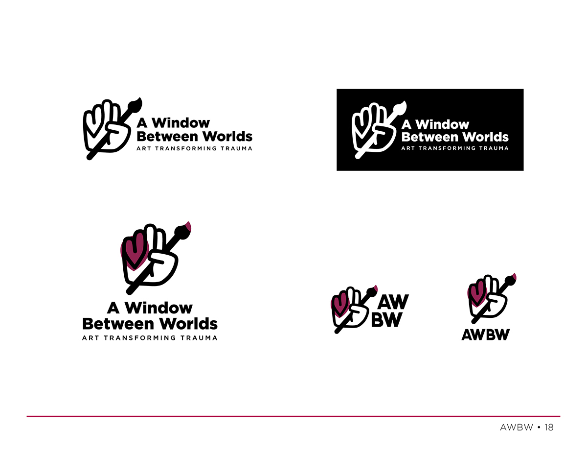
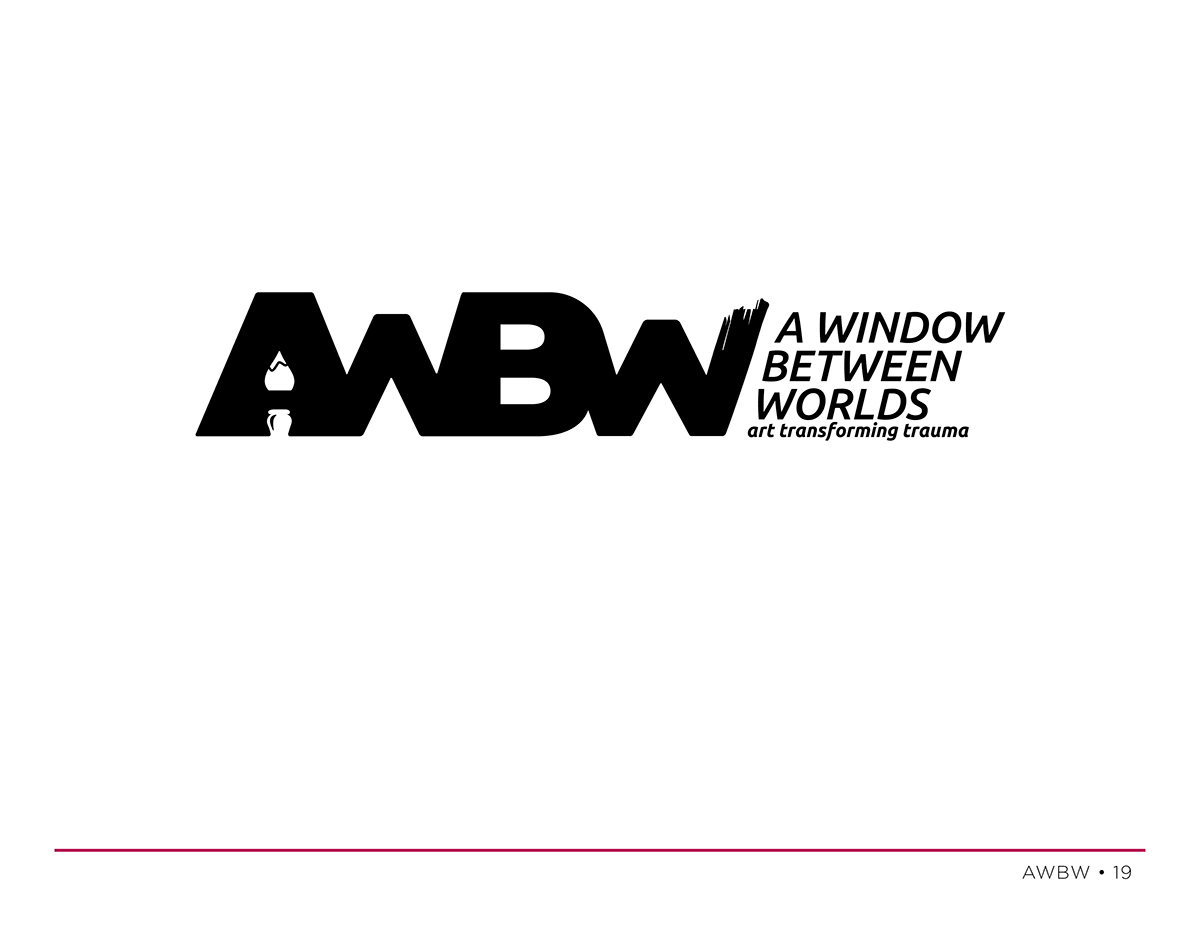
1.) 2 logo options to go with their new mission statement and which incorporates their new tagline.
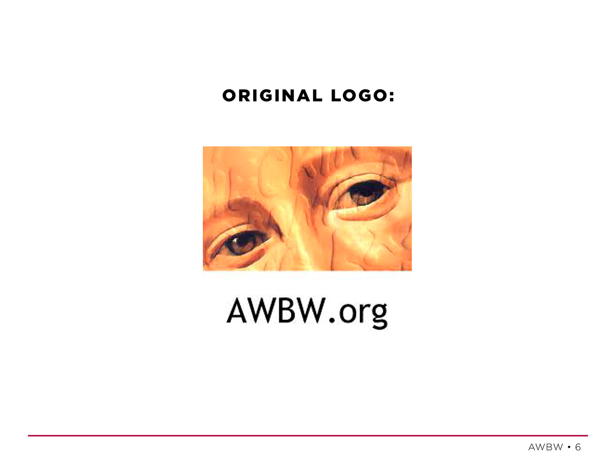
a.) An An Acronym Version (Similar to their current logo)
b.) Something Creative Our Team Comes Up With
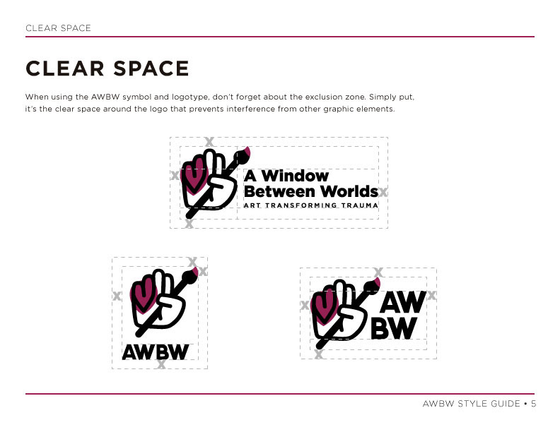
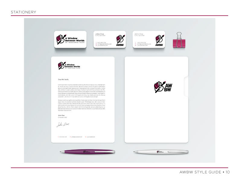
2.) Style guide for how to use their new logo and branding to help guide their internal marketing team.
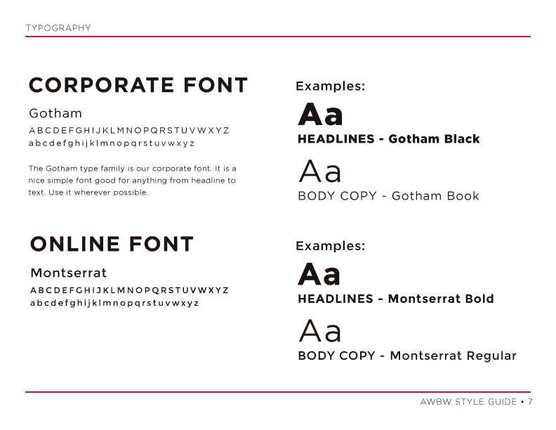
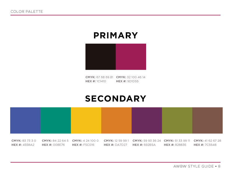
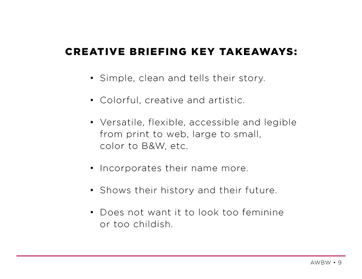
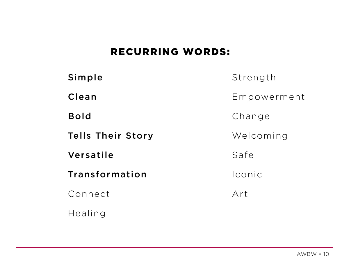
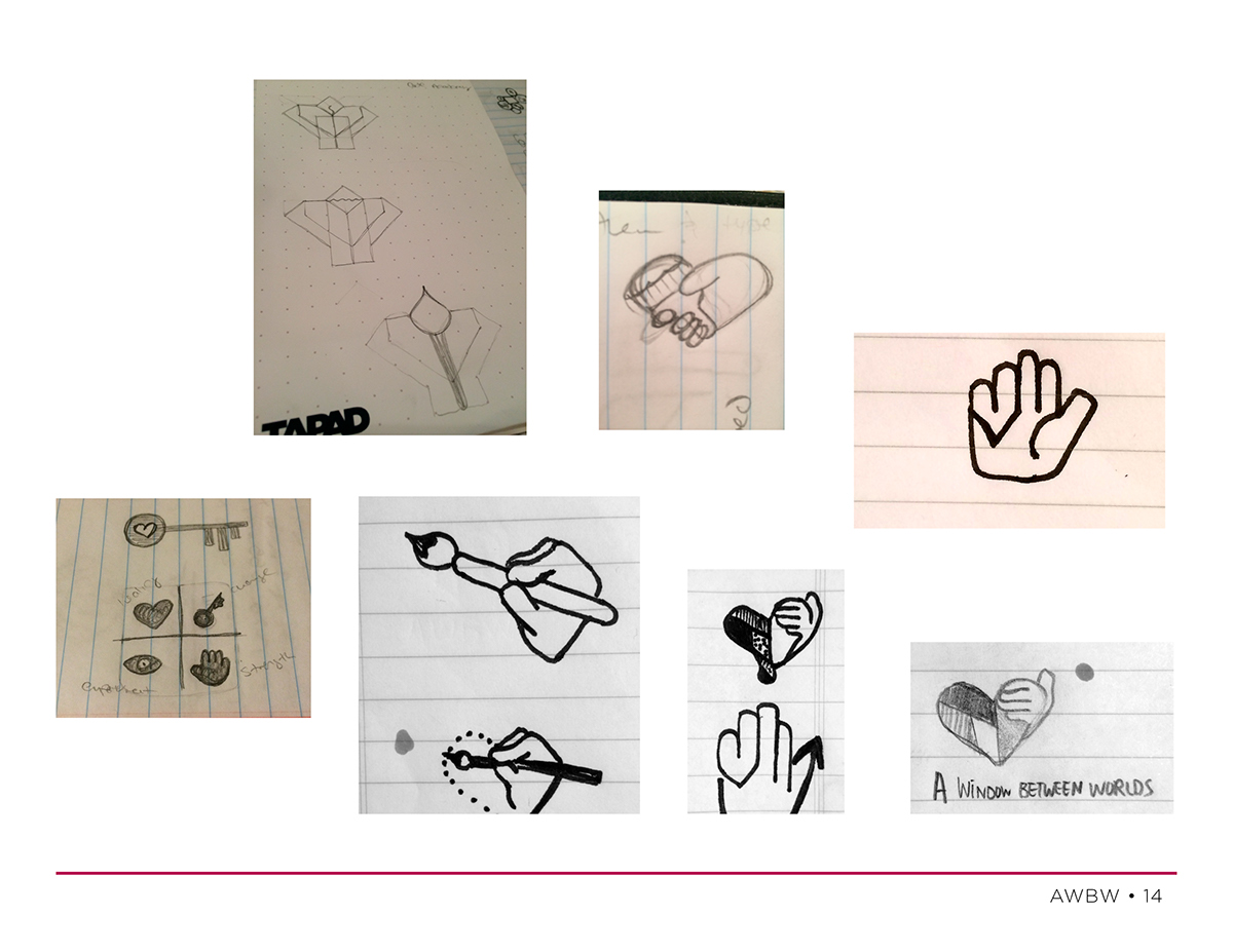
During our discussion and within the background work they left for us to look through, we found a thread of ke words which kept appearing in reference to what they were looking for in their new logo, such as: clean, bold, versatile, simple, tells their story, better incorporates their name, clean, colorful, creative, transformative, not too childish or feminine. They also mentioned several symbols or icons that had particlarly important meaning to their organization such as hands, eyes, trees, keys, windows and art, which we might also want to consider incorporating into their new brand.
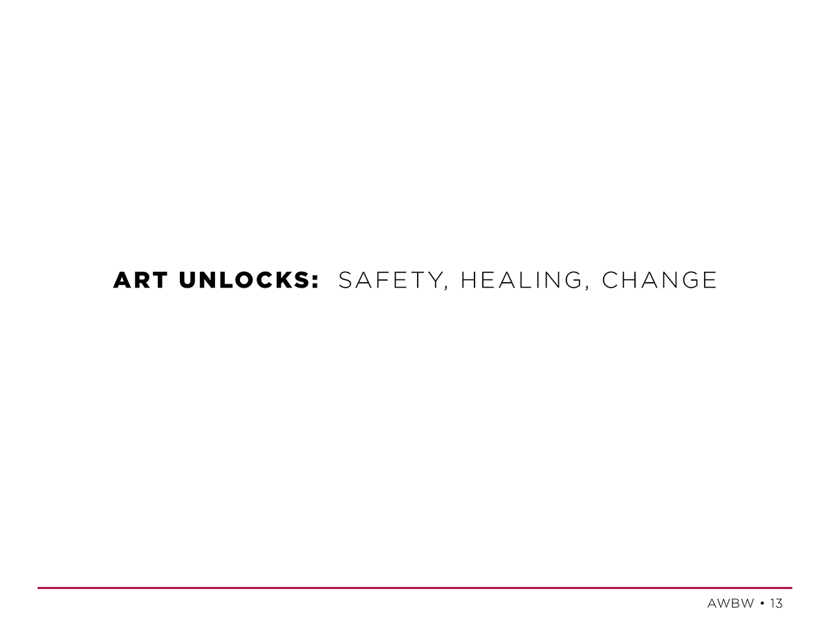
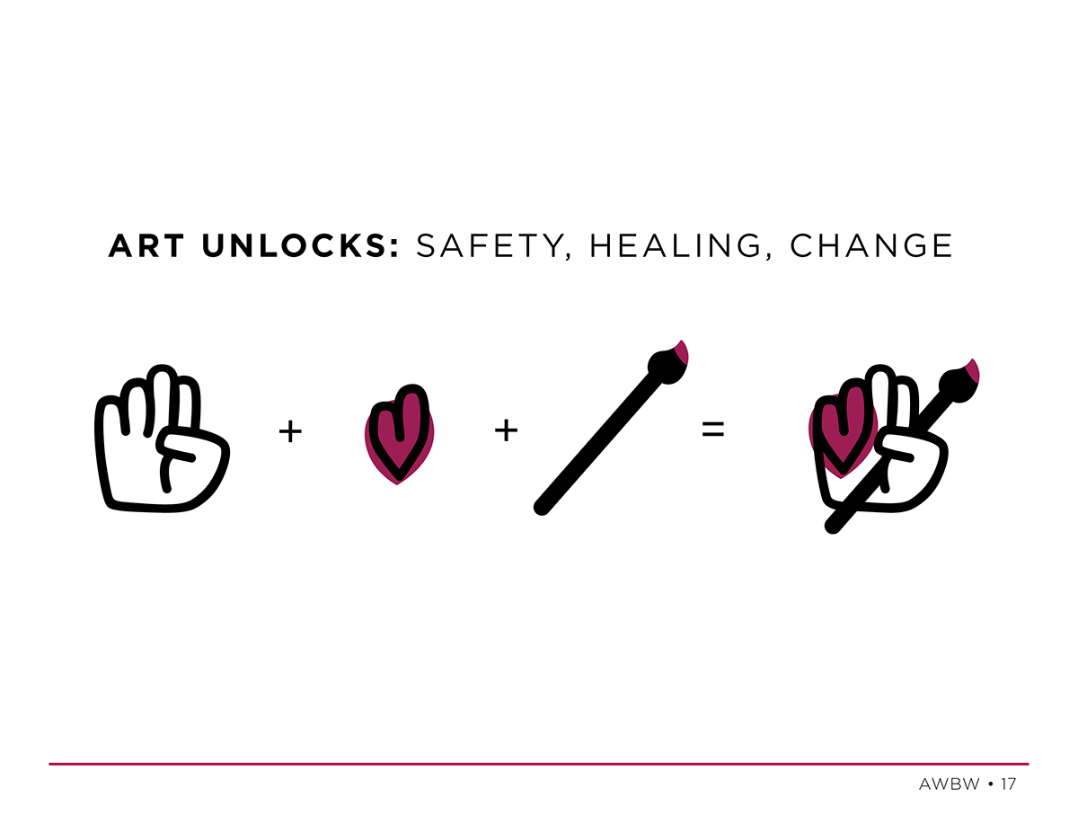
Our biggest challenge though was in the way AWBW had re-defined their target audience. It had become a very large target, so large infact that some would argue that it's too large to be considered a target anymore really. In the end my team and I decided to take a different approach to it. Even though their target audience has significantly expanded from where they began, no matter their differences, everyone who comes to AWBW share a few things in common — all are (or know) survivors of traumatic events, all have discovered and believe in the healing benefits of art, and all believe in and share in some form AWBW's core values — my team and I coined them as AWBWs 3 Pillars "Art Unlocks: Safety, Healing, and Change."
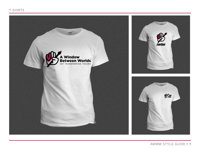
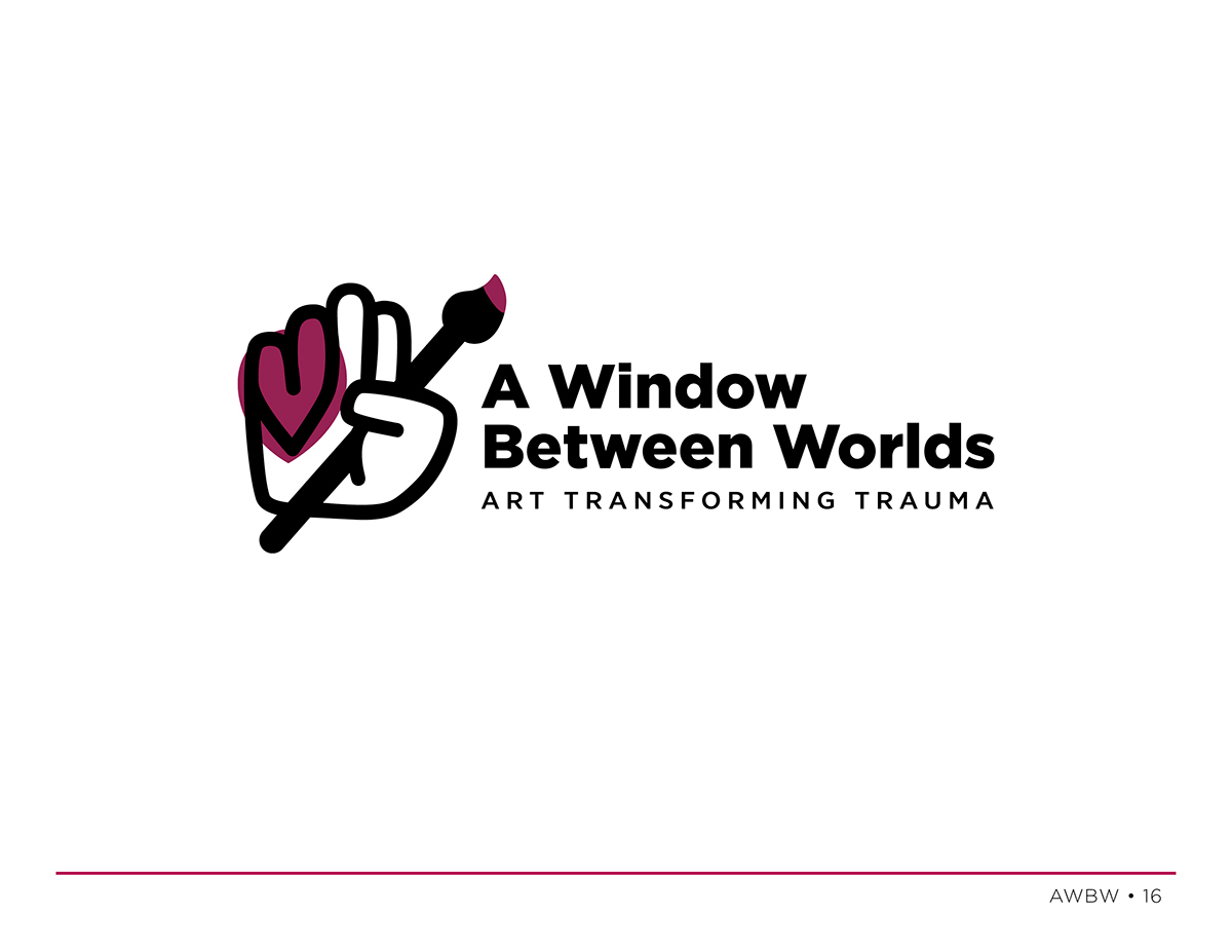
Keeping these 3 pillars top of mind and considering all of the information we gleened from them in our meeting and brief research, we began working on creating a new identity for AWBW. We used Pinterest to create a mood board where we gathered references of other identities we liked that used a style which might inspire our designs, color palattes, a bit of research in competitors, and anything else we might find helpful, informative or inspiring. Then we hit our sketch pads, taking breaks to share our sketches, brainstorm and bounce ideas off one another. Once we had a few directions we were ready to explore we brought them over to the computer and divided the work among the team. We used Google drive to share documents and files quickly and easily between our group. Once we had 2-3 directions we really liked and felt worked, we began fleshing out the style guide. Along the way we took short breaks to eat, socialize and for mini-presentations where each group had a chance to present their progress to the other design groups for their feedback and inspiration. No one in our group ever napped, we powered right through! At the end of the 24-hours we had exaclty what the client had asked: two versions/options for the logo with a style guide to go with our groups recommended version. In the style guide we went above and beyond and began exploring possible business card and letterhead layouts, folders, pens, t-shirts and even the beginnings of a basic, informative, tri-fold brochure. We were exhausted but also elated to have accomplished so much in just 24-hours. We had arrived at a re-branding solution for AWBW that we loved, one we felt was fresh, versatile and would trully help them to better tell their story.
On October 24th, 2014 we presented our project and unveiled the new brand and style guide to AWBW at the AIGA DfGLA wrap-up event, along with the other design teams and representatives from their nonprofits. Our representative from AWBW, COO Audrey Salzberg, was so excited to see the work we had done. She must have hugged and thanked me at least eight times thoughout the night following our presentation. It made the experience, which was already so rewarding, exponentially more rewarding than I had expected.
Being part of AIGA's DfGLA and working with AWBW was one hell of an amazing experience for me. I had the opportunity to lead and work with a talented group of designers whom I had never met before, to help an awesome non-profit like AWBW who's doing amazing work in my L.A. community, to push myself out of my comfort zone in so many ways, to meet and make new friends within my local design community... the list goes on and on. This has been such a rewarding experience and I am so proud of the work we did and the good we created within both L.A. and the design community.
The following slides are from my presentation on October 24th and the final style guide is directly following that.
The following slides are from my presentation on October 24th and the final style guide is directly following that.
DfGLA Wrap-Up Party Presentation 10/24/14


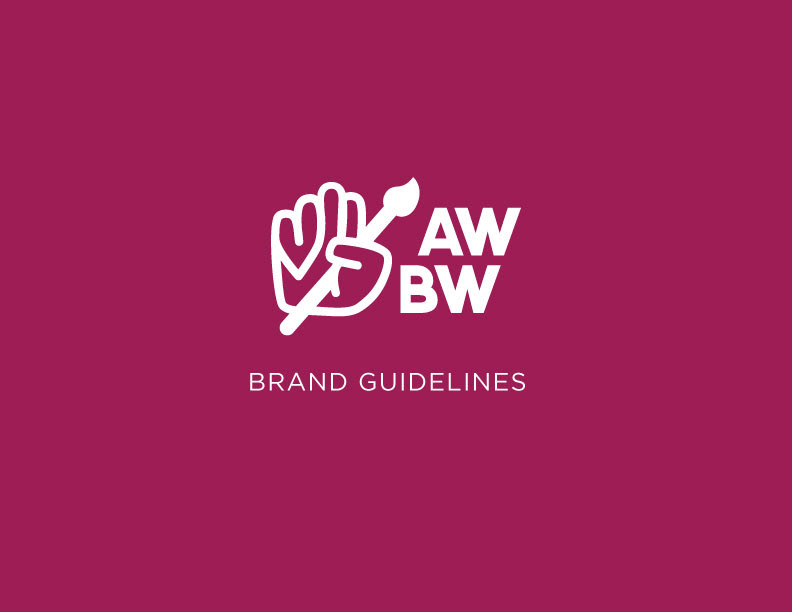
AWBW Brand Style Guide