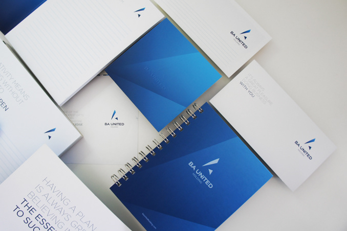
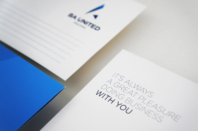

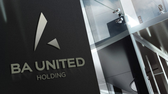

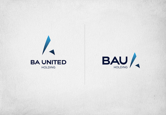
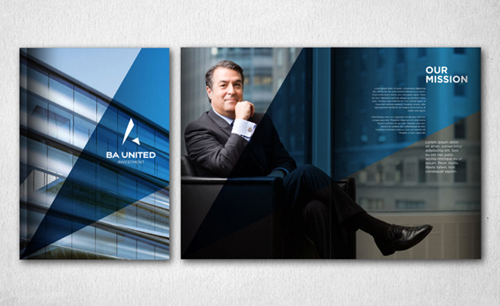
Whilst preserving its brand equity, the new identity for BAU is a direct evolution of the original symbol.
It is ultra modern and corporate yet retains a sense of adventure and optimism, and a look of elegance
and sharpness within a timeless color palette. The open angle conveys dynamism, and encapsulates BAU’s future-focused model. By creating a more succinct, memorable and useable identifier for the group,
the new logo portrays progressive and positive values reflected in its shapes and enclosed within
a new brand language - an open and vibrant expression of simple shapes designed to reflect energy
and modularity.


