Green Health Packaging Design
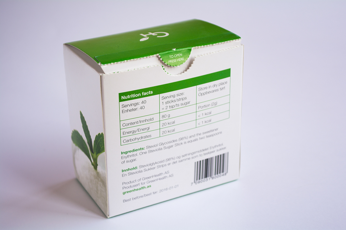
Green Health AS, Norway’s nutraceutical producer, offers pure and high quality products. They wanted to launch a new series of products, Stevia, Blue Berry Extract and Bitter Melon Detox, to open up new markets in Asia. The products are extracted from premium ingredients from the plants in natural region, which are perfect to improve health and quality of life.
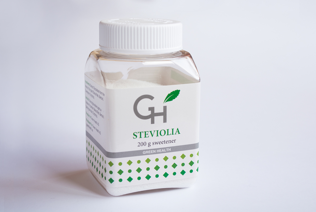
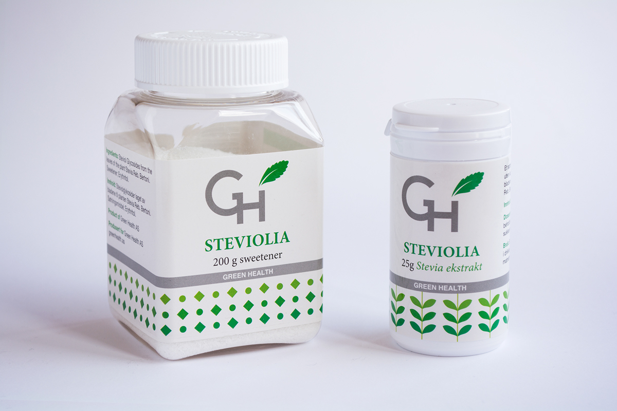
We started with logotype design and created a series of graphic elements for each individual label design of the stevia products. The idea of designing a series graphic patterns actually came from the color of the stevia plants, and different shape and size of the natural ingredients.
Green color symbolizes health, purity and nature, so we used it as the primary color for the stevia products. Purple color and gradient green color were used for Blue Berry Extract and Bitter Melon Detox. Using visual language of simplified colors and graphic patterns to deliver the message that these products are indeed pure and natural. We wanted to present to the customers a clear visual identity that can immediately capture their attention as soon as they lay their eyes on the products.
We managed to create a design that stands out on the shelf and clearly differs from other alternatives in the category.