Fun logo to design, I had total freedom to create the lettering, composition and colors.
The briefing was to make something with a classic and sophisticated look. The word "Golf" was supposed to be evident, since it's not a popular sport in Brazil and it should be very clear that it's a gold range, and not a field.
THE LOGO
Used different shades of green (for obvious reasons) and an "old gold" for the lettering.
Used different shades of green (for obvious reasons) and an "old gold" for the lettering.
The G - F ligature is supposed to give it some movement, reminding of the ball's path when hit.
The back is shaped like a golf ball and gives it an overall "blazon" shape.
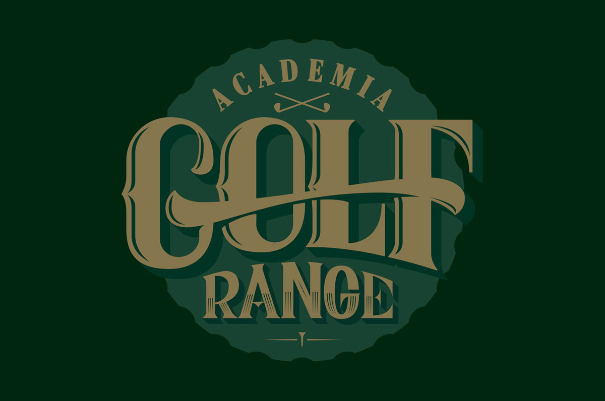
Final version

An overview of the sketching stages till the final sketch, there was a LOT of sketching
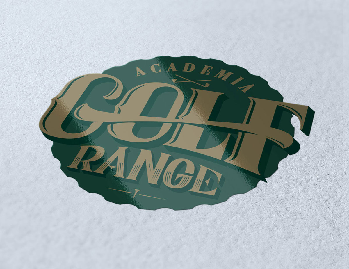
IDENTITY
The new brand aplication is made easy by it's shape and color scheme.
The new brand aplication is made easy by it's shape and color scheme.

Business card
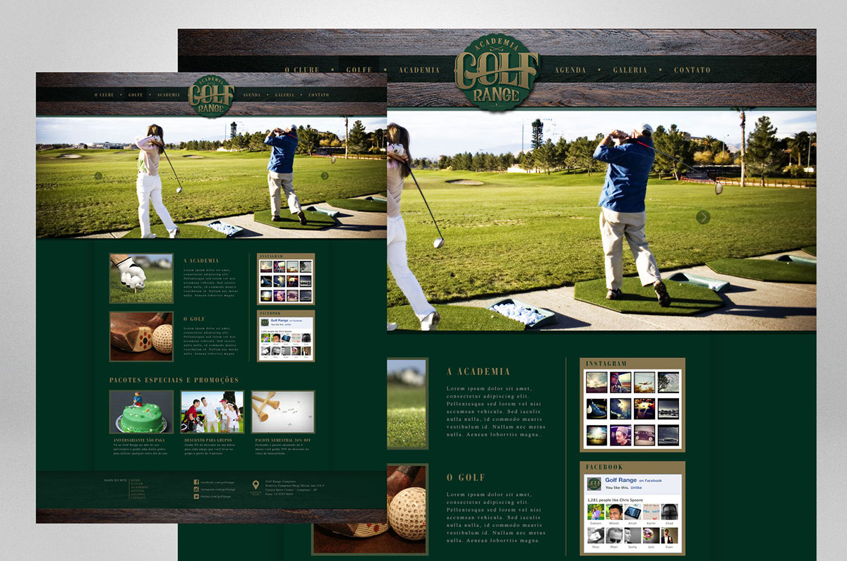
Website
The brand is yet to be presented to the client, so hopefully meet the expectation.

