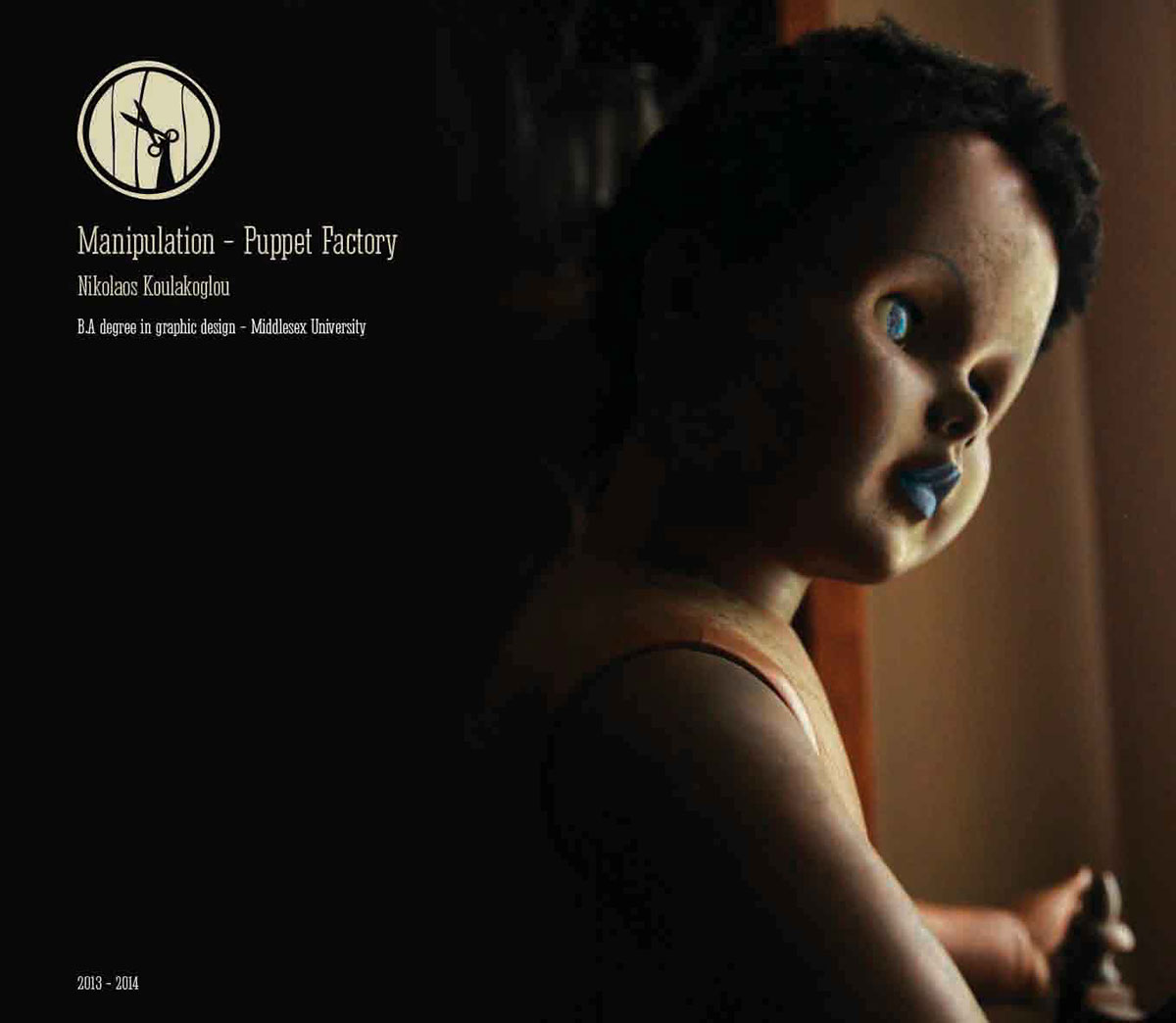
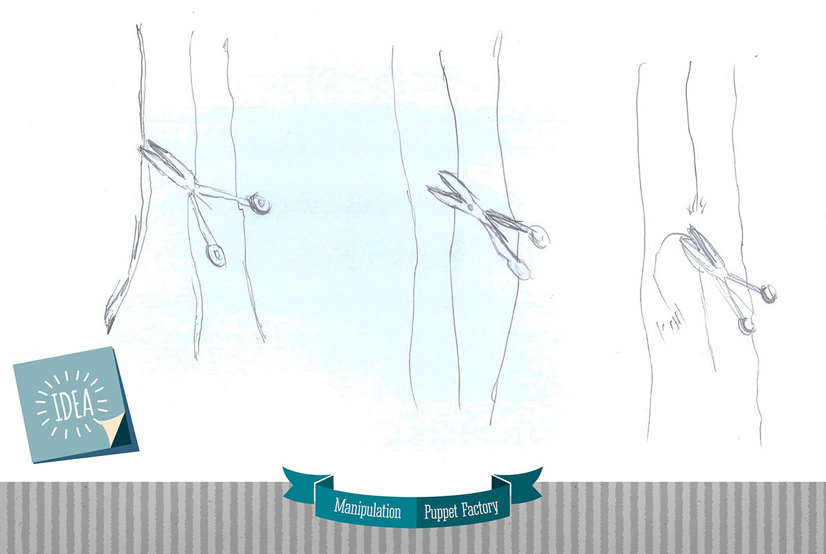
The name of the company came obviously from the symbolic idea of a puppet, which is the main product,
which becomes free and ceases being manipulated. The term Manipulation in the title of the logo
becomes a key element for the formation of it, as the logo has been created as a vertical question and
answer (Manipulation - icon). The basic idea is combined with the central company slogan, “Free
Puppet”, therefore in the logo we see the same puppet cutting its shackles and being released, becoming
part of our own world; a free puppet that actively participates in our lives.
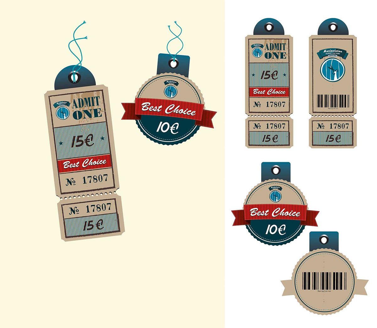
The very basic aim of the project was the creation of an overall corporate identity, where the company
logo, the overall idea behind it, the analysis of the subject and finally the technical part of the process
which has to do with the materialization, have certainly played a key role. In this direction the project
focuses to various applications of the company’s brand identity; these include letterheads, business
cards, greeting cards, membership cards for customers and travel postcards and the company's website.
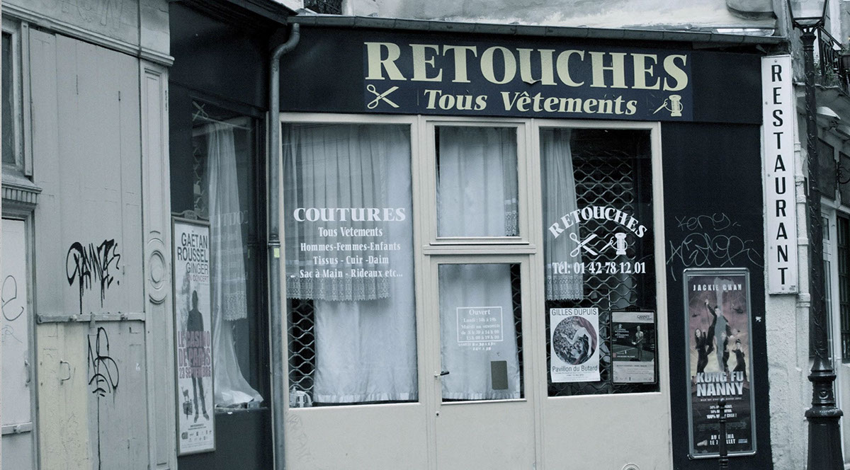
Also, the brand’s identity is being applied in spatial elements and eventually the shop itself and its
façade, which is being designed in accordance with the style of the brand.
In this respect, the development of a narrative for the product, which would take into account the very
nature of it, was crucial. The puppet theater is a very special ancient form of art and entertainment
which is believed to have been first developed in India, almost 3000 years ago. However it can be found
in various cultures and civilizations around the globe, in various forms that are very different from each
other and still survive today. The contemporary forms of puppet theater also vary from place to place
and are still changing, being enriched constantly with new elements. The puppets themselves also vary
in style and form, being constructed by a wide spectrum of materials with the use of different construction
techniques, depending on the demands of each kind of play. One can find puppets that are
extremely complex to be constructed and play, often by more than one puppet player, and others that
are extremely simple.
logo, the overall idea behind it, the analysis of the subject and finally the technical part of the process
which has to do with the materialization, have certainly played a key role. In this direction the project
focuses to various applications of the company’s brand identity; these include letterheads, business
cards, greeting cards, membership cards for customers and travel postcards and the company's website.
Also, the brand’s identity is being applied in spatial elements and eventually the shop itself and its
façade, which is being designed in accordance with the style of the brand.
In this respect, the development of a narrative for the product, which would take into account the very
nature of it, was crucial. The puppet theater is a very special ancient form of art and entertainment
which is believed to have been first developed in India, almost 3000 years ago. However it can be found
in various cultures and civilizations around the globe, in various forms that are very different from each
other and still survive today. The contemporary forms of puppet theater also vary from place to place
and are still changing, being enriched constantly with new elements. The puppets themselves also vary
in style and form, being constructed by a wide spectrum of materials with the use of different construction
techniques, depending on the demands of each kind of play. One can find puppets that are
extremely complex to be constructed and play, often by more than one puppet player, and others that
are extremely simple.


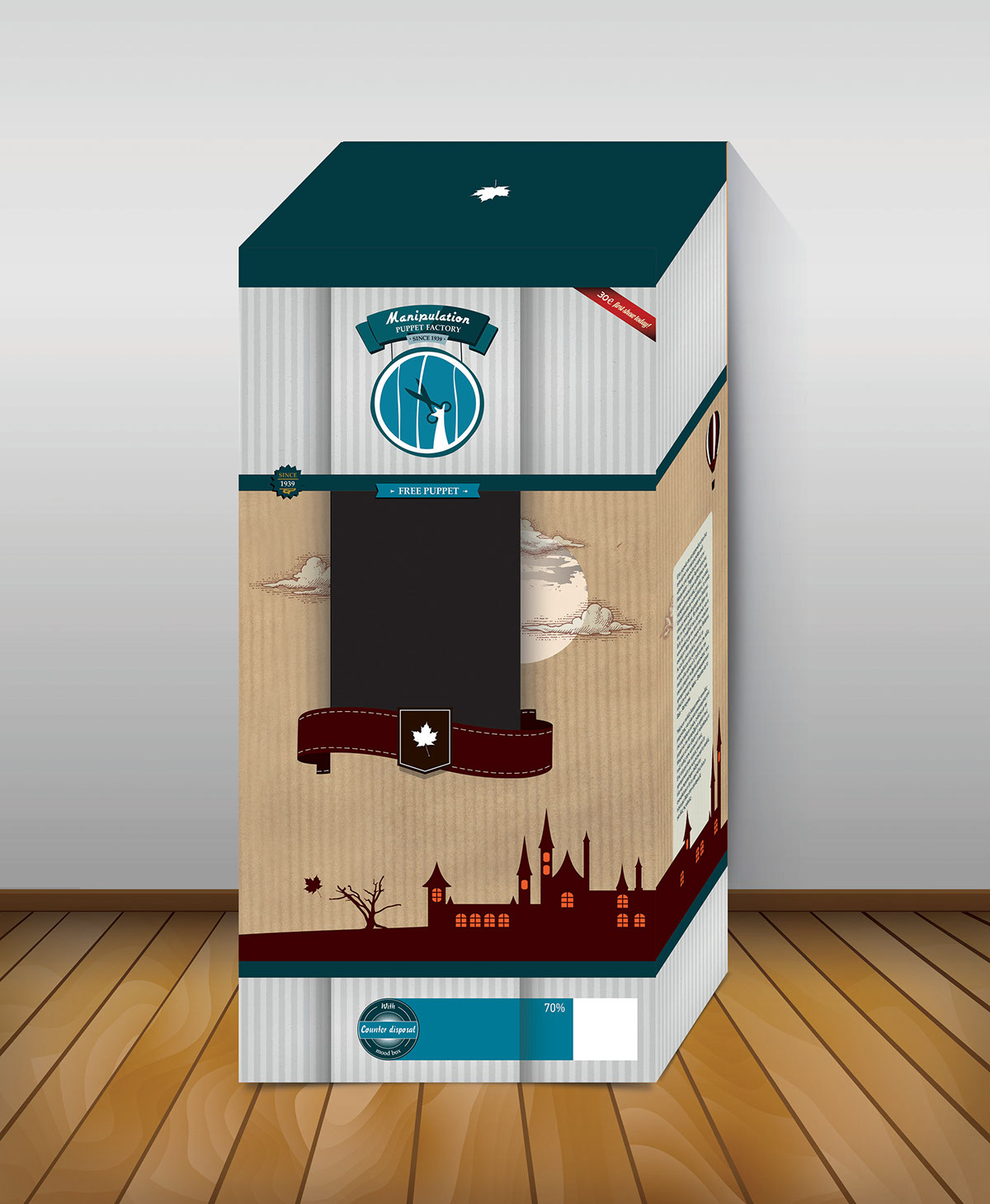
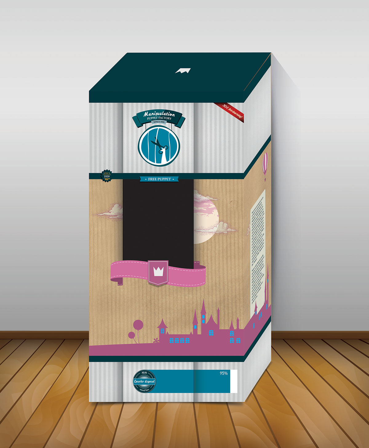
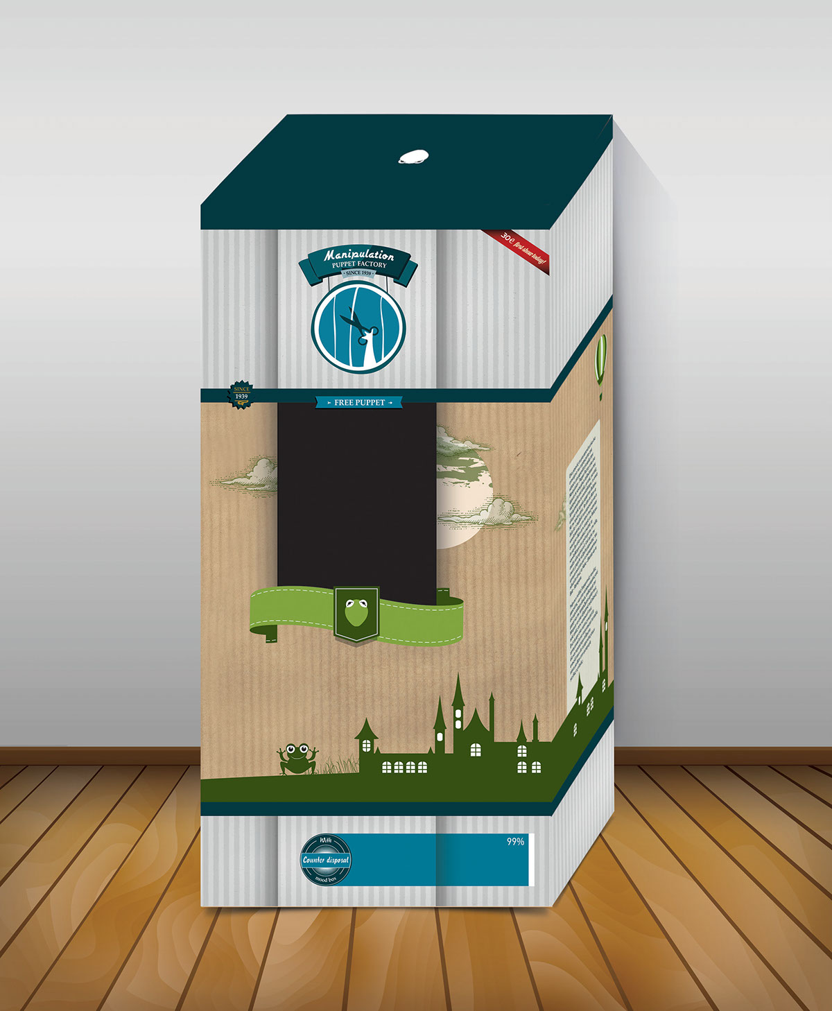
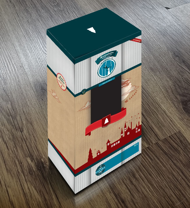
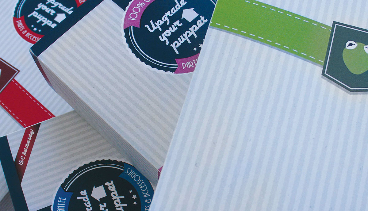
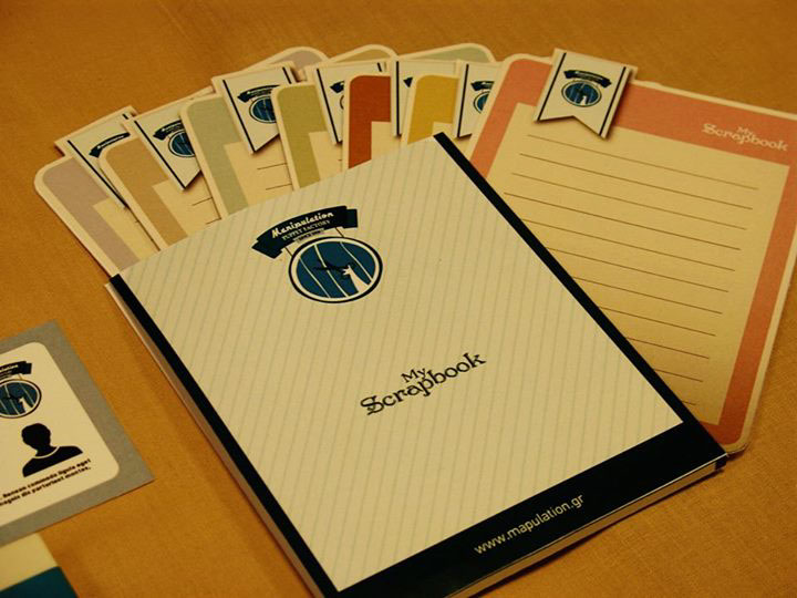
The layout of each package (Mood Box) has been designed in a way that intends to
represent the unique mood and personality of each of the puppets, allowing everyone to find the unique
puppet that expresses their personality and share beautiful and special moments by “manipulating” it.
represent the unique mood and personality of each of the puppets, allowing everyone to find the unique
puppet that expresses their personality and share beautiful and special moments by “manipulating” it.
Concerning the creative thinking, the methodology and the development of the subject, the intention
was to create is a visual theme influenced by the previous century, combining retro and modern
elements, aiming to highlight in this manner a nostalgic, and also a little dark, brand name, designed
today but in a way that gives the impression that has been born yesterday.
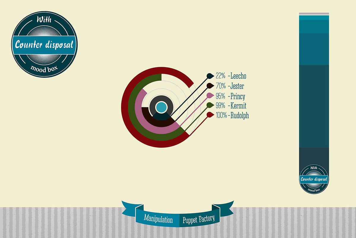
As far as the research and design fields are concerned, the design idea of the basic packages of the
company is being based on the intention to take into account the diversity of the audience. This is why
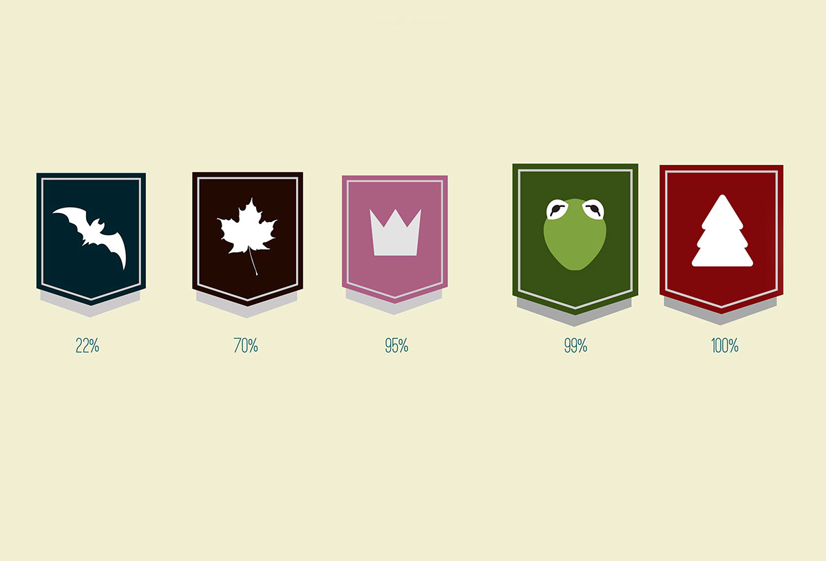
there are 5 different categories of boxes for the puppets; those are Leecho, Jester, Princy, Kermit and
Rudolph. Each puppet main package will also have a secondary that will contain additional parts and
accessories for each of the five puppets of the company. The differentiations of the packages are based
mainly on the "mood" of each puppet and are attempting to attract different kinds of audiences, people
with different backgrounds, different taste, culture and even different age.
Being inspired by the French Alps, Transylvania and a northern district of the Czech Republic, I attempt
to recreate an intercultural journey where everyone can find stories and characters that had never
before imagined.
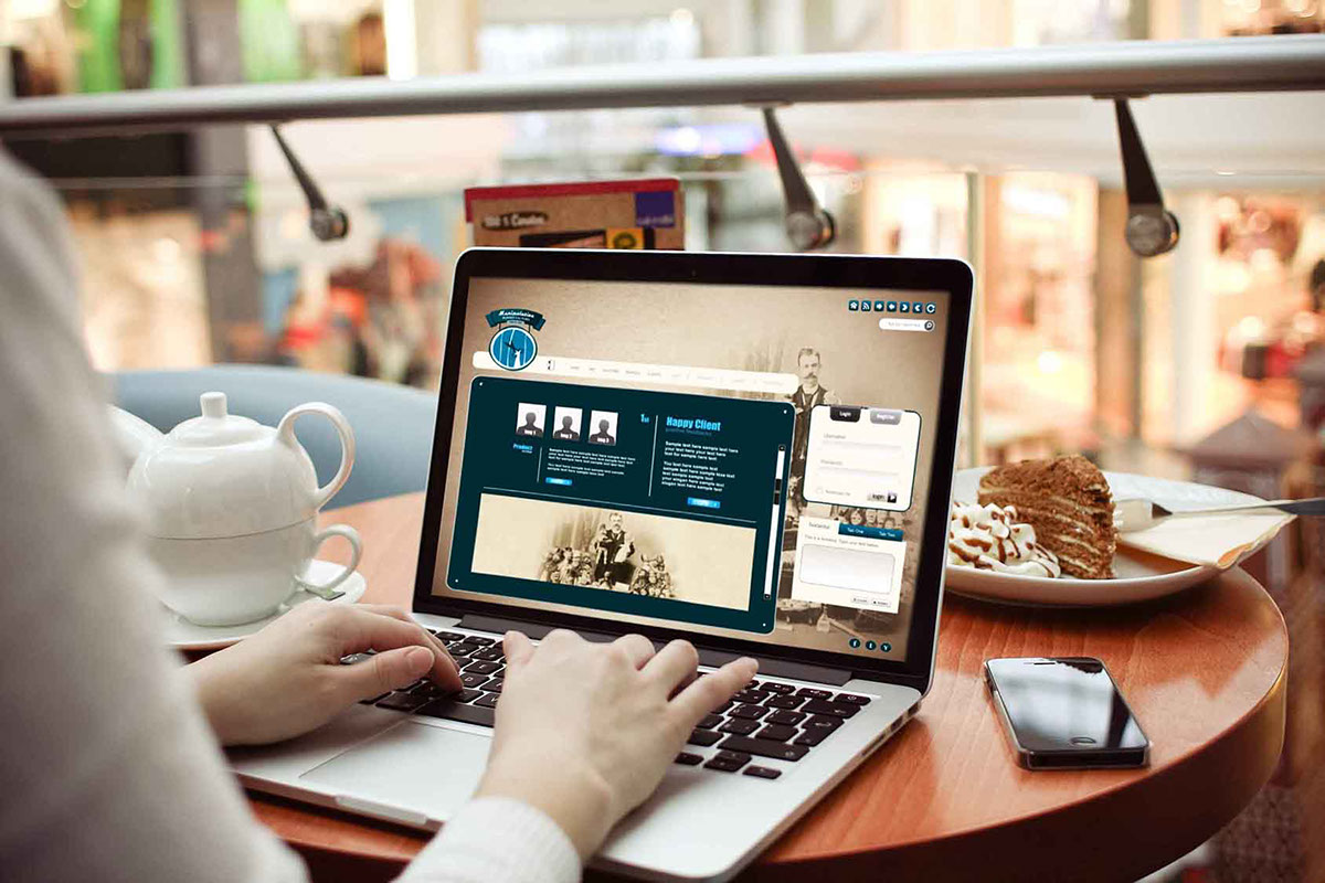
Apart from the packaging, concerning the other applications of the brand identity (letterheads, business
cards, greeting cards, membership cards for customers and travel postcards and the company's website),
the aim of the design process is to keep a solid and distinctive brand identity while attempting to
support variation. In this direction, the choice of the color palette used in the packaging and the other
applications is always combined with the colors of the logo of the company. This color range of blue,
dark blue, pale blue and turquoise, is influenced by several elements of previous centuries and intends
to give a nostalgic and retro mood and style which represents the concept and the overall character of
the company.
was to create is a visual theme influenced by the previous century, combining retro and modern
elements, aiming to highlight in this manner a nostalgic, and also a little dark, brand name, designed
today but in a way that gives the impression that has been born yesterday.
As far as the research and design fields are concerned, the design idea of the basic packages of the
company is being based on the intention to take into account the diversity of the audience. This is why
there are 5 different categories of boxes for the puppets; those are Leecho, Jester, Princy, Kermit and
Rudolph. Each puppet main package will also have a secondary that will contain additional parts and
accessories for each of the five puppets of the company. The differentiations of the packages are based
mainly on the "mood" of each puppet and are attempting to attract different kinds of audiences, people
with different backgrounds, different taste, culture and even different age.
Being inspired by the French Alps, Transylvania and a northern district of the Czech Republic, I attempt
to recreate an intercultural journey where everyone can find stories and characters that had never
before imagined.
Apart from the packaging, concerning the other applications of the brand identity (letterheads, business
cards, greeting cards, membership cards for customers and travel postcards and the company's website),
the aim of the design process is to keep a solid and distinctive brand identity while attempting to
support variation. In this direction, the choice of the color palette used in the packaging and the other
applications is always combined with the colors of the logo of the company. This color range of blue,
dark blue, pale blue and turquoise, is influenced by several elements of previous centuries and intends
to give a nostalgic and retro mood and style which represents the concept and the overall character of
the company.