

Darkness
for Quote/Unquote
for Quote/Unquote
Striving to produce an exhibition that focused on art outside of our norm, the collective selected 'Quote Unquote' as the theme for its seventeenth exhibition. Each piece in “Quote Unquote” is based on a quote – famous, cultural, or even from the artist’s own life – and is created to represent that quote and its meaning to the artist. The result was an exhibition that saw many styles of literature interpreted in a new light by our artist core.
The efforts of Edmar Cisneros, Rob Shields, Nicolas Monin-Baroille, and Anthony Giacomino shone through as highlights in this exhibition, while the work of one of the latest additions to the collective, Tarin Yuangtrakul, will go down as some of the strongest in the history of slashTHREE.
http://www.slashthree.com/exhibitions/17/
Hope you guys enjoy it, lots of hard work (especially for me) went into this one, so it's very personal again for each contributor.
Promo video by Vladimir Tomin, Creative Director on Slashthree.
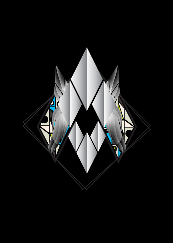
Starting off with a very simple composition and placement of the elements I tried creating a balanced and calm work. For my quote to fit accordingly:
“I would hurl words into this darkness and wait for an echo, and if an echo sounded, no matter how faintly, I would send other words to tell, to march, to fight, to create a sense of hunger for life that gnaws in us all.” -Richard Wright
Though I thought the colors and current coloration didn't help much.
I inverted what I had previously and added this new shape and some small bits to give the boring gradient some variety. Looked like a much better start now, still some slight color in this as you can see but that will change in the next few steps.

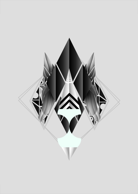
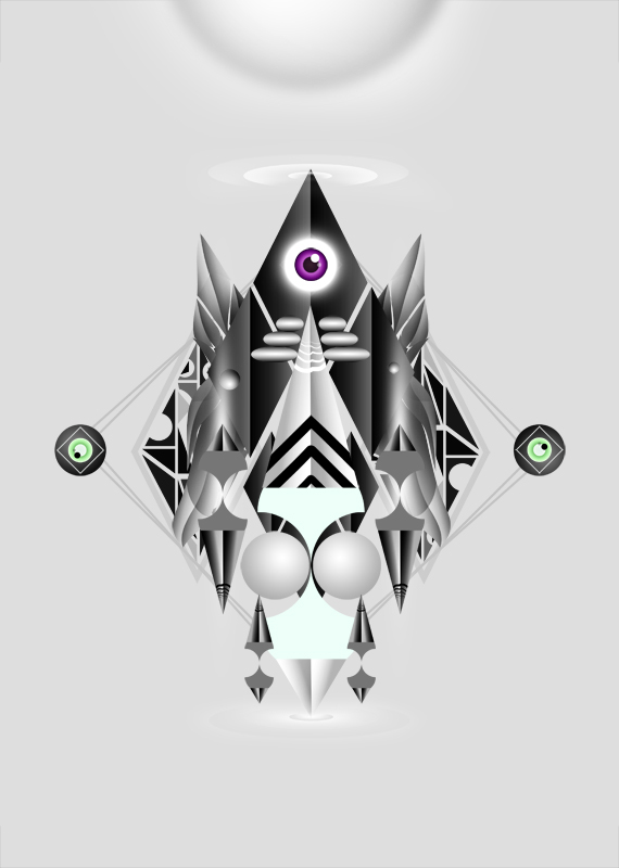
Added a few spheres and some 'echo' lines which support my initial quote for the theme of the exhibition.
Again more elements and some lights for visual pleasure that still support the balance and calmness of the work. Creating some kind of singing triangular shapes. Starting to look like an appealing piece!
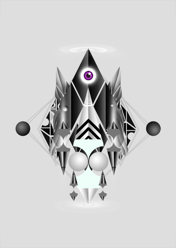
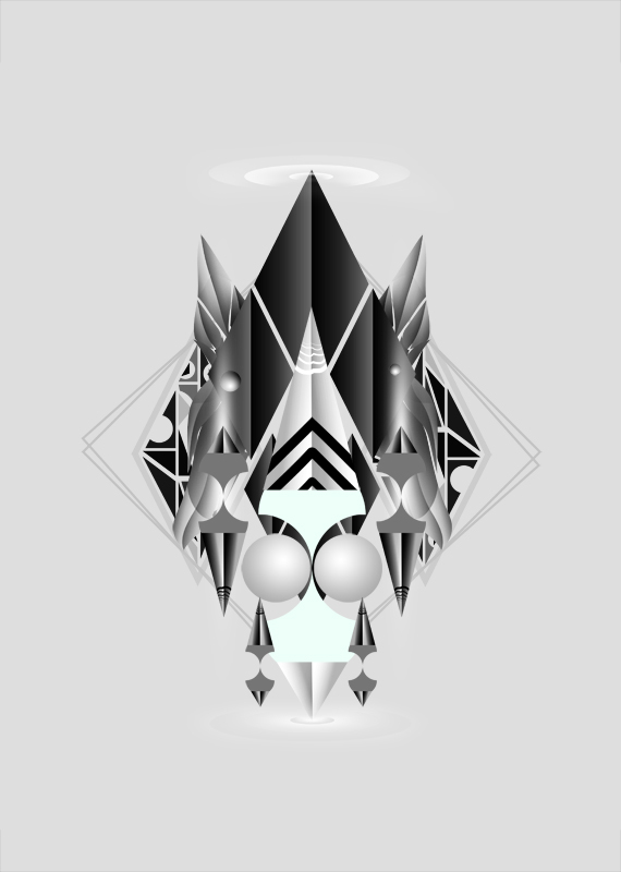
Added some spheres again on the sides, composition still works from my point of view, added an eye to include a bit of life in this, in my opinion it worked out very well.
Added a huge 'sun' above it, a little detail on the spheres on the sides and some more silver stuff in the middle. The composition comes together nicely, only thing I'm missing is some textures and better colors.

Yes I've said texture and some better colors, I've totally desaturated our 'singing composition' to add on better colors in the next through some adjustments. If you've got good eyes, you may already have noticed the texture and darker spots in this update.
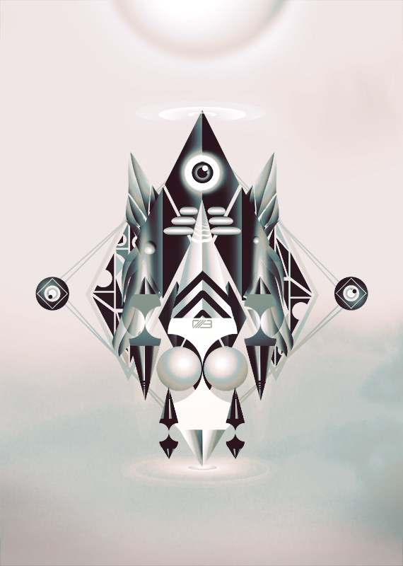
Finally, with a bunch of Adjustment Layers I've tweaked the boring unsaturated piece into a slightly colored but appealing and balanced minimalistic work. I hope you liked this small case study where I've shown that less CAN be more, even with minor changes but in big amounts.
Below you'll find a quick animation of the above,
Below you'll find a quick animation of the above,


