
Perfect Pour Magazine Spread
Redesign of All About Beer magazine project
Redesign of All About Beer magazine project
UPDATE! One of my favorite print projects, I just revisited Perfect Pour and remade the entire thing from scratch in InDesign CS6. Originally made in Quark 6.5 (not Universal, and unable to export to InDesign), I took the opportunity to do some tune-ups: reduced the number of typefaces used, tightened up the grid system, and made some tweaks here and there.
This is an excerpt of a personal project: a redesign of a magazine spread. I selected a magazine I found in a bookstore magazine rack and thought was not particularly well-designed. I thought it would be fun to try to make it over into a layout I would enjoy.
This layout uses a five-column grid system. I chose not only imagery that reflected the subject matter, beer, but a warm, amber color palette as well.
This article was originally printed in the September 2007 issue of All About Beer magazine, and I make no claims of copyright to their work.
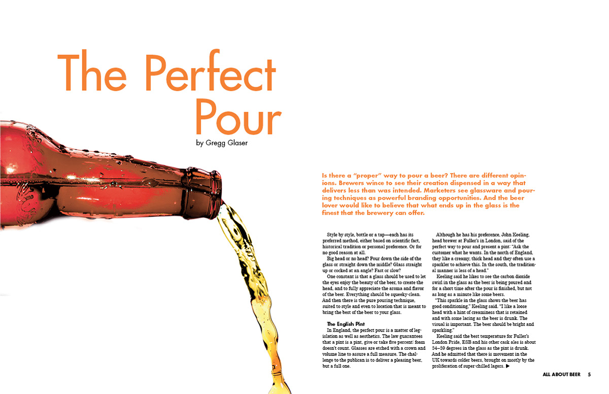
Main Article Spread 1. The title descends with the pouring liquid, leading the eye to the article. The color of the bottle is reflected by the first paragraph of the story.

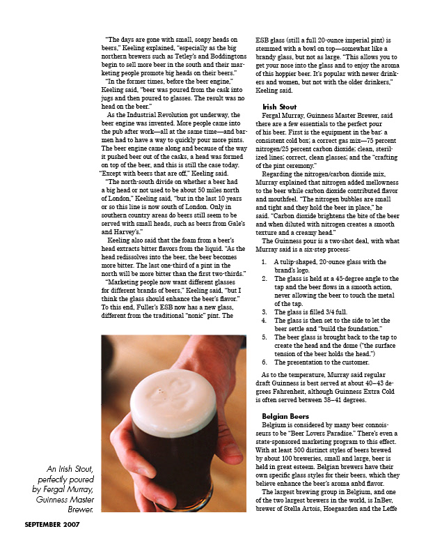
Main Article Spread 2. The outer columns of the five-column grid were left mostly empty. This allowed some white space for the viewer's eyes, clear room for image captions and page numbering, and room for the viewer's thumbs to rest while reading. I broke up the grid some with a callout. The end sign is a custom vector graphic I created, a frosty mug of beer!
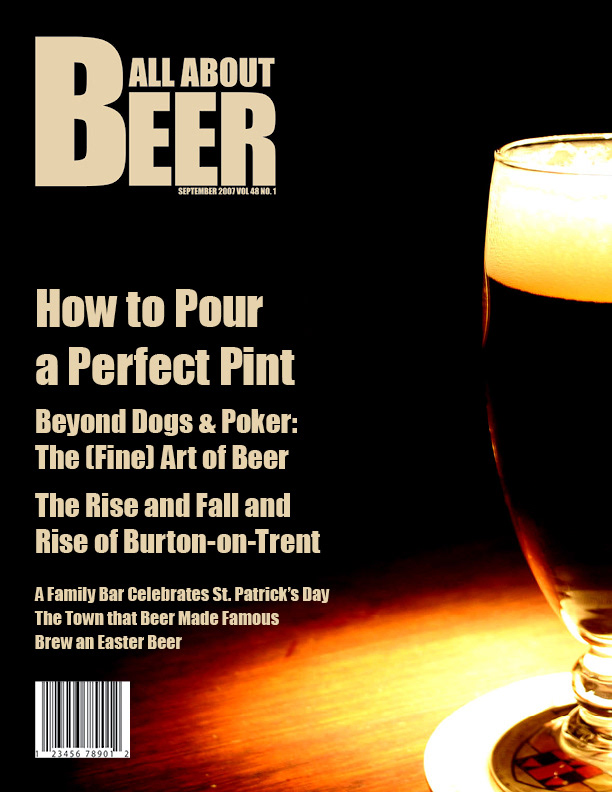
The magazine cover. The original was a riot of secondary color on a white background, featuring a woman holding up a full glass.
I wanted to tone down the entire thing and refocus on the beer itself. Now we have an understated presentation for the aficionado. The colors reflect that of a tall pint of Guinness. Typography is simple and follows a hierarchy. The custom logo is strong and sturdy. The entire look is decidedly masculine without diverting into fraternity territory.

The new Table of Contents has a complete typographic overhaul. Its grid was torn down and rebuilt. Typefaces were reduced: Impact for the subject lines to reflect the cover, and the rest of the page as well as the rest of the project was Futura Bold (for titles and callouts) paired with Century (for main text).