I couldn’t find an image that linked visually to my name, that I liked, so I came up with the name LER Grafic, my initials Leighton Edward Rathbone, and Grafic, from the Greek, graphikós, belonging to painting or drawing, picturesque, of or for writing; of style, lively.
Combined, we get a unique name (top search result in google) and a French sounding name, which links to my heritage.
Combined, we get a unique name (top search result in google) and a French sounding name, which links to my heritage.
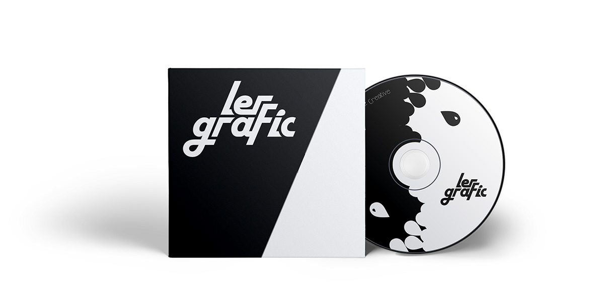
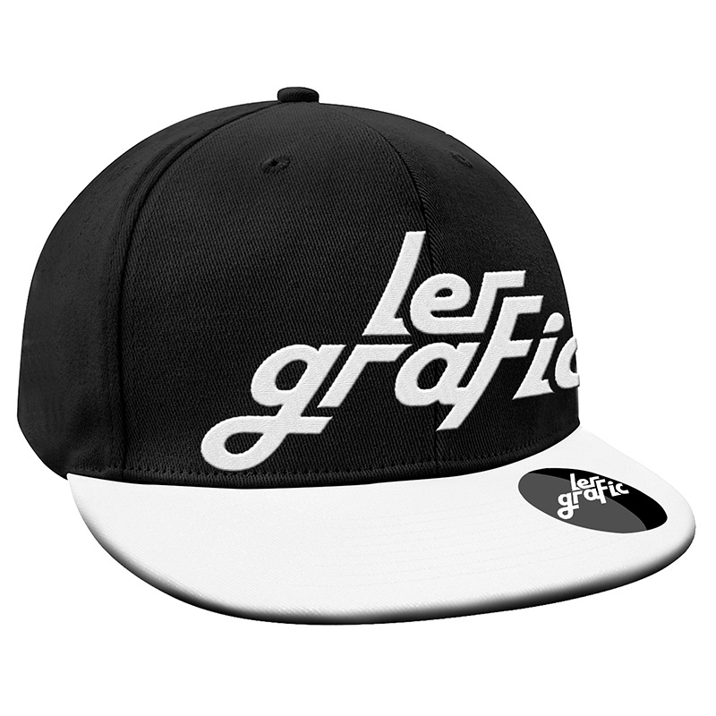
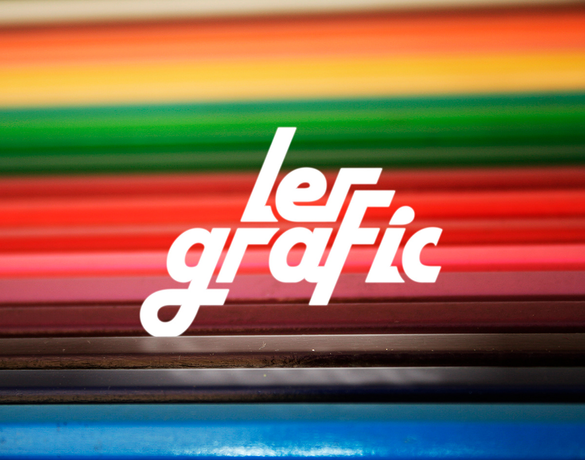
The Logo, My Logo:
The text is slanted in a progressive manner, taking inspiration from street art, as well as futurism, I feel it encapsulates my design style, clean bold and minimalist.
The text is slanted in a progressive manner, taking inspiration from street art, as well as futurism, I feel it encapsulates my design style, clean bold and minimalist.
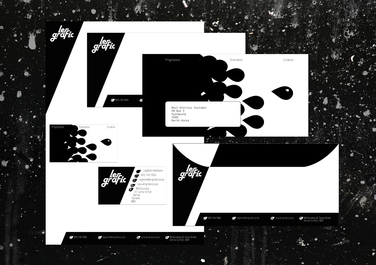
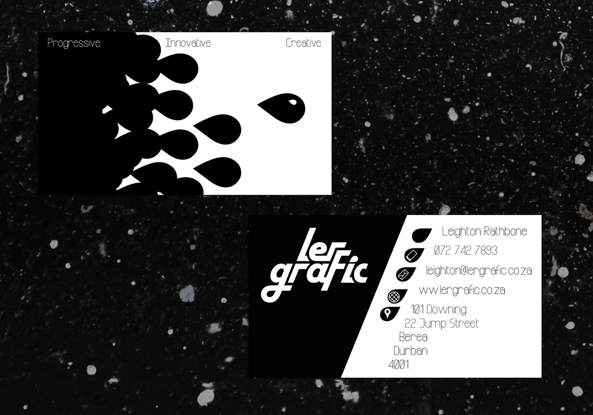
In the creation of this logo type, we get a graphical element, a tear drop, this can be used to great effect on its own, or even in a swarm, or a pattern.
The my slogan, catch phase motto, et cetera.
Progressive, Innovative, Creative
Progressive, Innovative, Creative
Progressive: I’m forward thinking, fast, always looking for the freshest style
Innovative: Doing things the normal way is boring, why not experiment?
Creative: Need I say more?
Innovative: Doing things the normal way is boring, why not experiment?
Creative: Need I say more?