

Hazel Hill Wine Label
Ayres Vineyard grows exceptional grapes, and makes exceptional high end wine. I had been honored in the past to add to or change elements of their current label, bearing the Ayres name. The good folks there trusted me to take care of their label and their good name, because they know how much I value the name and the work that name represents. So when Ayres decided to branch out into the under $20 wine market, they came to me.
They told me they would only be distributing in the Portland metro area, and that the wine would be under $20. They wanted to create a new label with the name Hazel Hill, named for their vineyard, which is on the site of a former hazelnut orchard. Creating a new label would keep them from watering down their current high end brand with a lower cost wine, while still producing a great product.
They told me they would only be distributing in the Portland metro area, and that the wine would be under $20. They wanted to create a new label with the name Hazel Hill, named for their vineyard, which is on the site of a former hazelnut orchard. Creating a new label would keep them from watering down their current high end brand with a lower cost wine, while still producing a great product.

Research Phase
What was this client trying to accomplish? They wanted to sell wine for under $20 in Portland, OR. Who is most likely to purchase wine in Portland for under $20? I looked at the most recent data from the Wine Market Council to see who was buying the most wine, and cross-referenced that with demographics from the Portland metro area gleaned from US Census data, then took into account some psychographic data from Neilsen. (Turns out, educated middle-income millenials.) What does the target demographic want that Hazel Hill has to offer? What about Hazel Hill is most likely to connect with the people most likely to buy their wine? I created a psychographic profile of our target market to find out where their values intersect with the values of Ayres and what Hazel Hill wine had to offer. This of course meant that I researched Ayres and found out a bit more about its history.
Hazel Hill was an orchard struggling with the help of chemicals in soil that was not ideal for the trees, and would eventually be wiped out by blight if it had remained there. The owners of Ayres cut down the orchard, revealing a stunning easterly view the previous land owners would later see and regret never enjoying themselves. The hill was made new as a vineyard, whose vines were far better suited to the soil and able to grow in an environmentally responsible manner. The land was upcycled, redeemed. The wine is handcrafted, high quality, small batch. This is a story that relates a set of values our target audience can relate to, so they can feel good about purchasing this wine. It’s a story with some great visuals as well. From this story I created 3 keywords to describe our Goals and Objectives (G&O): quality, Oregon, and craft. Everything in the design had to come back to those core concepts, telling that story.
Conceptual Phase
From here I did mind mapping to figure out the visual attributes that might best communicate our G&O.
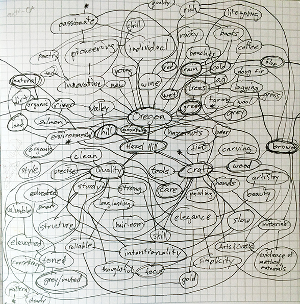
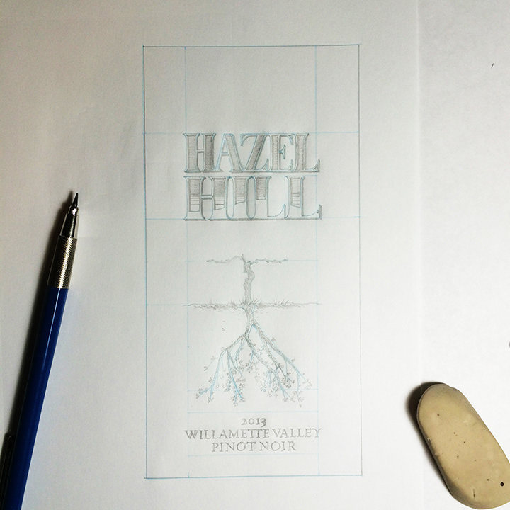
Based on those ideas and visuals I created a series of thumbnails, at least 50 distinctly different concepts. Once I felt I had exhausted those possibilities, I thought long and hard about which concept would best fulfill the G&O, and the reasons why it would do so more than any other concept. I fleshed out that concept a bit more, with multiple drawings considering layout, proportions, medium, color and type.

Then I wrote up a check-in for Ayres, giving them all the reasons I had chosen the concept and detailing how it would be developed and why. I allowed them to see the other concepts, see my process, and see my justifications, soliciting feedback to make sure they were a part of the process and allowing them the opportunity to raise any red flags or ask any questions before proceeding. They gave the go-ahead to proceed to the next phase.
Design Development
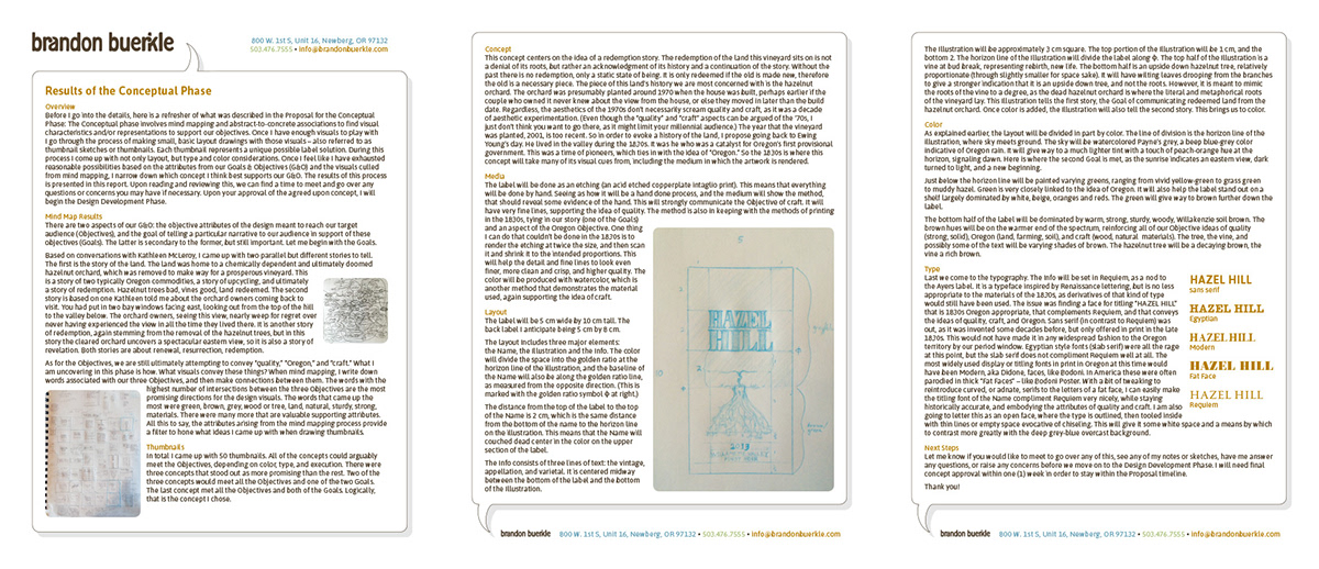
In the Conceptual Phase the design we decided on would use visuals taken from 1830s aesthetic, tying it back to the pioneer roots of Oregon, and specifically to the time when the land their vineyard is on was settled. The type style would take its cue from this era, and be congruent with the typeface used on the Ayres label, which is used for the smaller type on the label, as a nod to the parent vineyard. The colors were chosen to evoke the idea of “Oregon.” The whole thing would be executed in media that would show evidence of the hand, in order to convey the concept of craft.
So I did the label art as a copperplate etching intaglio print…


…then colored with watercolor.

And all along the way I sent pictures and details of the progress to the client.

Finishing Phase
After the artwork for the label was finished, I scanned it in and cleaned it up where needed, placing it into a layout in InDesign.

Since the bulk of the work was done by hand, there wasn’t as much to do in the Finishing Phase. After completing the layout on the computer, I sent proofs and finishing notes to the client. They were exceedingly pleased with the result.


