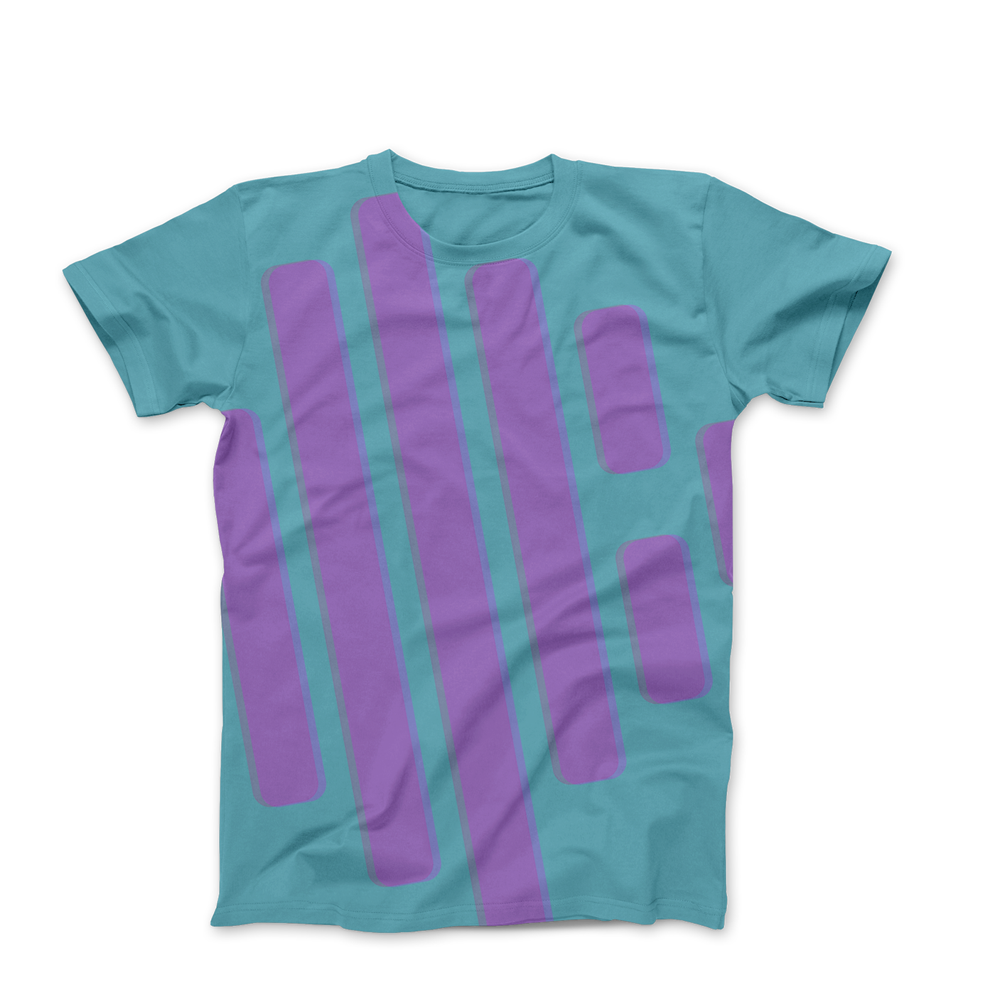
The idea was to take the equilizer spectrum and a circle indicative of the shape of a record. I still wanted to keep it as minimal as possible. Once I place everything on top of each other I thought it would be best to have the eq spectrum be punched out so the background of whatever you place the logo on could show through when the client only wants to use black/white or one color.
The colors I chose kind of have multiple meanings. Those vibrant “Miami Vice” blues and pinks are exactly that. They remind you of where the label is from and keeps it’s office. These colors call to the kids/young adults that flock to this type of music. The pinks and blues are the same colors that you see at the festivals when the lights are on full blast. I thought about using gradients. It is something that everyone likes using right now but in the .75 form it didn’t come through as clearly so I kept it with the “flat” icon look. Enjoy!


