Every auto show season, brands create new graphics that reflect their personality and highlight vehicles for the new model year ahead. For most all brands, this is a simple exercise of taking print advertisements, blowing them up 1000%, and plastering them all over their space.
SCION is a unique brand with passionate owners, and I wanted to do deliver more for them. For the 2014 - 15 season, I was excited to lead the design and development of SCION's new season graphics kit in collaboration with Andrew Danger.
Our Challenge : Develop a fresh and exciting look and feel for graphic media across all auto show platforms.
We started with a blank sheet , researched a wide range of lifestyle categories to identify patterns and themes, and came away with three major trends we could represent in 2D. With the support of our client, the direction we locked in was FLATITUDE - Flat design + SCION’S personality.
Flat design is currently used in various graphical UIs as well as some current SCION campaigns. SCION's owners are mobile first so creating visuals that cross over from static to dynamic mediums was front and center in our design strategy.
FLATITUDE Inspiration Board

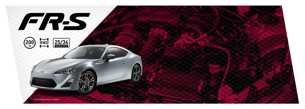
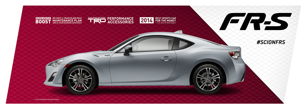
We create a new family of graphics using a fresh framework and logic that carried across all vehicles. Using bold colors and iconography, and a layering of pattern and photography, SCION's new season graphics are set apart from anything else you'll see on the auto show floor.
SEASON GRAPHICS
The graphics below showcase what was is currenlty in use at Secondary and Regional auto shows.
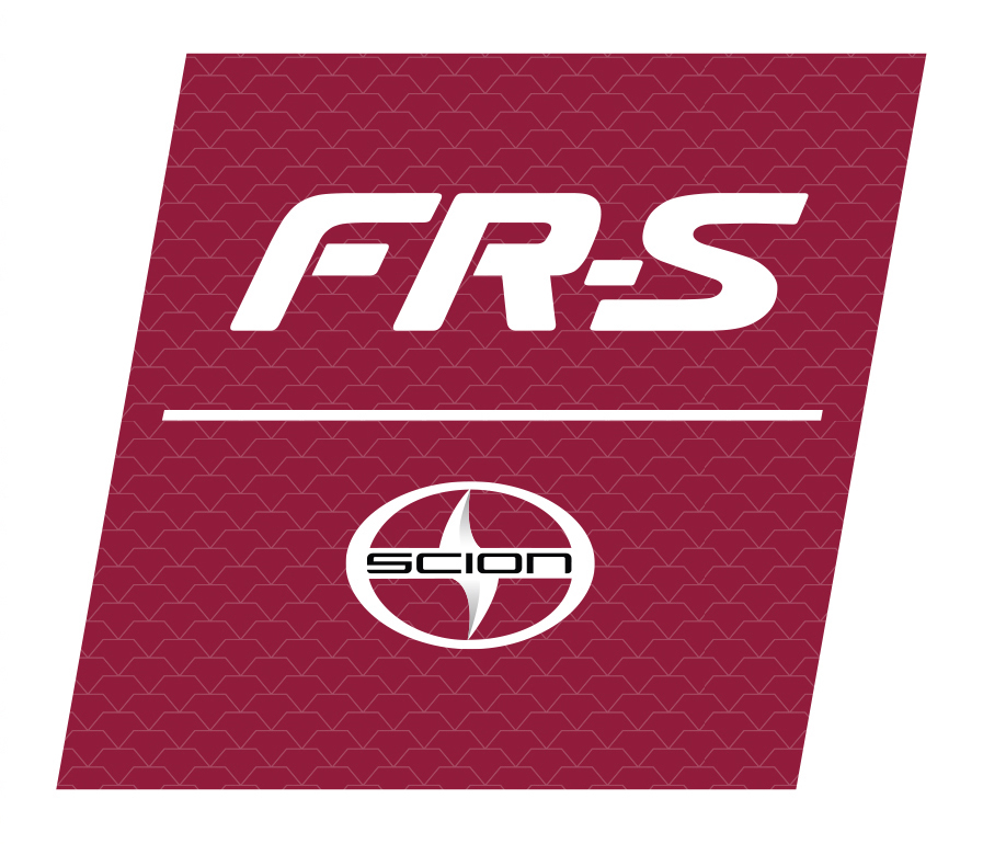
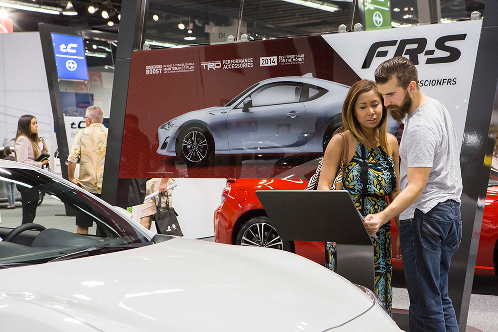
SCION FR-S
Each left leaning Blade has a digital display playing SCION content mounted within the graphic. Photos below.
Lightbox graphics

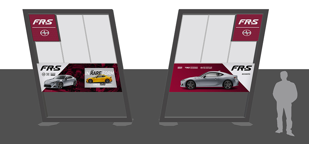
Previs in situ
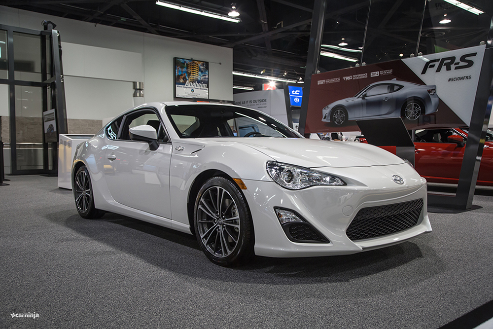
OC Auto Show - Photo via CarNinja
OC Auto Show - Photo via Kathryn Rapier Photography
SCION tC


SCION xB


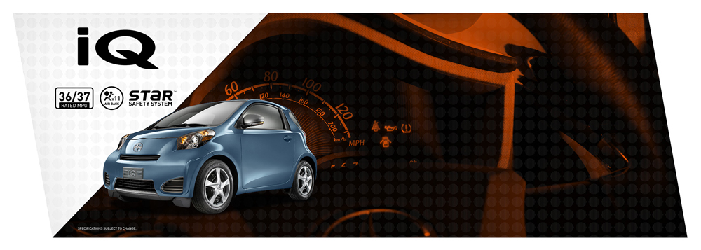
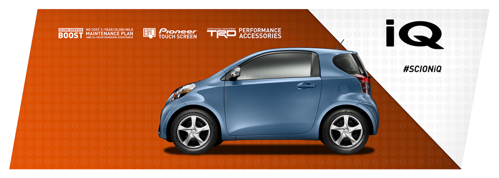
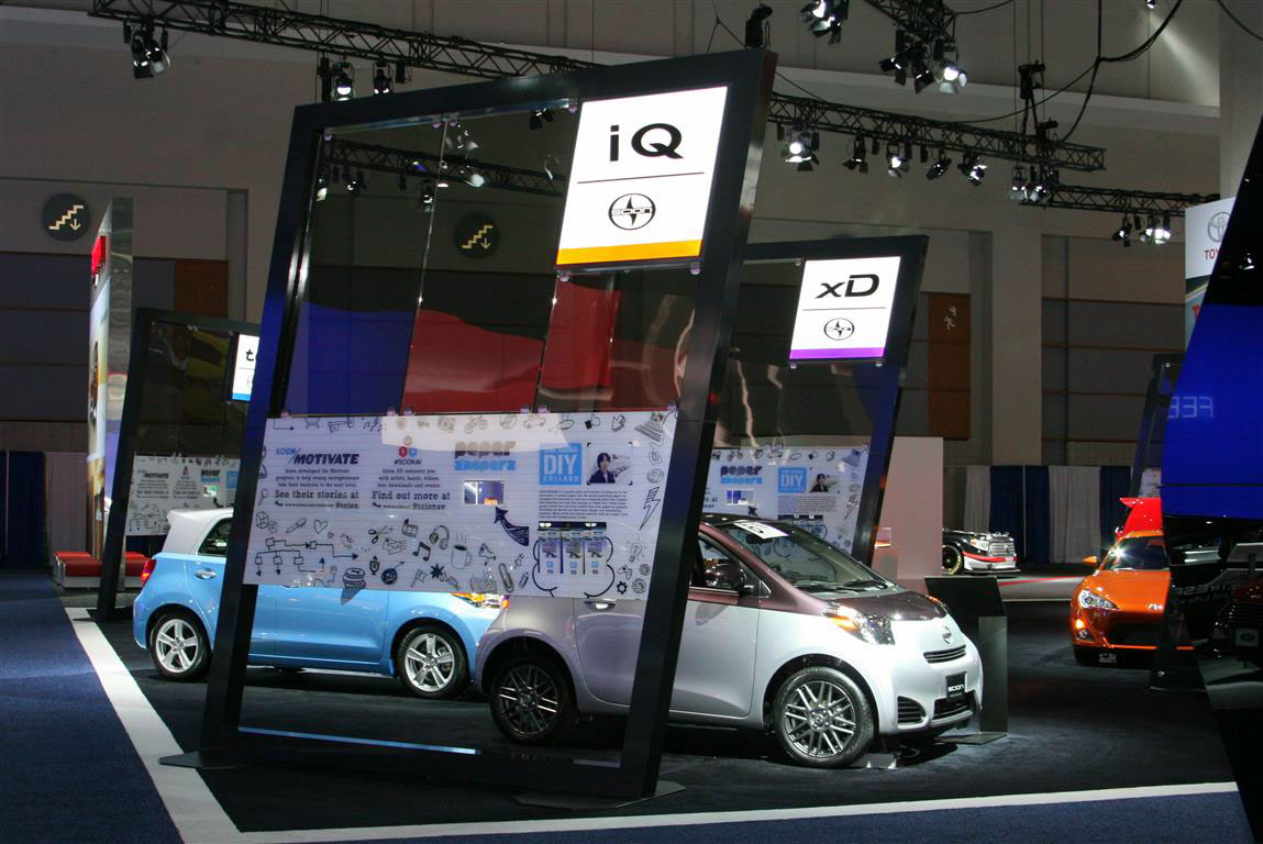
SCION iQ
SCION xD


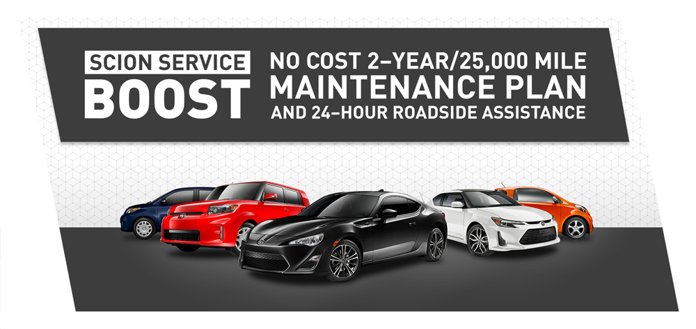
We also featured two campaigns on the "storefront" portal - Pure Process and SCION Service Boost.
Each graphic carries the same logic as the vehicle graphics with bold typography, layered patterning and strong call to action.

Previous Season Graphics - for context
For more creative inspirations, follow me on Pinterest at @StuartFingerhut


