


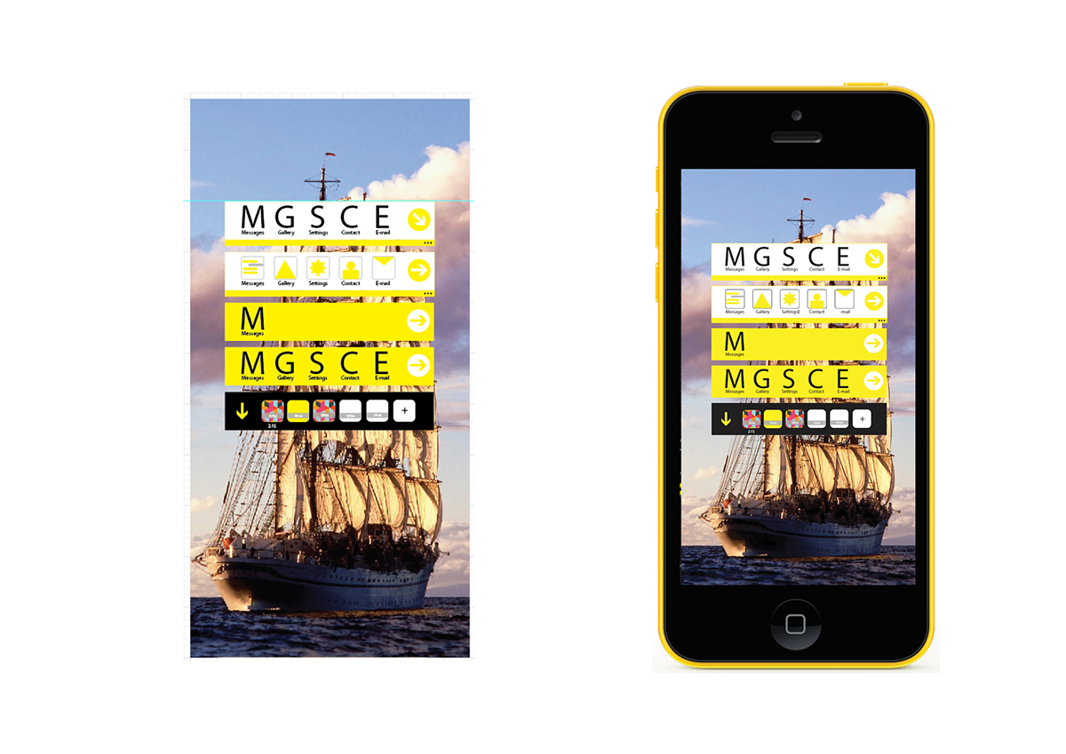
Album Development 1


Album Development 2

Contact 1 for Message
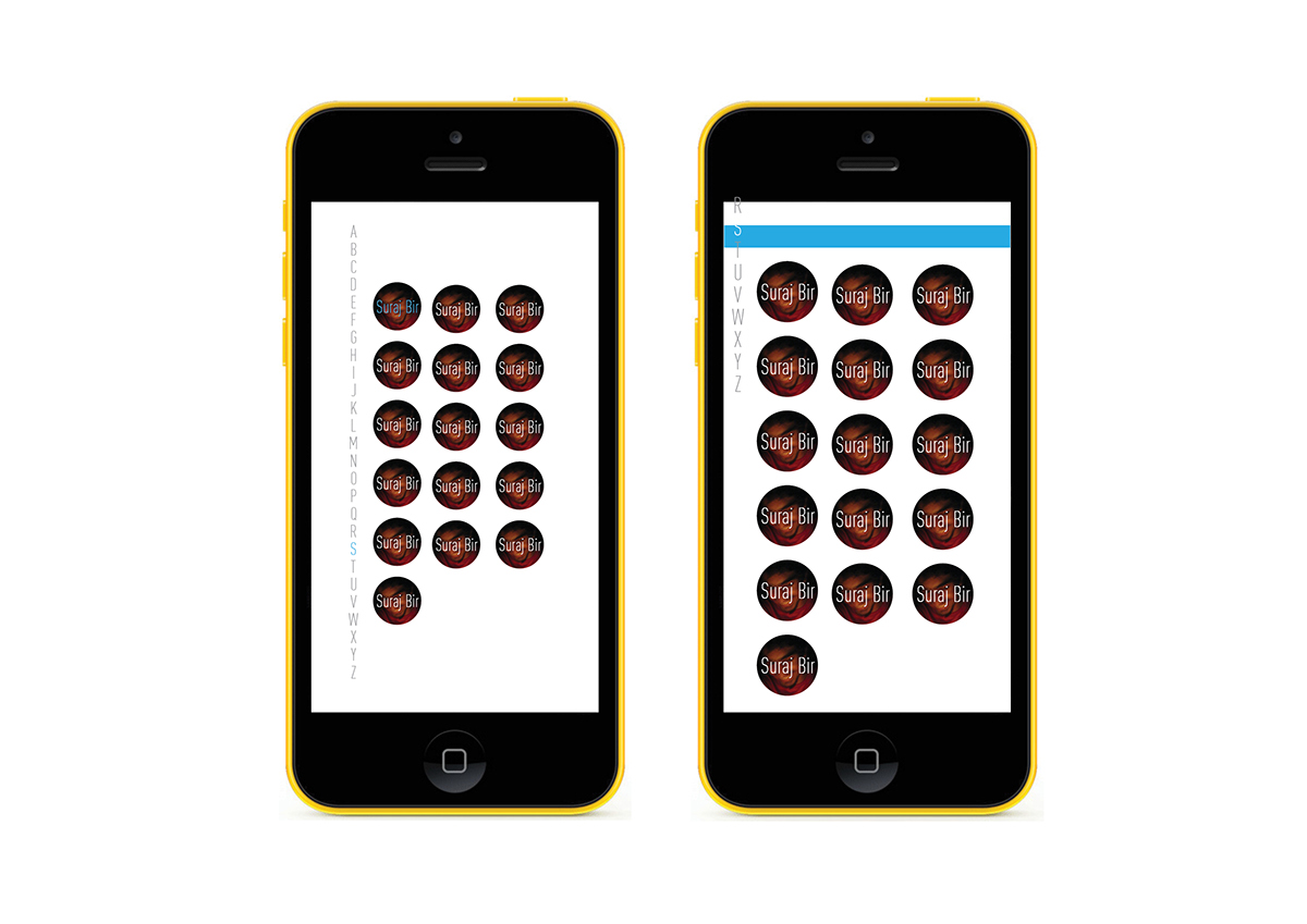
Contact 2 for Message

Approach 1
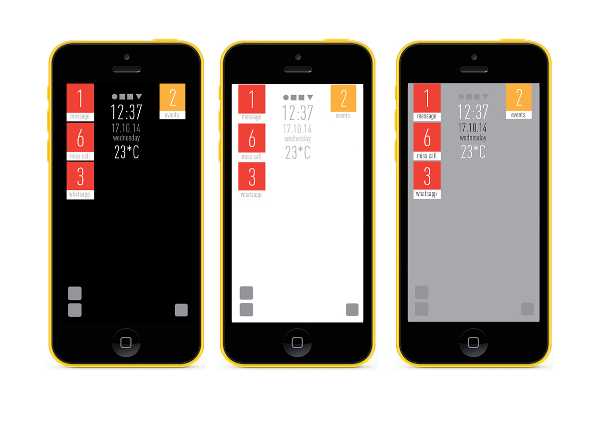
In this home screen i focused on the content first. The inspiration here is airport and its signage and way findings. The way the way finding are used, its signage and the content which are big and data focus and main emphasis to its main content. The way we enter airport, its entire ambience is created through its navigational characteristics, it guides us, gives directions and helps us to reach to the appropriate gate etc. The entire experience is what I wanted to capture here in this following home screen development, using the crucial following keywords from the main guideline keywords.
A good inspiration which introduced me to graphics and info graphics as my other inspirations.
I developed this new language by bringing the basic elements of quick, fast, fluid, data highlight, hierarchy of data and focusing the main data, no unnecessary elements and to the point.
The home screen looks at the data by bringing the similar experience of looking data at the airport. Above eye level, navigational. The exploration done here are by keeping all these in mind.
The notifications and contents are kept clean and understandable. At glance information served.
A little confusing for the first time users.

Homescreen Idea 1
Homescreen Idea 1 Final
Approach 2
In this approach I wanted to keep the home screen as the direct face/single faced screen page. All the notifications, events, calls, updates all at a glance in one screen layout.
In beginning I started exploring but after few exploration I realised my entire process is more affected by the metro UI and it was getting carried away to its metro UI content, its similarity in boxes/ live tiles and certain layout placements. I slowly explored more and broke through the context of metro and discovered myself in a new place, where I wanted the exact solution for this approach, and how exactly I wanted it to look the same. It was a completely new approach and a risky path to try for final deliverables, but without thinking much I went forward.
According to my research, users sometimes like something different, this approach was a more like a metaphor of “Clean Table” were you personalize your table or your working area according to your characteristics. It’s going to be very customizable as that legibility is a must in this approach.
A good amount of negative space to feel free from the daily stress of life. Easy and Direct.
Homescreen Idea 2 Themes

The background is a live tile. it will update the place where you and the time (i.e: night or day) of the location or the street through images. New places, new images new updates. giving the interface a feeling and expereince of more alive, playful and personal.

Homescreen Idea 2 Final
Approach 3 (main outcome)
It was my try to explore futuristic visual language design in the world of User interface. I wanted to see how far I can carry my project in terms of its approaches. With this approach I gave myself a variety of exploration, a dimension that made me satisfied with the end result. I was not sure about this but it came out the exactly the way I wanted it to look like and in terms of experience.
The basic principle that carried this idea so far is “An extension of Life”. A saying in which my own phone should no longer be or feel like a phone or device anymore. It should no longer be a thin long cubical box. It can be an extension of my life, my daily activities, monitoring, what I like, who likes me, who adores me, basic alert sensing, connection with people in real life getting more personal and easier. All these thoughts were uprising during the laying out of its working scenario.
With the help of these thoughts and the addition of guidelines, the final keywords, I came up with the existing language. I didn’t want it to end in a vague manner. It should convey what I wanted it to be like. I started exploring manually, hand work, sketches.
I wanted a new way, a way the mobile world has not yet seen. I didn’t want it to be complicated or i didn’t want it to get that futuristic that it’s hard to understand and feel like the same existing ones of the future thoughts. I wanted something close or next level.
After a point I realised while exploring that in the beginning when mobile phones was still an idea and it was not yet executed or brought into the world, the visual language was just set. It was put in to grids, boxes and squares. Only simple write-up, no highlight on typography, iconography, layout, color etc. The same boring language was slowly and slowly developed till date. The traces of the style sometimes still remains in the modern smart phones. A simple write up or a rectangular box etc.
I wanted to start aall over new process, no traces of old things at all. A completely very new language. A breakthrough. New in terms of layouts, process, experience, placements, look and feel.
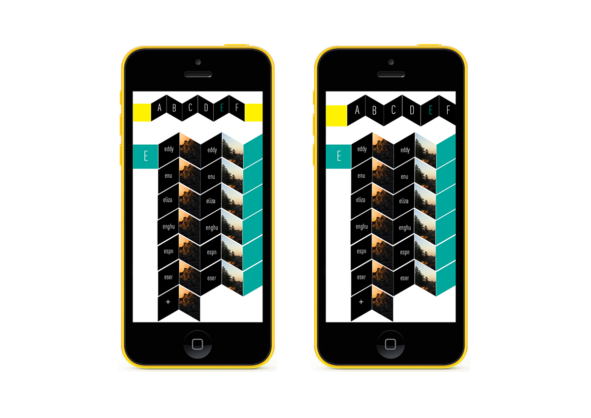
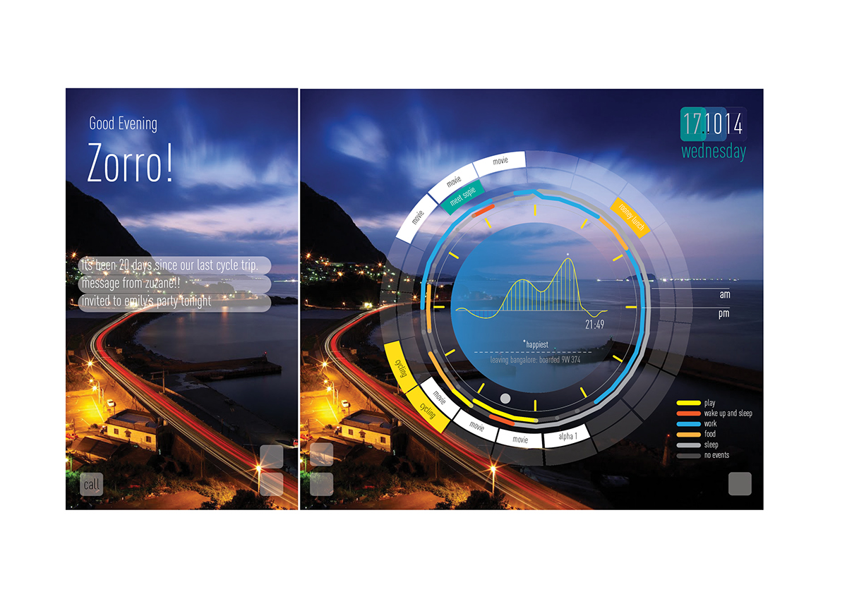
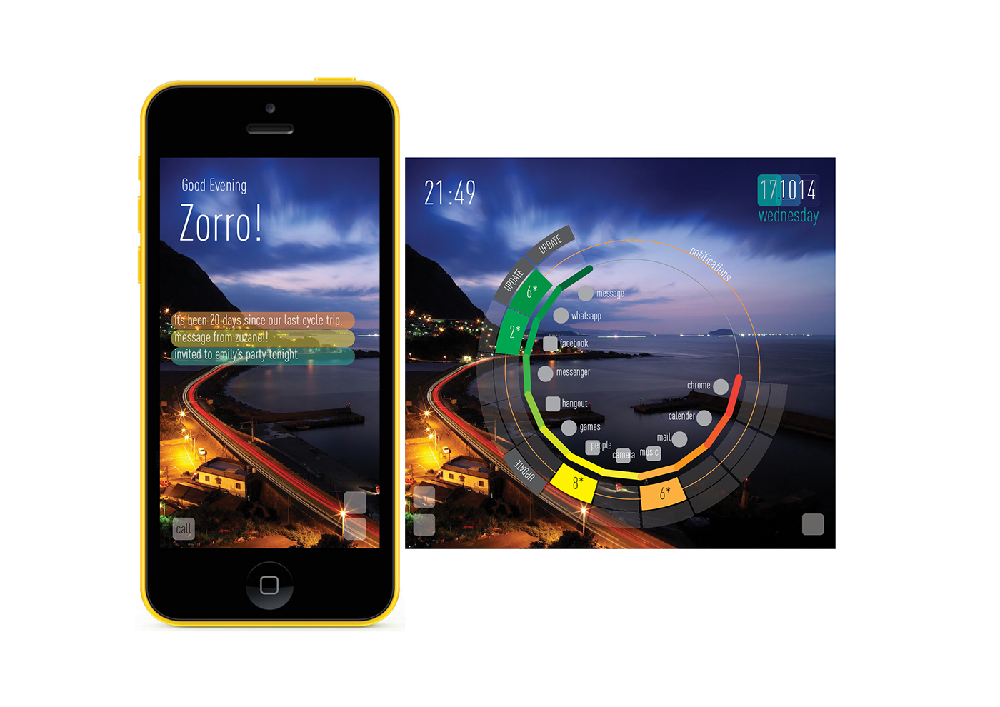
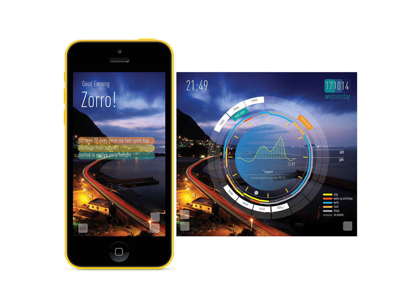
So i took this approach, took every possible step to make the language happen. I started exploring. I took a circle, the best form to depict data in a easier manner. It is very spacious for more data representation than other forms.
The two circles are two areas of data:
Circle 1:
Updates and Main app. App drawer, notifications.
Circle 2;
Daily activities, Timetable, Events, your day records, your personalized contents.
The circles will keep updating with new information.
More circles can be added for more data.
The main page/Face page of the home screen always welcomes you and it’s a constant update of the place where you are currently standing, its timing, temperature, weather, day or night everything is depicted through images or an image. A constant update to make it more alive. Once you go to bed or you sleep the phones sleeps too, it goes to no update mode, a blank screen with only alarm, time, date and day. So basically it’s a big live background.
The main/ face page will also update you of activities. It will also say about any upcoming events or notifications. It will also update you of activities which you do on certain days; which the device will understand and add it according to day understanding. E.g. On rainy days I love cycling so according to the day understanding, the device will update you to go for cycling as its raining!
it can even forecast things. Weather and all. Timetable updates.
The main characteristics of this language is fun, colours, at a glance information, data focus, alive.

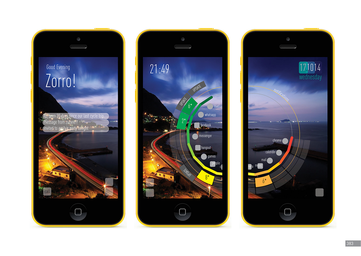


Simplification of information and data focus through colors.
Main Visual Language Final Circle 1
Similar,The background is a live tile. it will update the place where you and the time (i.e: night or day) of the location or the street through images. New places, new images new updates. giving the interface a feeling and expereince of more alive, playful and personal.
The interface and the visual language is at a glance infomation.
Main Visual Language Final Circle 2

Main Visual Language Final Circle 1 for Open screens

Main Visual Language Final Circle 2 for Open screens


