SINOPEC LUBRICANT
After a successful launch in Australia under the name GREAT WALL LUBRICANT, the chinese leading oil and gas provider SINOPEC decide to define is brand image for a global market development.
Task :
Strategy, brand design, logo
Challenge :
The competitors are deeply implented, and had already strong links with high recognition automotive brands.
The given name GREAT WALL LUBRICANT, very generic, speak about the origin and weaken the product image with the connotation of industrial product of low quality.
Result :
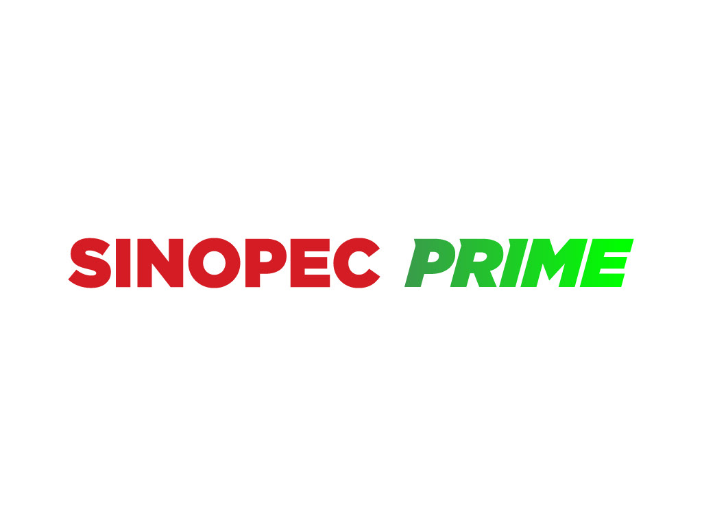
Change the name, according to the new strategy.
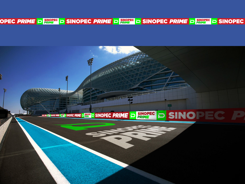
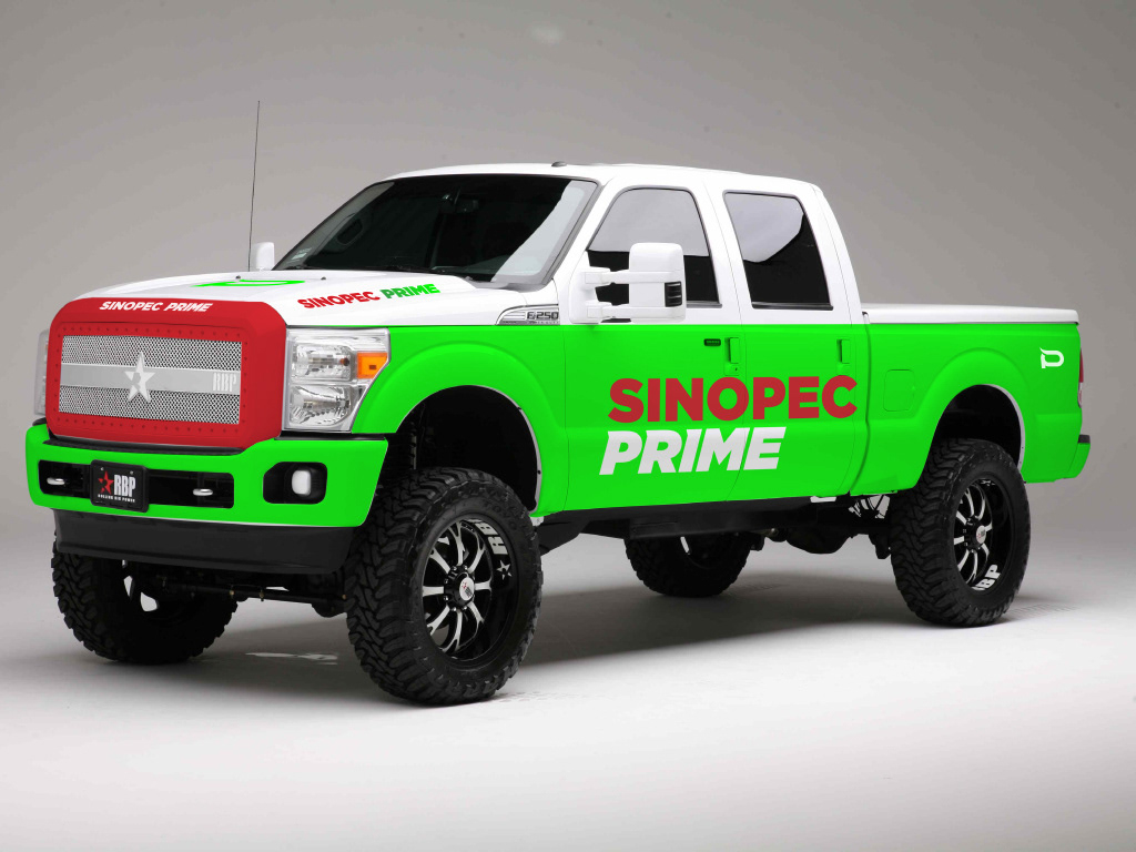
Provide a simple but singular, flexible and easy to use brand product with a small color palette.
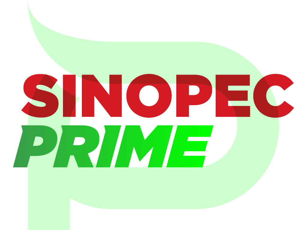
Design an impactful dynamic logo, integrating a very energic bright green color, associated to a refined company name as legacy.
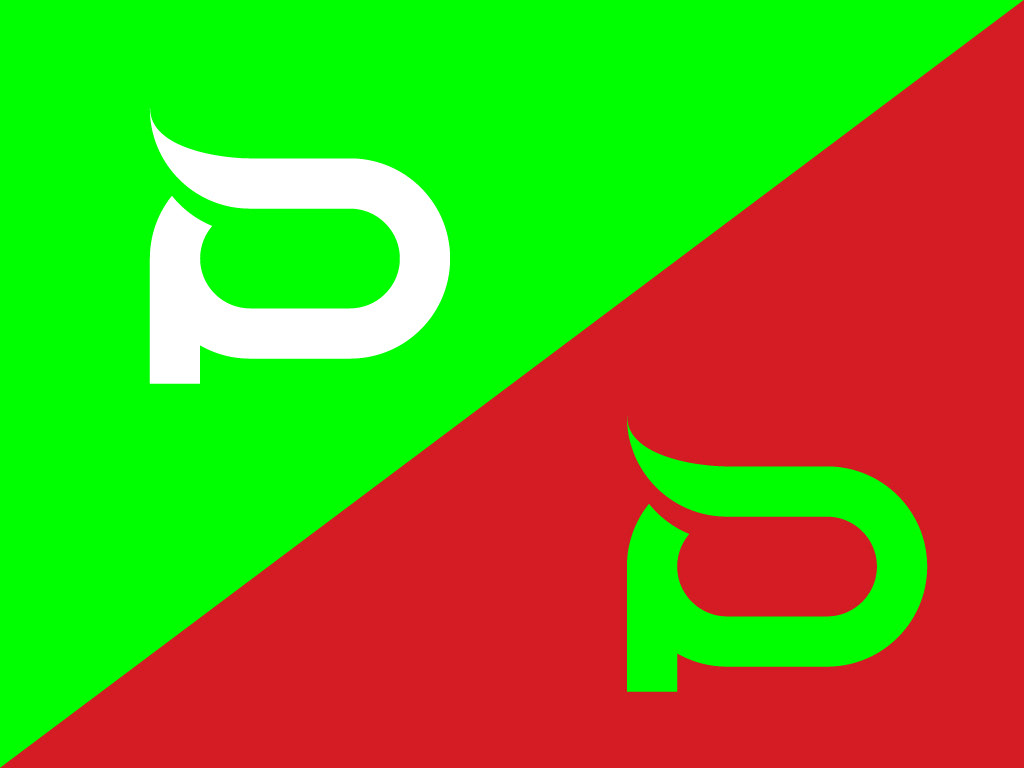
A complementary graphic is associated, to help the brand recognition.

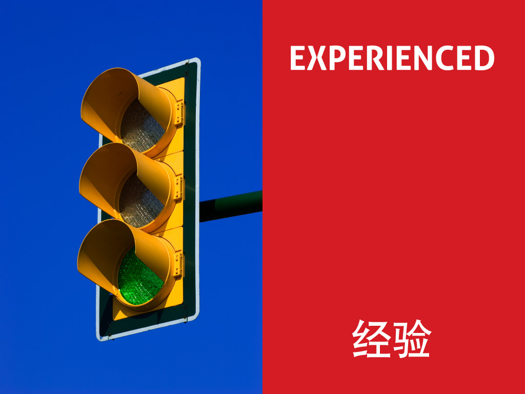
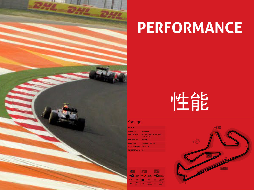
BRIGHT RED


VIBRANT GREEN