An Exercise in Typography: Sochi Olympics
A project produced for my Typography III class at RISD, the goal was to display the events on a given day at the olympics in SOCHI, RUSSIA. For my solution, I split the day into three parts, Morning, Midday, And evening. I explored different ways of portraying the different parts of the day through Iconography, and typography.

Version: Iconography
Since this was a typography excercise, the natural solution would have been to go with the typography version. But I believe that Iconography can be a better solution to displaying general data in some situations, it felt neccessary to do an exploration in iconography.

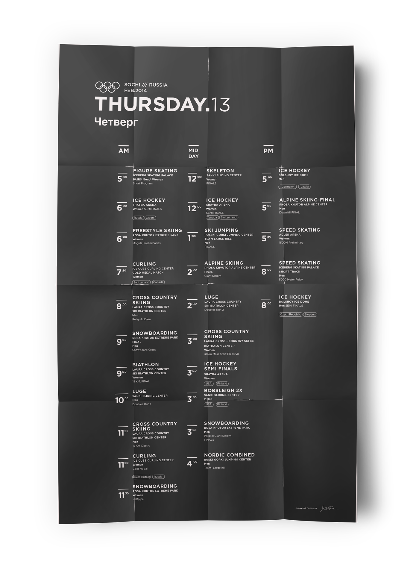
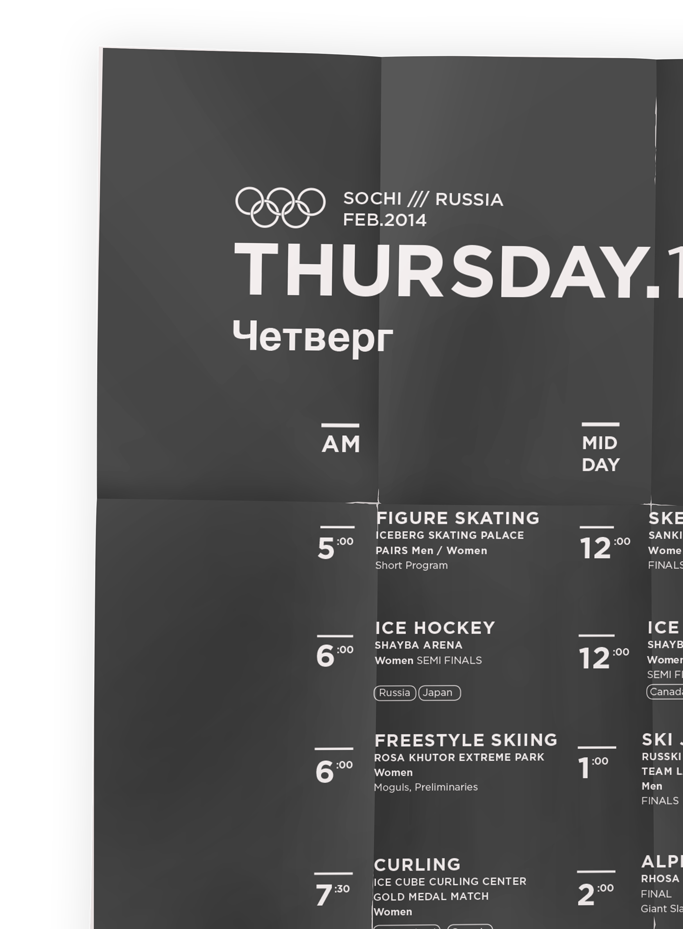
Version: Typography
In the typography version, I explored the AM/PM and Mid-day variations. The fact that Mid-Day was spread over two baselines, was a major driving force in the development of the icon direction.

Version: Variability
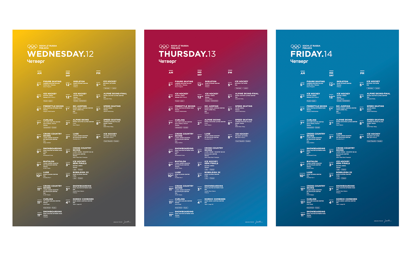
As a final deliverable, it was neccessary to provide a mocked-up version of what other days of the week would look like. To provide an extra level of differentiation between days in Sochi, I experimented and executed different versions of gradients and dates.

Thanks
For taking a look!

