
The client is a start up clothing business. Founded in Melbourne, the business aims to portray the best of Melbourne’s clothing design, culture and identity. The business aims to distribute well-known street wear clothing from world-renowned brands – “Street wear is a distinctive style of street fashion. Rooted in Coastal surfing and skate culture, it has grown to encompass elements of hip-hop fashion, Japanese street fashion” (Wikipedia). The business is to be distinguishable from the large proportion of mainstream clothing brands such as Myers and David Jones; rather the business will distribute brands that create clothing of high quality and low quantity. The business aims for its customers to feel inspired when discovering the brands distributed in the store. The retail store will be located in the heart of Brunswick to associate with similar street wear clothing distributors that are located in the same area, therein attracting customers of similar interest. The business requires the development of a unique yet simple name and logo, a visual identity for the brand, web skin with the coding handed by alternative supplier and a variety of promotion and advertising concepts. Ultimately the business is in need of design and marketing services to begin trading.
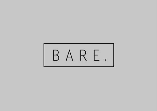
The logo is simple, concise and elegant, symbolized by the type used – Letter Gothic std. – a sans serif font, reflecting a contemporary audience. Furthermore the type selected, is stylistically paired back, a font that does not confine the boundaries of the clothing designed and distributed by the company, therein the niche target audience are inclined to have an emotional response to the logo treatment because it has a current simplistic design aesthetic, yet it does not suggest a rejection of alternative designers within the clothing industry. Through the balance of kerning between letters, which is even and wide, a restraint and confidence is expressed through a deliberate respect for each individual letter, implying a fashion forward collection to the audience. The logo has geometric form, suggesting a contrast between the wide spacing and the iconic simplicity within each unique letter, elevating the form into a considered logo for the audience. The point – dot point – defines the logo with emphasis and formality, the point elevates the word into a statement, almost as if it’s the final statement in the context of clothing, design and retail.


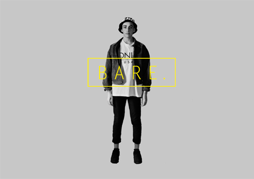

The advertising campaign, emphasises to the audience on the large branding, a range of clothing styles and an introduction of the advertising concept line.
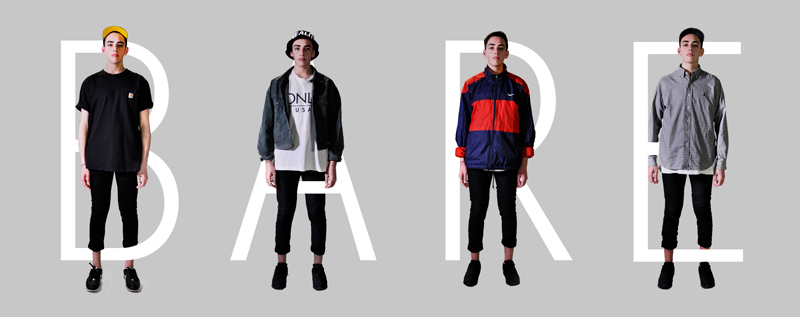
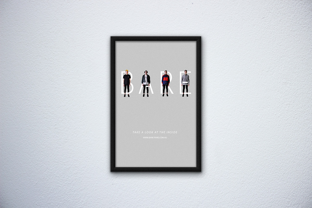
The advertising campaign, emphasises to the audience on the large branding, a range of clothing styles and an introduction of the advertising concept line. By integrating the core visual icons that where established in the corporate branding, a cohesive advertising campaign is proposed, for a uniform brand message to the audience. Hierarchy is used in the advertising campaign, where the audience first observes the brand name, intertwined with the clothing style of the company. The audience then moves their eyes down to the type, which informs the audience member of the specific information about the campaign. The type (slogan of the company) poses a question, it challenges the reader to look beyond the shallow exterior of being innately bare, contrast to being clothed by the items sold in the brand. Further, this humorous contradiction creates banter for the audience, where the company is a clothing brand yet, it insists on viewers to look within themselves for truthfulness, reinforcing the light heartedness of a seemingly formal company.
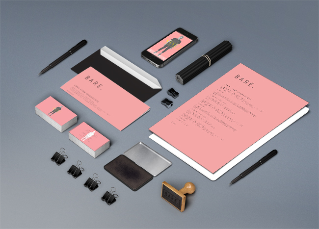

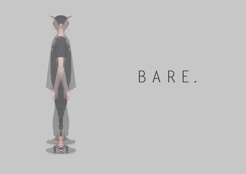
The promotional items, is the core branding concept, it was dictated by the product, clothing, a veil over our nakedness. The entire concept is based on transparency, nudity and revelation, thus the texture of the promotional items is tracing paper, referencing an analogy to clothing, masking or unmasking our nudity, underscoring the branding concept. Furthermore, the interaction of the texture of tracing paper acts as a visual skin for the audience. Line is used twice, firstly as a design element as secondly as a subtle design treatment within corporate communication. The geometric juxtaposed lines form a backdrop and a secondary layer for the branding; the lines represent irreverence to the formality of the corporate branding. Symbolizing a softening of the otherwise formal branding sty, allowing the audience to realise a creative and intuitive thought behind the design. Secondly the lines used within the type, although the lines are, by the common understanding of deleting, are deleted, it in this case draws emphasis to the words, which are of great importance. For the audience the transparency and sincerity of the business is highlighted, as the deleted information is still left on the page, laying bare. The soft, pale, grey colour places emphasis more on the content then the background, creating negative space, which to the audience is considered and formal.
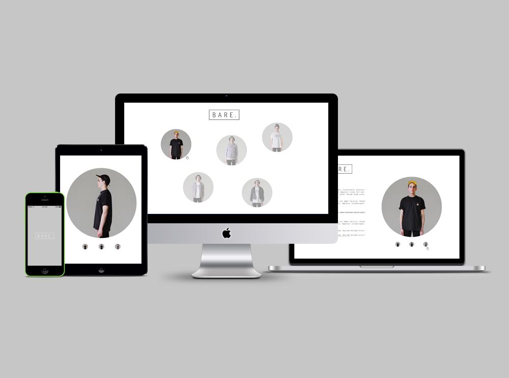
The webskin, is forged to engage the audience on a different context. The minimalist and unbalanced style is deliberate to shock the audience, to juxtapose with the balance of bare. Further, the circle shape creates a harmonious and comfortable feeling to an otherwise aloof stark layout, creating trust within the reader. Furthermore, the circle creates a point of difference to most other webskins, thus creating excitement within the audience. Although, this layout seems to oppose the rest of the design choices made for bare, there is still an element of formality, signified through the contrast of colour, with a white and plain background and the pale circles.
- Byron Robertson -


