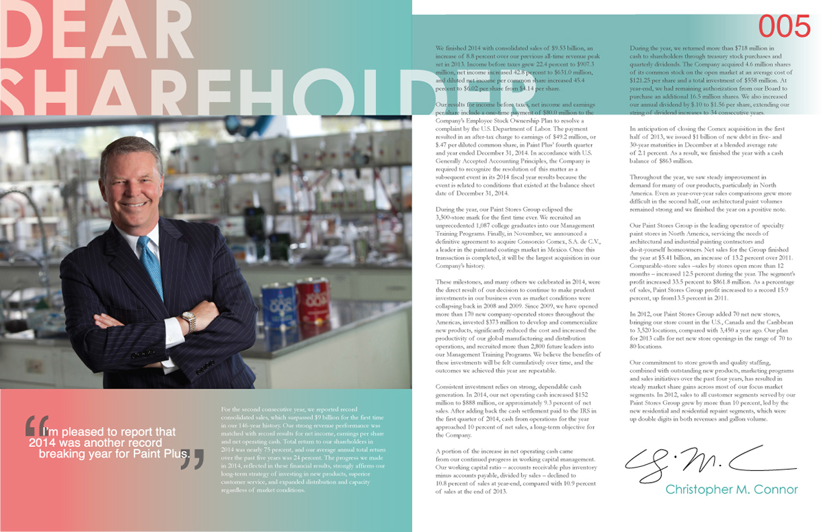
"Pick a Fortune 500 company and entirely recreate their brand identity." I chose Sherwin Williams because, let's be honest, their logo is pretty terrible and outdated, possibly because it has barely changed since the late 1800's. I settled on the logo after 40 permutations; going with a modern color palette and drawing from the rectangular shape of paint chips that can be found in their stores. I chose the new name Paint Plus to express that, in addition to paint, they actually offer stains, tools and other services to their cusomers. From this I produced a stationary package and several annual report spreads that would be sent to shareholders, pulling text and statistics from Sherwin Williams' actual 2012 annual report.