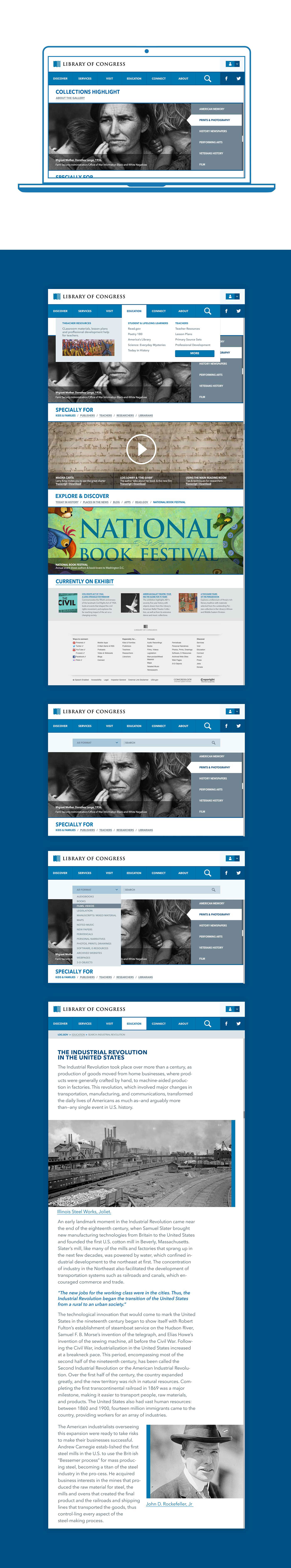
In this project I looked into the Library of Congress's website. My goal was to not only prototype a responsive website for the library, but to think of the limitations that were implemented, and necessary, in the original design. The basic navigation of the site was surprisingly coherent but among its negative aspects there was a lack of visual hierarchy. The website in general was functional yet not very intuitive when indicating where was the content coming from, and at times it was quite overwhelming.

The organization of the website is useful and mostly well done. However, the experience for the end user is almost a question that goes like this: how do I find something is such overwhelming system?" My goal was to make that experience less of an insidious question and more of a familiar environment that doesn't take too much time to understand. To achieve this, I focused in three areas of the website where people will find themselves asking that question more often. Education, Connect, and Visit. In these three instances the pages' s content imply a search-mode mindset.

Education:
In this section you'll find articles, lesson plans, and classroom material like videos and images. So a new "search" and "advance search bar is needed, also a better list that display the result of a search.
Connect:
In this section one can find bulletin services, social media links, blogs, podcast, and shareable content. All from the vast library's repertory, so this means that after few clicks sometimes is difficult to tell where is the content found has came from.
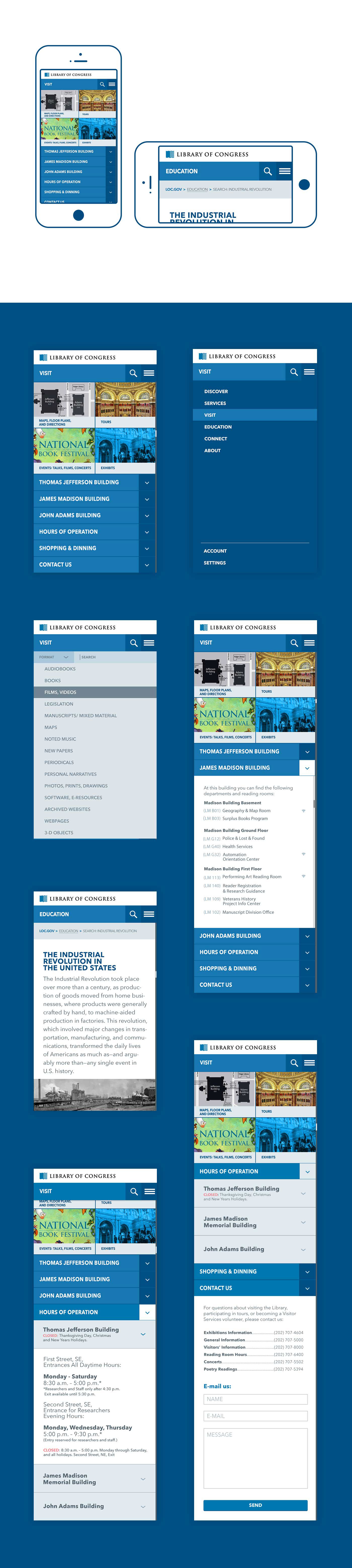
Visit:
in this section people can find about events like lectures, exhibits, concerts , tours, directions, maps, and general information such as phone numbers for each department and hours of operation. This section needs the most help since the instances in which people would be using it are more likely to benefit or complicate their interaction with the library itself, and therefore the site. When working in this section I though of that person at the library attempting to find something, or the person planing a visit to the library.
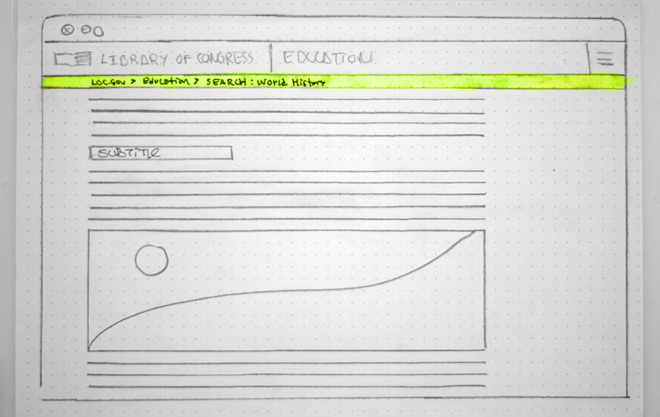
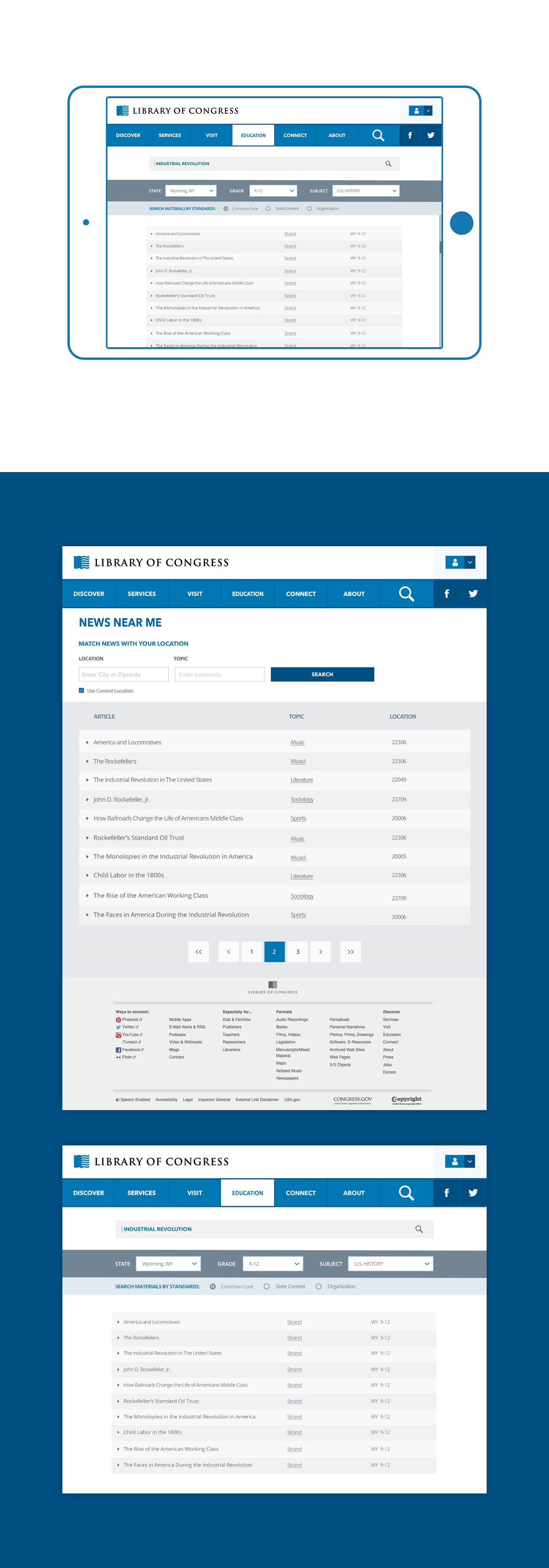
This is a sketch of the advance-search function in the Education page of the site. After a short glance it was clear this form needed to be simpler. This below would be an article from the search results, by clicking in one of the items, one can see the breadcrumbs so is easier to trace the precedence of the content.