Company redressing
plan it simple
plan it simple
The biggest factory for plastics in the Balkans, "Peštan" needed a new visual identity and a new company slogan to advance to export market.
Peštan's main product are pipes, plain and simple. Chances are, if you are living in the Balkans your household is using some of their plumbing.
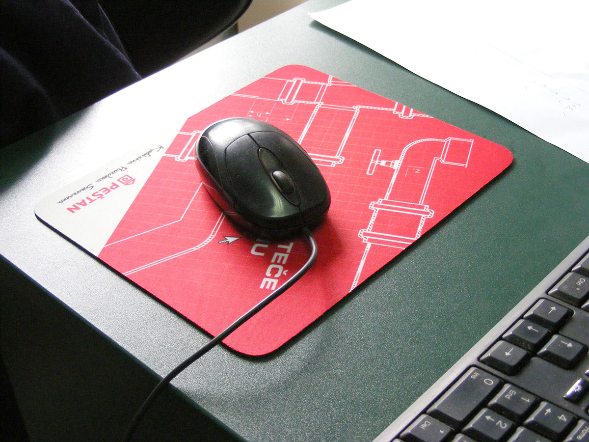
Peštan's new slogan (Da sve teče po planu) has a double meaning in Serbian language and with a target group designated as plumbers and builders it was clear that a new design should appeal to those that love that everything works out according to a plan of construction.
It is interesting that design is made out of 4 elements: background gradient, grid, pipes and logo.
Simple design made it possible to quickly adapt it to over a 1000 plumbing shops in Serbia that required branding.
With a 1000 shops, website, flags, corporate material, trucks, packaging and various printed material all receiving a new dress, this is one of my works that got the biggest exposure.
Peštan's main product are pipes, plain and simple. Chances are, if you are living in the Balkans your household is using some of their plumbing.
Peštan's new slogan (Da sve teče po planu) has a double meaning in Serbian language and with a target group designated as plumbers and builders it was clear that a new design should appeal to those that love that everything works out according to a plan of construction.
It is interesting that design is made out of 4 elements: background gradient, grid, pipes and logo.
Simple design made it possible to quickly adapt it to over a 1000 plumbing shops in Serbia that required branding.
With a 1000 shops, website, flags, corporate material, trucks, packaging and various printed material all receiving a new dress, this is one of my works that got the biggest exposure.