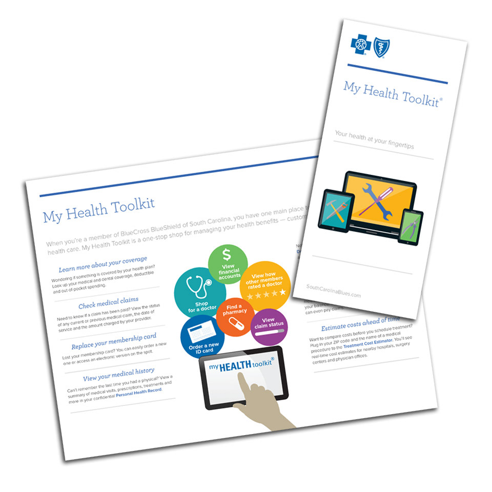
Recently I was tasked with developing a new design system for my main client at BlueCross BlueShield of South Carolina. My client requested the use of more infographics and graphics as opposed to photos and heavy copy. I wanted to give the pieces a very clean, fresh feel which would be easy to replicate through various printed materials as well as presentation platforms, such as Powerpoint. Since some pieces will still have a good bit of copy, I thought it best to format the text in a way that breaks it in to more easily readable chunks. This design system has been so well received that we are now pushing it through all areas of the company and the collateral material they produce.