


Type of work:
Previously ‘As du Placard – Kastenkenners’, Camber is a chain of 14 stores in Benelux with more than 25 years of experience. Camber was the first store of its kind in Brussels, specialising in functional and custom made home storage. Camber approached us to reposition their brand by aligning their image across all communication tools.
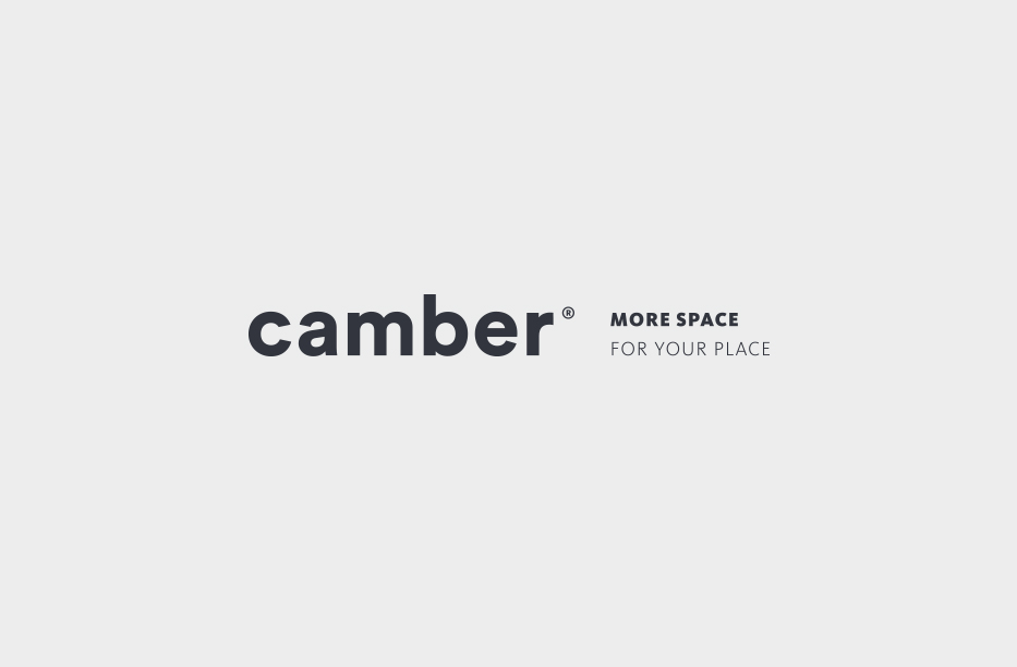
The project began with finding a suitable name for Camber, as well as providing the client with a professional visual identity that would enable them to expand to new international markets. The name ‘Camber’ was developed from 2 sources:
1.) It was the first store close to the district ‘la Cambre’
2.) ‘Kamer’ meaning room in Dutch
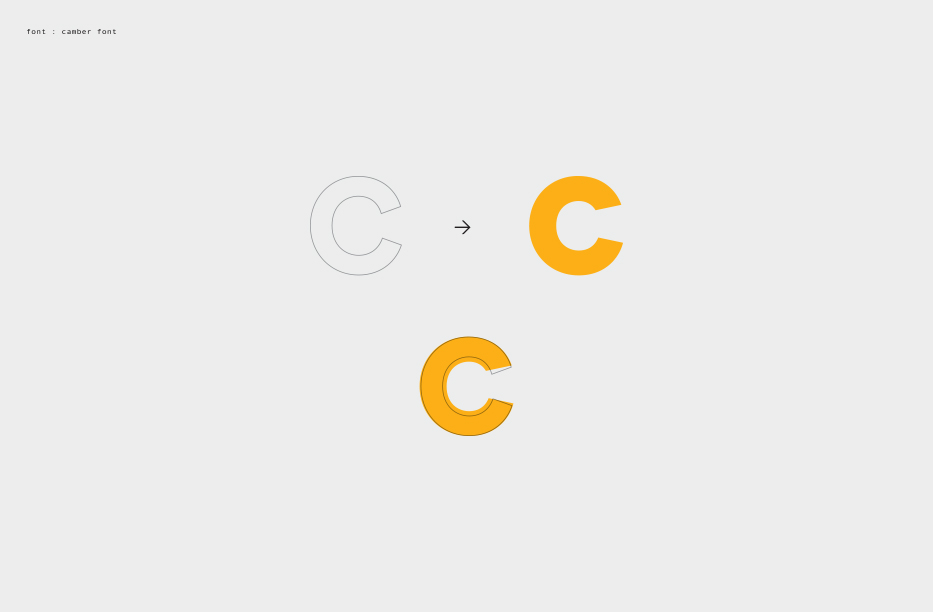
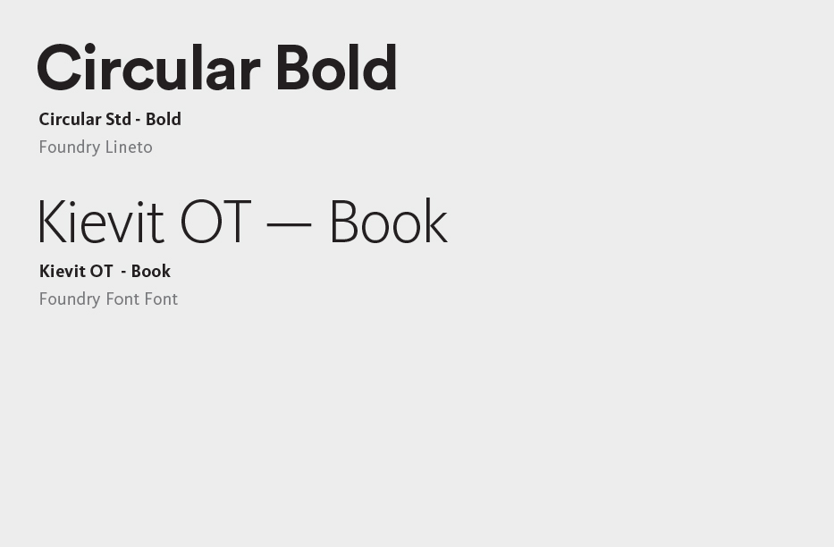
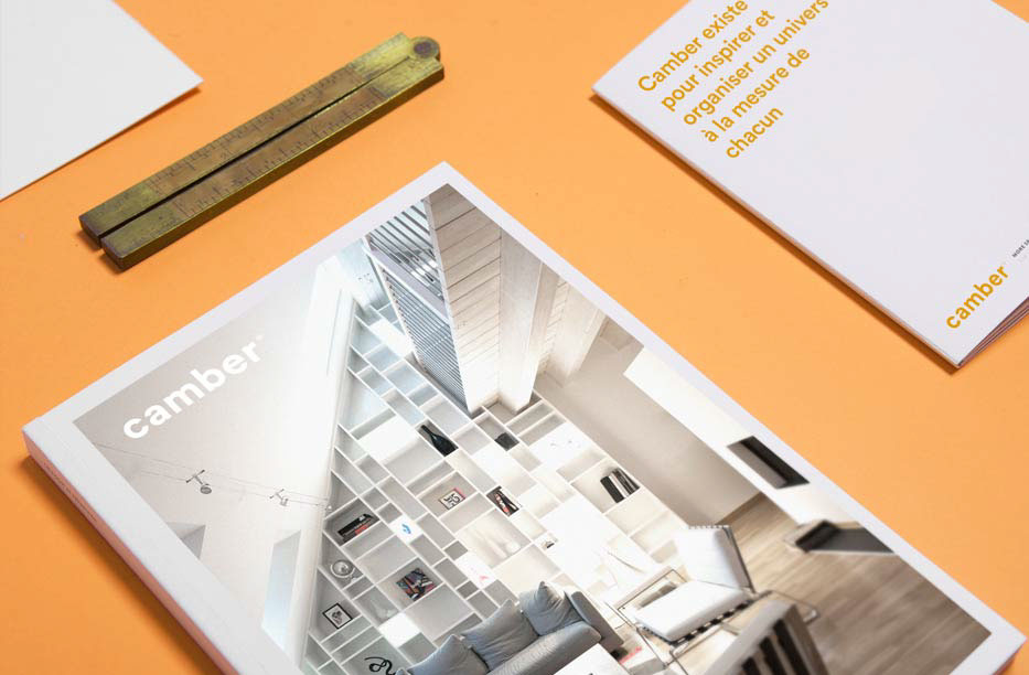
The colour orange was chosen as it represents friendliness – aligning with the ambition of the company to remain close to its clients. A customised version of the Circular font was used to provide a unique identity for the brand within its segment/market.
The project began with finding a suitable name for Camber, as well as providing the client with a professional visual identity that would enable them to expand to new international markets. The name ‘Camber’ was developed from 2 sources:
1.) It was the first store close to the district ‘la Cambre’
2.) ‘Kamer’ meaning room in Dutch
The colour orange was chosen as it represents friendliness – aligning with the ambition of the company to remain close to its clients. A customised version of the Circular font was used to provide a unique identity for the brand within its segment/market.
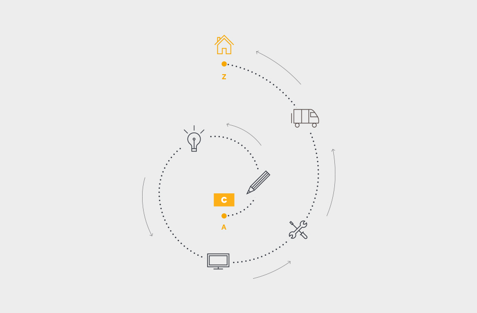
Naming . Visual Identity . Graphic Chart
pictures by: Oskar


