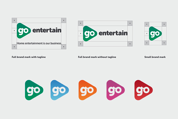
The main "Go" logo is a bespoke mark that takes the triangular play button idea from the previous logo and modernises it. It has been designed to exist on it's own as an instantly recognisable mark that can scale effectively to any size.
To reflect the dynamic and playful nature of the brand there are five core colour gradient versions to be used across all applications. The green is the flagship colour but any others can be substituted depending on the use case.


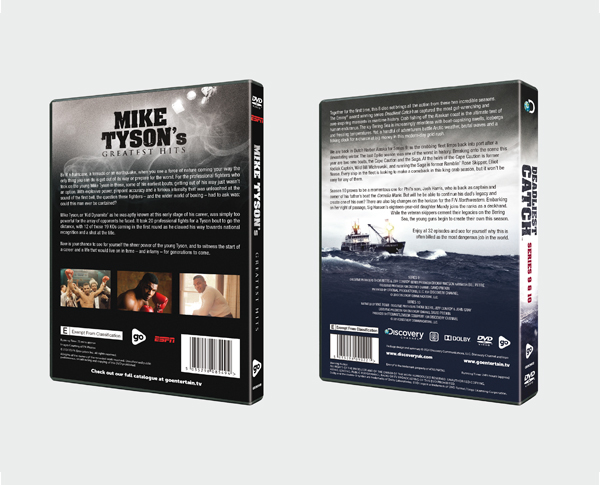
The imagery and phrasing used to convey the brand plays on the idea that the company name “Go Entertain” is actually a request to the user to try something different. To engrain this idea into the company message while making it relevant to the types of products they create, the brand uses iconic imagery blended with a call to action thats ties both aspects together.