Great Skin Guide Identity Creative Concept
The story
The founder of Great Skin Guide (GSG) Kathryn Dodd is one amazing lady. Her mission is to empower consumers to make informed decisions when purchasing skin care products. Many products in the marketplace, including global brands that dominate the supermarket shelf, claim to be 'natural' or even 'organic', but in fact contain harmful ingredients that could potentially cause long term damage to your body. Few of us really know the risk we are taking with our health when applying these products to our skin.
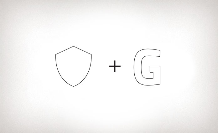
The big idea - shield of trust
On the drawing board, I explored a few approaches. The winning concept was the use of the initial 'G' that forms the shape of a shield. A shield, as you know is an important piece of armoury used in battle to protect the bearer from arrows, swords and other forms of physical attack. The shield symbol was depicted in coats of arms throughout history by royalty or wealthy families. In the modern world, it is commonly used by organisations or institutions that represent authority, knowledge and protection such as universities and medical facilities. For Great Skin Guide, we use the shield metaphor to effectively communicate its brand essence: authority, empowerment and trustworthiness.
As a mobile app, this brand would mostly be accessed by its users through digital media, so the use of the logo in traditional media would be minimal. Thus the design of the logo had to translate well on digital media. Subtle highlight, gradient and drop shadow were added to the icon to give it a three dimensional feel. It really jumps out from the green background and stands proud and prominent, especially when used as an app icon.
When choosing fonts and colours, I studied the natural/organic skin care category for inspiration as the target audience are purchasers of these products. I wanted the logo to have a strong connection to the category, yet not being confused with being a skin care product itself. The gradient green background going from yellowy green to mid green creates a fresh ‘grassy field’ feel, which refers to natural/organic products. The deep purple communicates empowerment and strength. The logo type is adapted from the Nextra family. It is a very clean and streamlined san serif font that has a skin care feel to it with the added strength and authority we were looking for.
The result
I worked closely with the client during the whole process, making minor adjustments here and there. Kathryn is very happy with the outcome and I am very proud to add another inspiring brand to my portfolio. Upon finishing the logo design, I continued to developing a set of images for GSG's social media backgrounds as well as website design.
Find out more
Great Skin Guide: www.greatSkinGuide.com.au
Work with us: www.CreativLi.com.au