


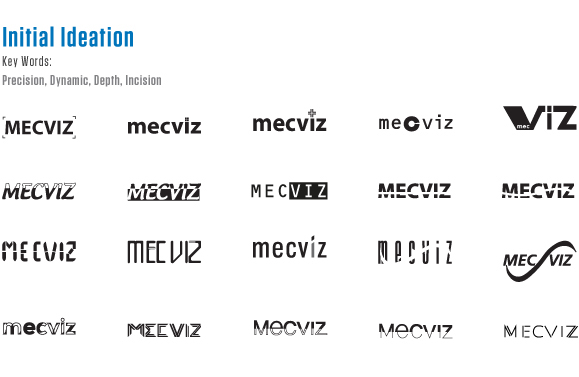
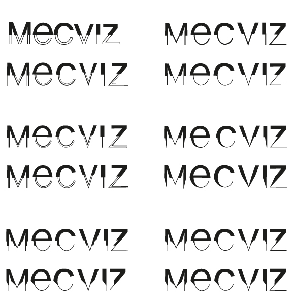


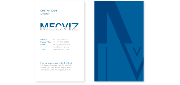
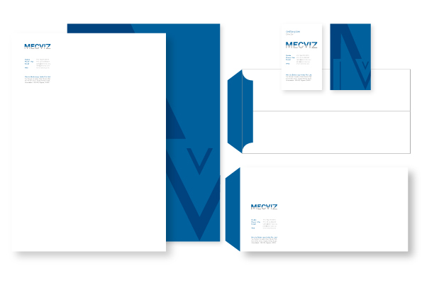
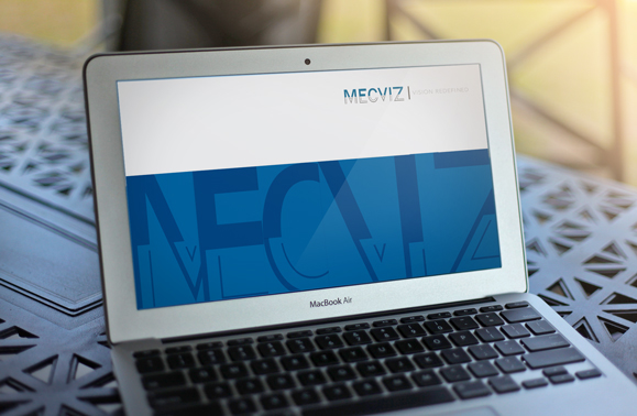
This is the logotype created to give the feel of laparoscope and laparoscopic surgery. The MECVIZ word is divided into two parts so as to give cut (invasion) effect and sharp. Colors are divided into dark and light, reason being dark on upper part to show the force of going in. Lower part of typeface is split in two lines that depict laparoscopic shears.


This is one of the iteration explored for the project...
For complete detailed documentation please visit


