


Imvelo wine
creating the identity for a new line of organic wines from South Africa which would be marketed world wide. These upscale wines are produced in a state that uses environmentally safe practices through out the process. The target market for this product is middle age people, wine aficionados and connoisseurs.
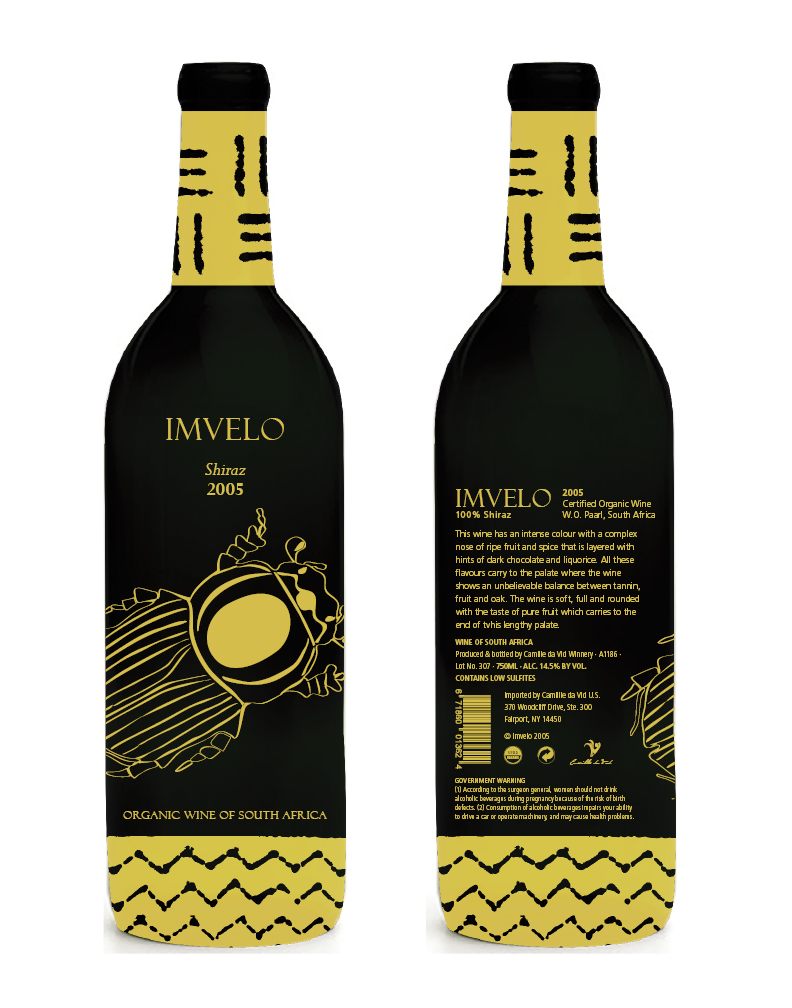
Because this is an organic wine, the focus of the design is on its inherent origin. The name “Imvelo” is a Zulu word meaning nature. The native African patterns used on the neck and bottom of the bottles give them an earthy feeling. The labels are printed right on the bottles using a golden ink and wrapping around it.
creating the identity for a new line of organic wines from South Africa which would be marketed world wide. These upscale wines are produced in a state that uses environmentally safe practices through out the process. The target market for this product is middle age people, wine aficionados and connoisseurs.
Because this is an organic wine, the focus of the design is on its inherent origin. The name “Imvelo” is a Zulu word meaning nature. The native African patterns used on the neck and bottom of the bottles give them an earthy feeling. The labels are printed right on the bottles using a golden ink and wrapping around it.
Fonts: Felix Titling regular, Perpetua italic and bold, Frutiger LT Std family. Pen and ink illustrations–CMYK: 10 26 84 02. Label size 10.5 x 6.875 inches, fist 750 ml standard bottle. Software used: Adobe Illustrator, Photoshop and InDesign.

Ink Sketches


Photoshop mock-up


