The Research
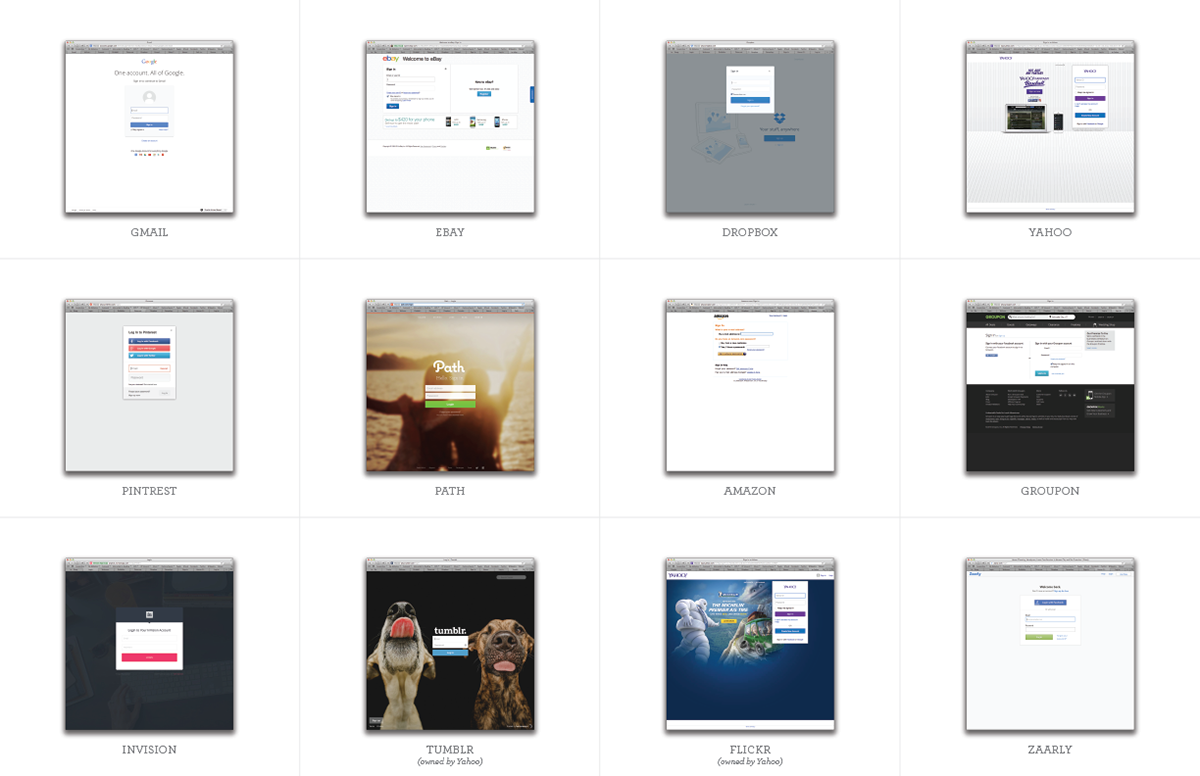
I started out by researching how several other websites handled "sign in" on their products. Currently FamilySearch is using their "sign in" page to also be a starting point for registration, because the only way to create an account is click on "sign in" in the top right of the site. I think this is overcomplicating something that should be very simple.

Next I researched how those same products treated their welcome page or their logged out home page. I noticed that their primary calls to action were centered around account creation or registration.
Current FamilySearch Sign in page

This was the initial sign in page that I designed. This page is providing value propositions, which makes it look like FamilySearch is needing to convince people of why they should "sign in."
Really, we are doing this, because the sign in page used to be the only doorway into creating an account. We have made progress in providing other calls to actions and paths directly to the registration page in the header of FamilySearch.org and various landing pages.
Behold! The purposed future of FamilySearch sign in


