
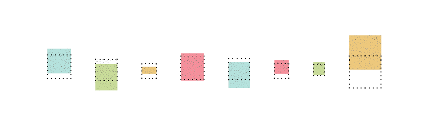


How to read it:
The visualization shows the cost of houses around the world,
in comparison with the greater or fewer resources available to buy or rent a flat.
Considering square 1 (dotted square) as historical average
and square 2 (coloured square) as 2013 variation compared to the historical average,
the percentage variation of salaries and rental fees is shown by
the shift of square sides A and B along the vertical axis


