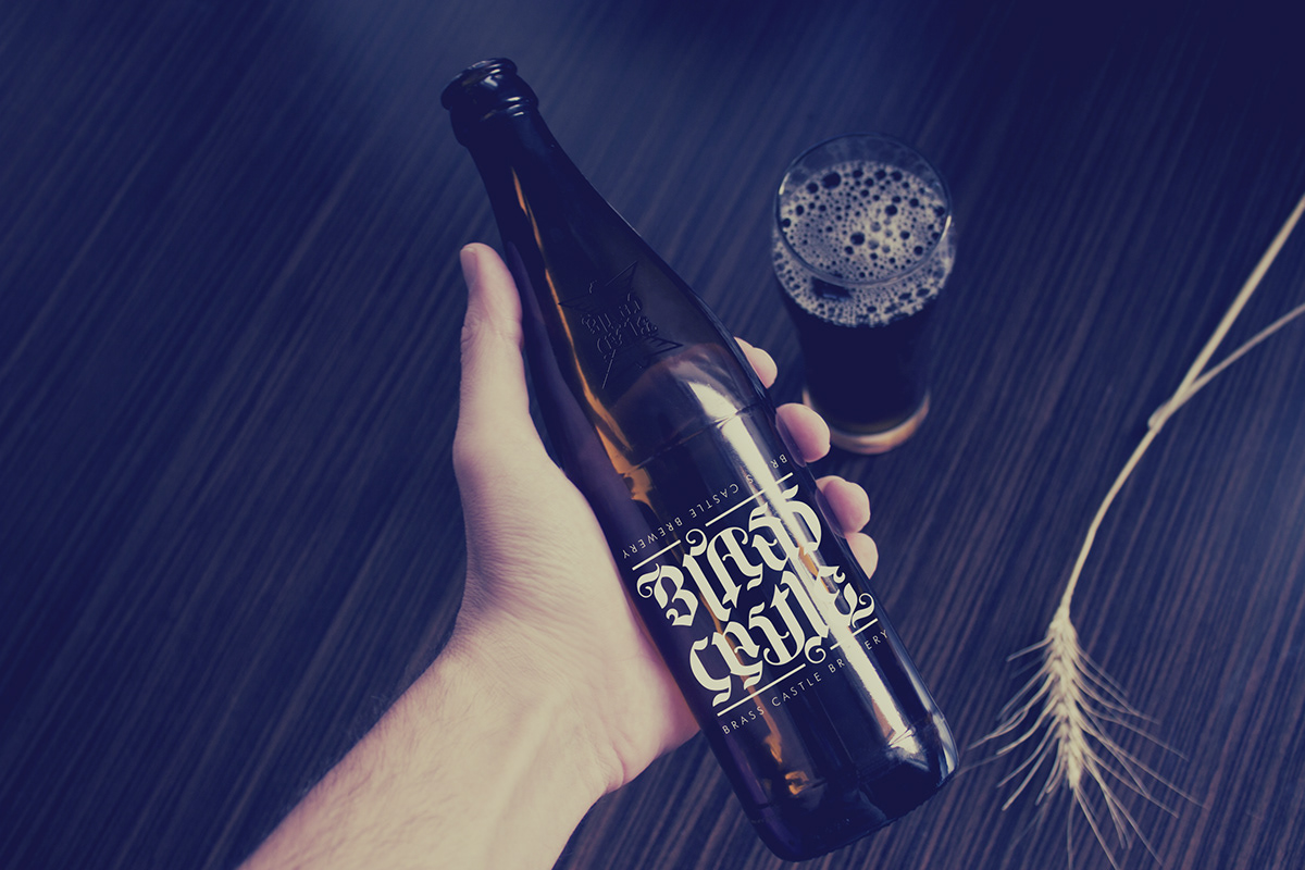
Brass Castle are a real ale microbrewery based in North Yorkshire, making cask-conditioned, keg and bottled beer.
Ian and Phil (owners) came to us at a stage where they were scaling up the business. Bigger brewery, a bar, bottle beers and well as an impressive list of cask ales. A rebrand made perfect sense. The brief excited us and we were very much on the same lines, as far as staying away from the stuffy, real ale, ‘old-man-pub’ visual.
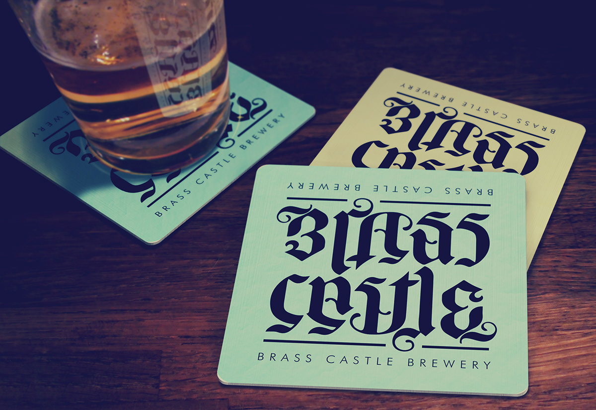
This idea came about whilst thinking into the most important aspect of beer drinking – socialisation. A friend across a table, a chat across a bar with a bartender, a game of snooker – the ‘perfect’ logotype design, would be one that is perfectly ambigramic and reads the same from both top and bottom. If you were to place a branded bar coaster down, both sides of a table/bar/snooker table could read it, the same.
We managed to achieve this, with a modern take on gothic text. The colours are soft pastles that just tone down the muscular look of the letterforms, allowing a broader, younger audience that does not aim at a particular gender/sexuality/age. These colours are rarely used in the industry and gives a real impact in a dark, bar/restaurant.
Beers are identified by colour and a symmetrical icon.


WHAT THEY SAID:
“Once we had decided that brewery expansion provided an opportunity to refresh our brand, Choir of Vision were quick to identify the proposed new direction and tone that we struggled to articulate. The ambigram logo elegantly captures beer’s communal and conversational associations, while also distinguishing our modern craft ales from more traditional beer branding. At every stage Choir of Vision have guided us through options whilst clearly and helpfully indicating the optimal solution. We couldn’t recommend Choir of Vision highly enough.” - Phil Saltonstall (owner)
“Once we had decided that brewery expansion provided an opportunity to refresh our brand, Choir of Vision were quick to identify the proposed new direction and tone that we struggled to articulate. The ambigram logo elegantly captures beer’s communal and conversational associations, while also distinguishing our modern craft ales from more traditional beer branding. At every stage Choir of Vision have guided us through options whilst clearly and helpfully indicating the optimal solution. We couldn’t recommend Choir of Vision highly enough.” - Phil Saltonstall (owner)