Cubica_2 alphabet, character by character in a big size.
CUBI-K >> CUBICA_2
Cubica's project began in 2008, during my first year in college. As the final test, my professor challenged us to design a font and a typographic poster for a movie using this font.
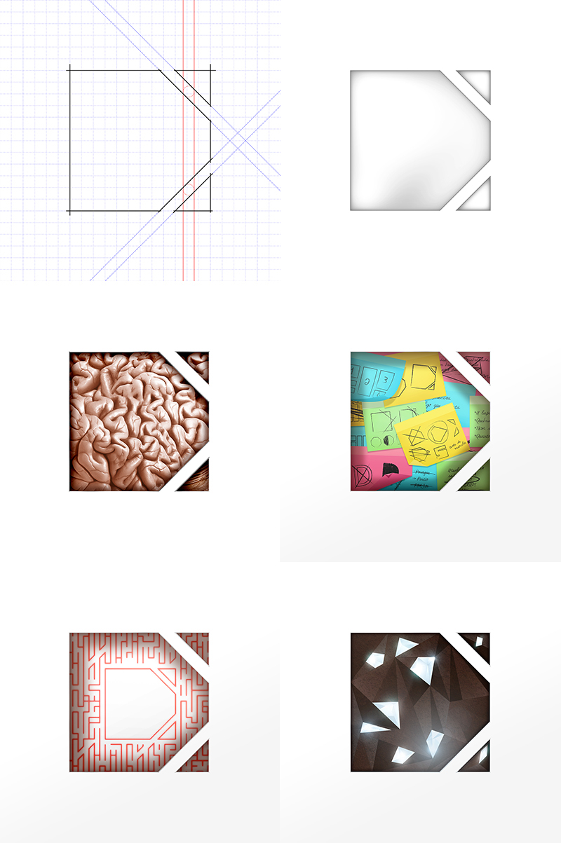
I created Cubi-k, a geometric alphabet that obeys some rules (e.g.: each character has to be monospaced, to be the result of a sliced square by a limited number of lines and angles, must not contain any rounded part, etc). I chose the movie "Cube 2 - Hypercube" as theme. The final art can be seen here.
The alphabet below belongs to Cubica_2, the enhanced version of Cubi-k. The spaces between letters and the slices in in them are wider and clearer, so although they still form a visual unity, as a dense dough, it's possible to see the ways through its shape, like many veins or even a big maze.

Cubica_2 alphabet font wall

My business card. Cubica_2 is the oficial font of my visual identity.
I designed Cubica focusing in keeping the characters always together in order to create vast possibilities of application. I call it Typographic Wall. It's not difficult to mix characters to find beautiful geometric patterns or just joining them randomly to form cool font mazes.

Typographic wall and patterns in Cubica_2 style

This is the first and second typographic t-shirts I designed based on Cubica_2 font (front / back arts). I plan to create another ones and explore more and more the Cubica family potential each time a stamp will be designed.
The first ones keep the primal concept of the Cubica family and brings some elements back from the fontwall: solid and basic visual, focused on the shape and using color as contrast.
The first ones keep the primal concept of the Cubica family and brings some elements back from the fontwall: solid and basic visual, focused on the shape and using color as contrast.


Cube 2 - Hypercube poster
The first Cubica_2 Version, called Cubi-k
Cubica_2 experimentations
Some tests of textures and videos made in Cubica_2 style, mixing music, typography and motion.