
Logo Rational
To showcase feminine strength and resilience, we chose to use the well-known legend of the phoenix
as the main inspiration. The logo itself is a stylization of a phoenix rising from the ashes. It is an emblem of renewal, a positive Icon of strength, resiliency and of course hope. It represents and focuses on the women and children themselves, not the organization, creating a more direct bond with Nelson House’s clients. The shape of the phoenix is reminiscent of a bright flame, hopeful and alive.
as the main inspiration. The logo itself is a stylization of a phoenix rising from the ashes. It is an emblem of renewal, a positive Icon of strength, resiliency and of course hope. It represents and focuses on the women and children themselves, not the organization, creating a more direct bond with Nelson House’s clients. The shape of the phoenix is reminiscent of a bright flame, hopeful and alive.

A strong colour palette was essential to compliment the design. The hues we chose coordinate and contrast with
each other for a beautiful yet meaningful look. An obvious choice was
each other for a beautiful yet meaningful look. An obvious choice was
Yellow; it’s a positive, uplifting colour that represents hope and happiness, a sign of things to come.
Blue; to represent trust, loyalty and professionalism, in two different shades to add dimension.
Red; essential, its associations with strength, power, and vitality that draw attention and call for action to be taken. Both Red and Yellow also call back to the phoenix and flame imagery of the logo.
Black; finally, we use a subtle amount of black to convey boldness and empowerment and to give solidity to the design.


Conclusion
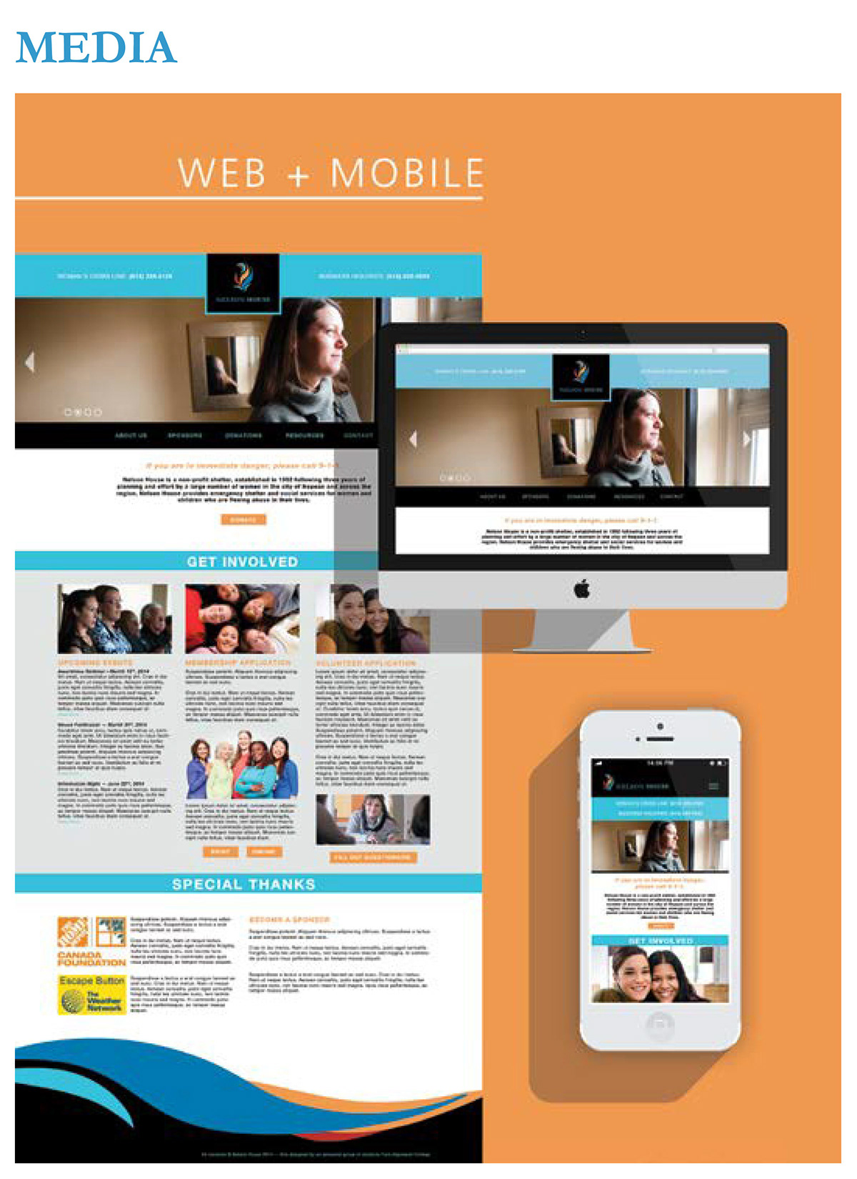
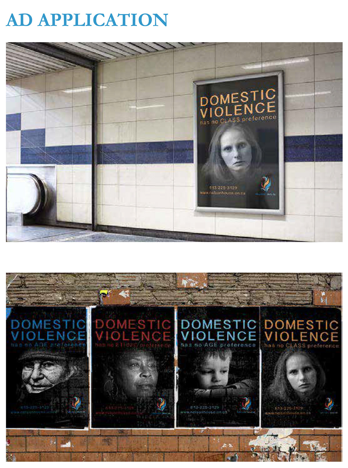
Our re-brand is successful in communicating strength, resilience, security, safety, professionalism, authenticity and hope, staying true to the organizations value and culture. We believe this unique, polished approach will encourage potential sponsors and partners to fund and work alongside Nelson House. The approachability and warmth of this re-brand ensures the clients and the public that Nelson House is a genuine, reputable, accepting organization. Thank you for viewing.

