Simple things done well
Client: The Empanada Kitchen
Location: Queenstown, New Zealand
Industry: Food
Photography: Troy Tanner
Best Design Awards 2017: Finalist
Published at:

About
The Empanada Kitchen is a small food business based in Queenstown, New Zealand. They produce empanadas - traditional savoury pastries with the shape of half a cloud. Originating from Spain, they are very popular throughout South America and play a vital role in their culture. Our client avoids monotony by changing their flavours all the time, experimenting with high-quality products, and collaborating with other local producers. They believe in good and honest food, done simply, done well.
Branding
Context: The Empanada Kitchen approached makebardo to create an identity for their new business project. The aim was to create a clear communication of a product that does not exist in the New Zealand market. While this product has a really strong identity in South America, our challenge was to create a new brand with a contemporary look and move it away from its stereotypes.
Solution: In this case we use the mantra "simple things done well". The concept was centred around the idea of making something really simple, with a few elements but with the best quality ever. Also the chef innovates a lot with the flavours, but always making something simple and unique.
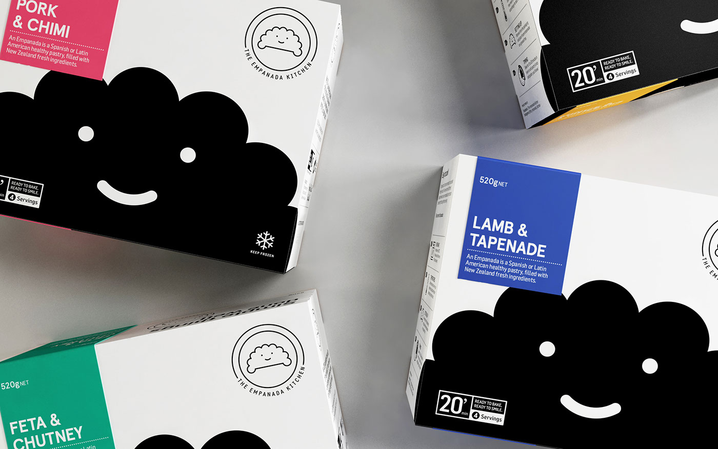
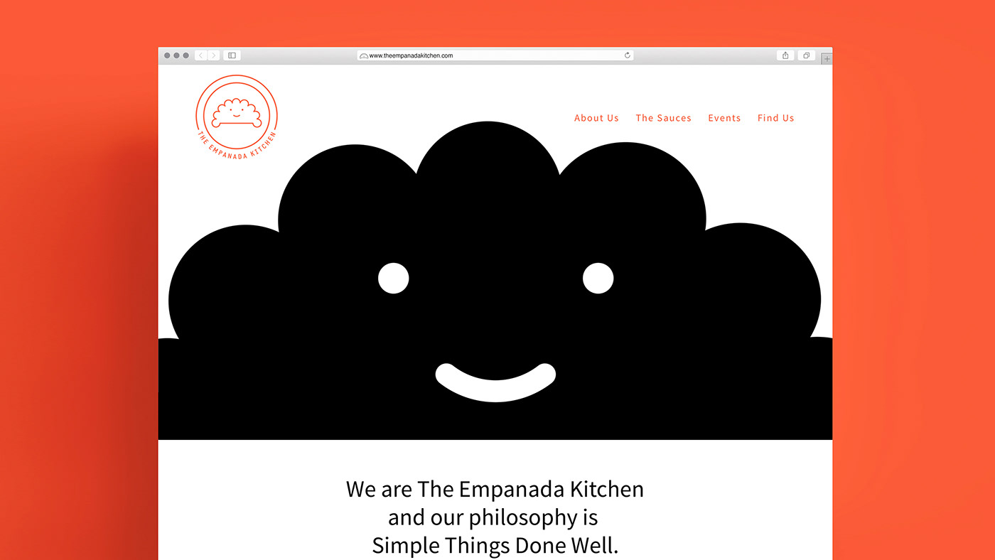
We used the shape of the product to create a recognition with the people. You will eat the same shape as the logo. So we spread this in the identity, adding a face to make a friendly character which is more inviting to the people.
A combination of two colours plus white is a response to the two product lines (empanadas and sauces). You can see a prevalence of the bright red colour for the empanadas and the black color isused for the sauce line. Finally we created an identity that establishes the promise of an engaging taste experience, unique & friendly.
Frozen empanadas packaging
Our client challenged us to create packaging for their frozen line capable of capturing the New Zealand market and educating them about a product that has never existed. We had to create a pack with a modest budget, that would be flexible given the client’s wish to experiment with flavours and not be wedded to initial flavours launched.
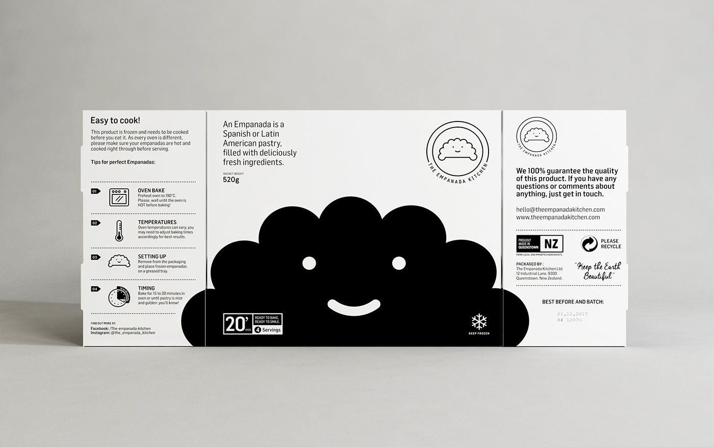
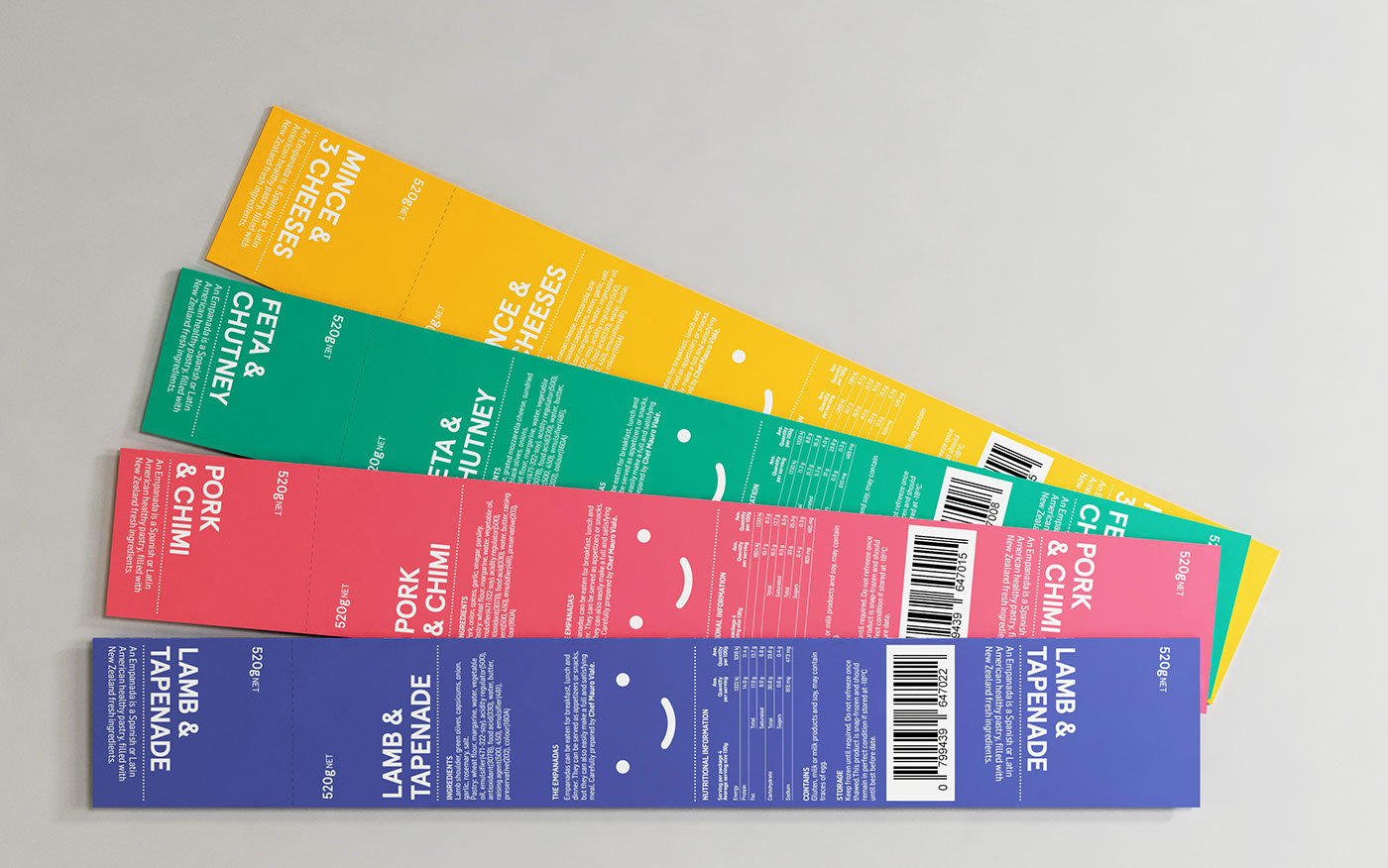
Our design approach respects the brand philosophy by creating something fun, flexible, unexpected and completely different through aesthetic simplicity and communicative clarity within a visually competitive context (but not at the expense of perceived quality). Our solution was to produce one single pack with the necessary information about the brand and the product. In order to differentiate the flavour editions we’ve created a labelling system also as a solution to the closure of the box. Doing this we gain versatility and flexibility to adapt the packaging according to the needs of the client, allowing future flavour experimentation with a low cost investment.
We’ve developed a clear front pack architecture using the shape of the logo. The idea was to create a friendly character (Mr. Emp) to generate an immediate recognition of the brand by the consumers. The illustration was created to appeal to a broad audience. It is full of personality with a youthful but not childish aesthetic. Because it is grounded by a clear communicative intention, an emotional bond is fostered between product and consumer. This raises the brand’s value, because only packaging that is capable of connecting with the consumer can become an unconditional product.
The bright label colour palette is an impactful and memorable visual tool for clearly dividing flavours. However, this is tempered by the white and black of the box that contributes to a distinctive and unique brand character suited to a high-quality product.
We avoided the traditional messages often used in the frozen food industry. We took this risk because we know that we must surprise the consumer if we want to sell this new product. A guaranteed way to seduce the consumer is by differentiating oneself from the rest. We've worked within a brand language that is quirky, engaging, honest, cheerful and sophisticated. The packaging design stands out amongst competitors, creating an appealing eating experience.
The result finds a good balance between a trend for simplicity and unique brand personality. Each choice is well founded, communicatively precise and understandable. The brand and its design propose a paradigm shift, rather than anything that will be short-lived.
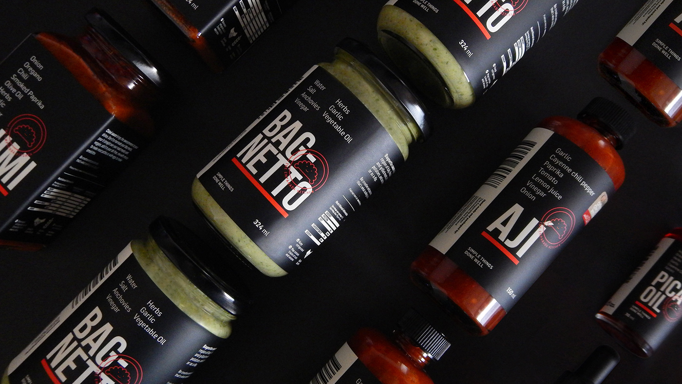
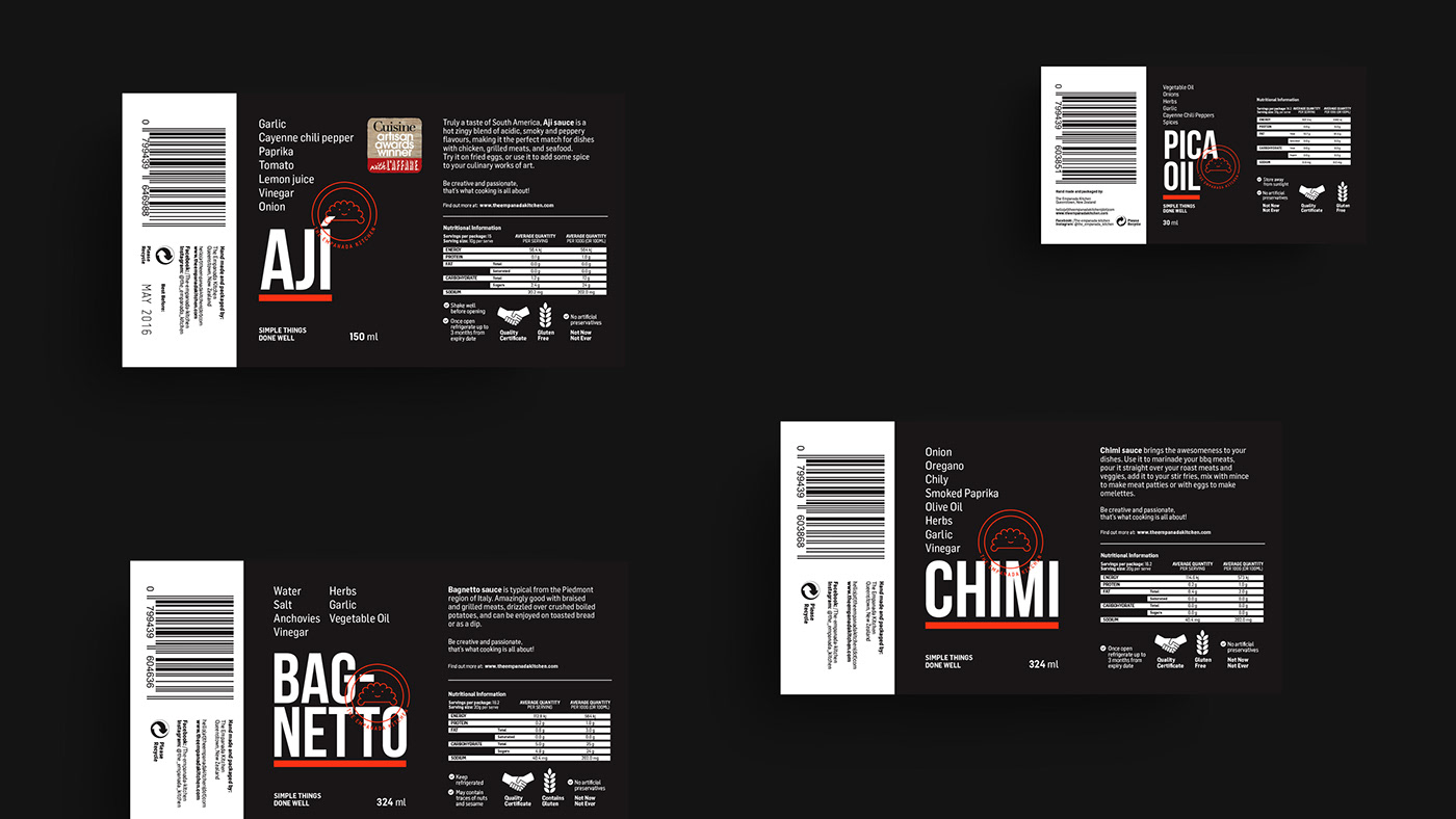
Sauces packaging
Context: Create a subcategory of the products in the brand. In this case our client needed a visual identity to make their packaging design for The Empanada Kitchen sauce product line. This was a new range of product that needed to be part of the whole family brand but with a different character.
Solution: We approached this project with the premise that in the main identity we used the illustration as a protagonist. In this case the typography would be our ally in developing a solid and strong identity, with other tones of communication being more gourmet and adult. For this reason we picked black as the main colour to emphasize the noble spirit of this subcategory of products.
Our work
Brand Design
Concept Development
Food Truck Design
Illustration
Packaging Design
Print Design
Retail Design
Visual Identity
Web Design