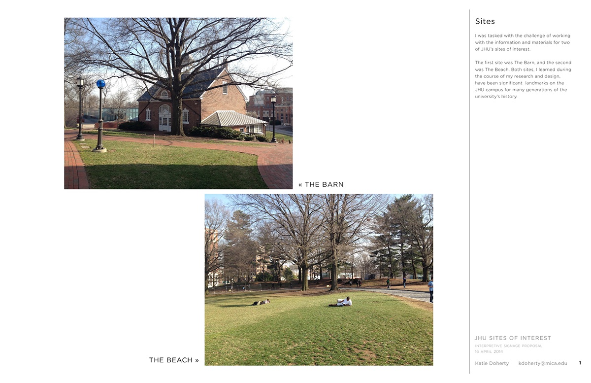
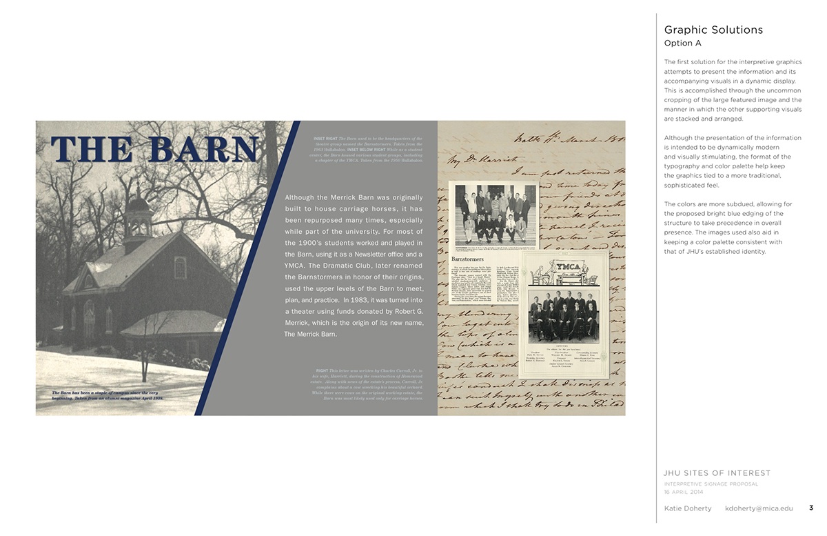
I was tasked with the challenge of working with the information and materials for two of JHU’s sites
of interest. The first site was The Barn, and the second was The Beach. Both sites, I learned during the course
of my research and design, have been significant landmarks on the JHU campus for many generations
of interest. The first site was The Barn, and the second was The Beach. Both sites, I learned during the course
of my research and design, have been significant landmarks on the JHU campus for many generations
of the university’s history.
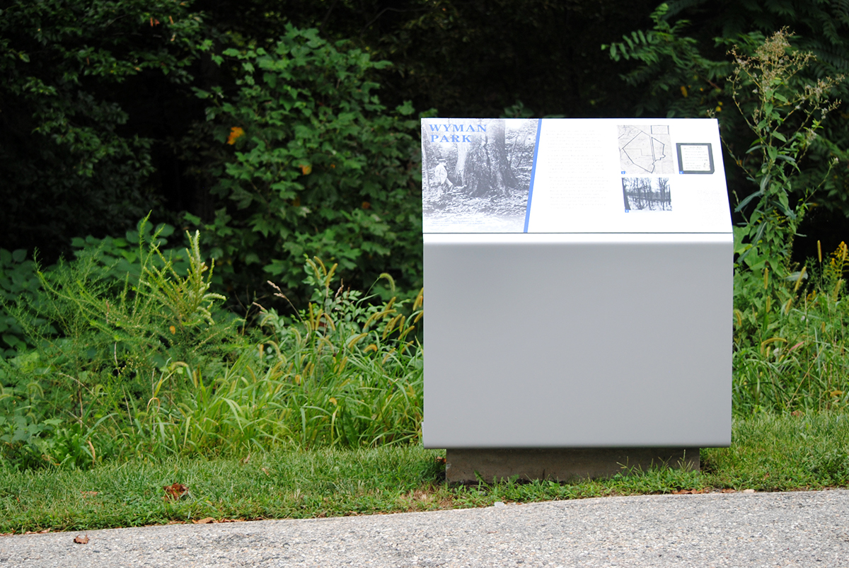
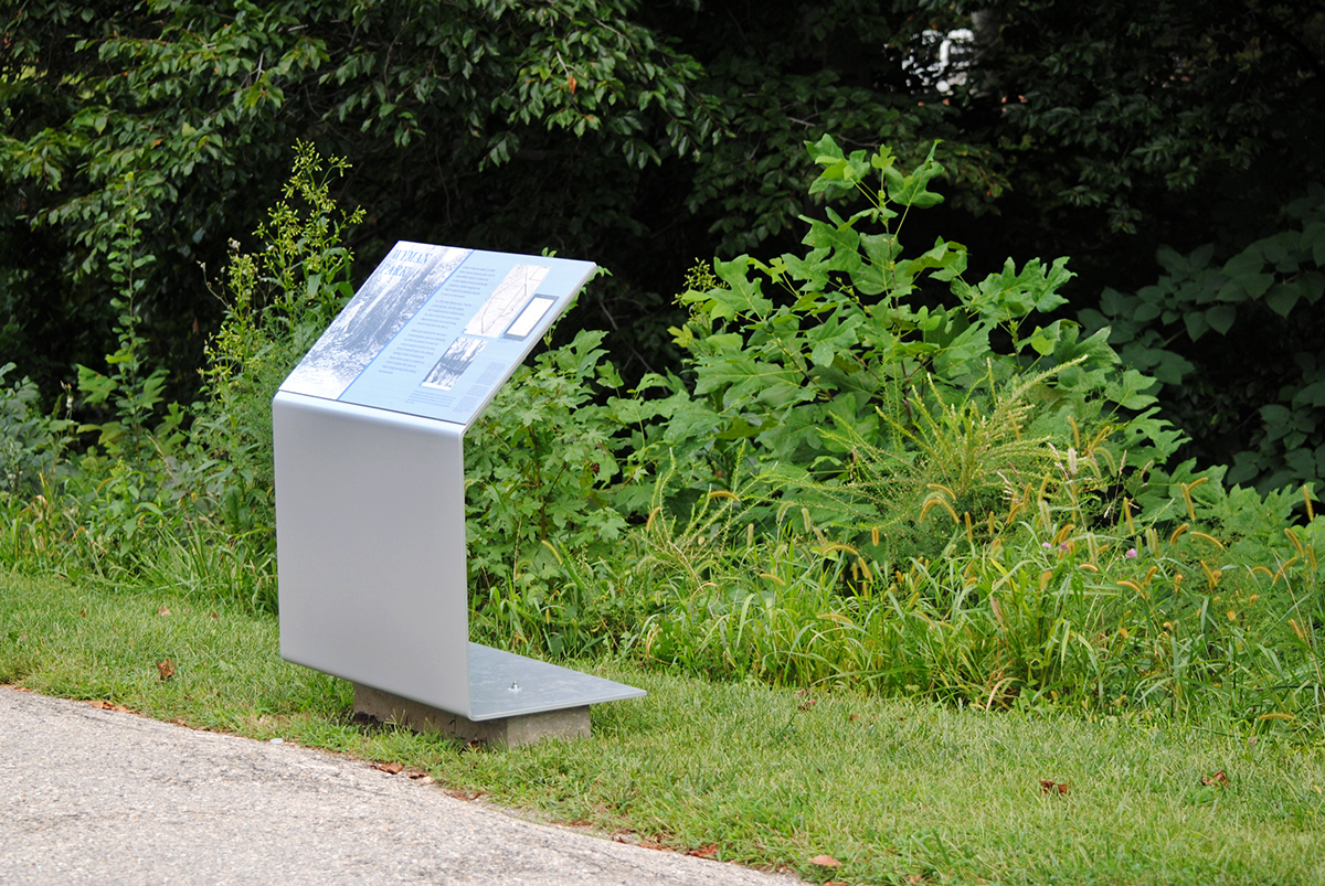
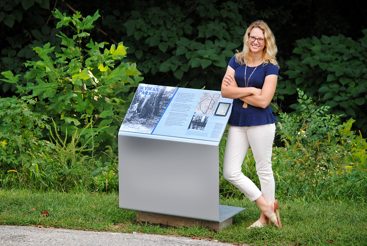
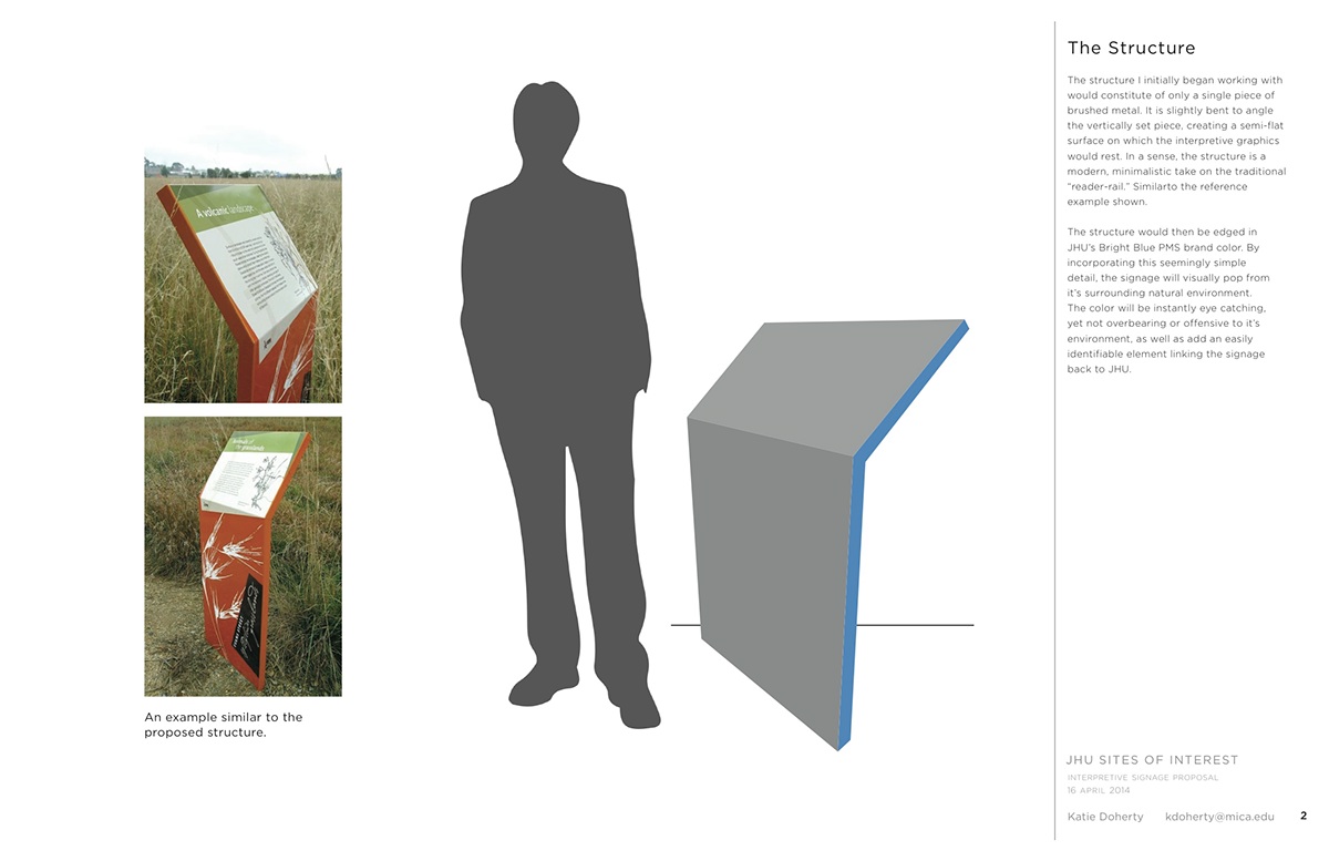
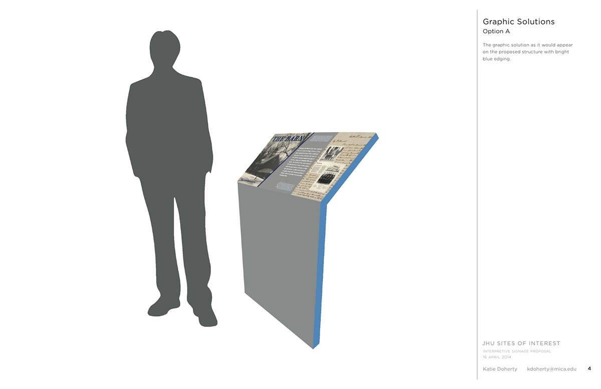
The structure I initially began working with would constitute of only a single piece of brushed metal.
It is slightly bent to angle the vertically set piece, creating a semi-flat surface on which the interpretive graphics would rest. In a sense, the structure is a modern, minimalistic take on the traditional “reader-rail.” Similarto the reference example shown.
It is slightly bent to angle the vertically set piece, creating a semi-flat surface on which the interpretive graphics would rest. In a sense, the structure is a modern, minimalistic take on the traditional “reader-rail.” Similarto the reference example shown.
The structure would then be edged in JHU’s Bright Blue PMS brand color. By incorporating this seemingly simple detail, the signage will visually pop from it’s surrounding natural environment. The color will
be instantly eye catching, yet not overbearing or offensive to it’s environment, as well as add an easily identifiable element linking the signage back to JHU.
be instantly eye catching, yet not overbearing or offensive to it’s environment, as well as add an easily identifiable element linking the signage back to JHU.
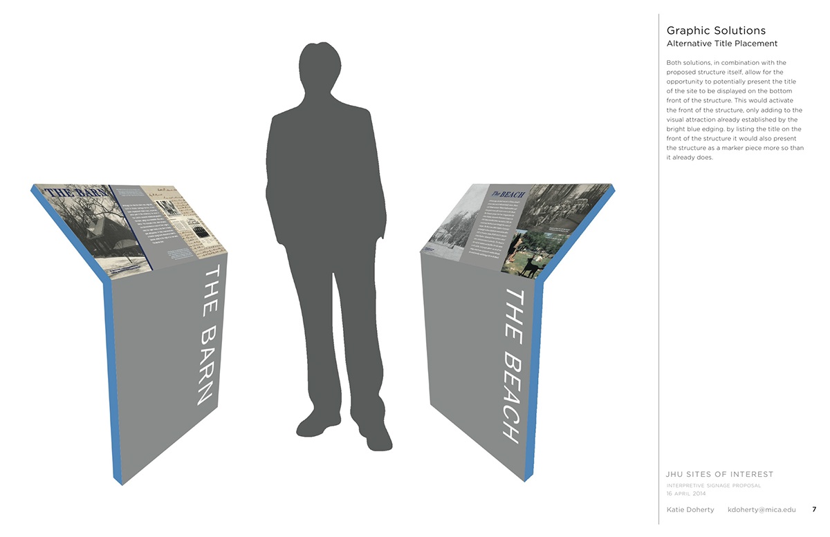
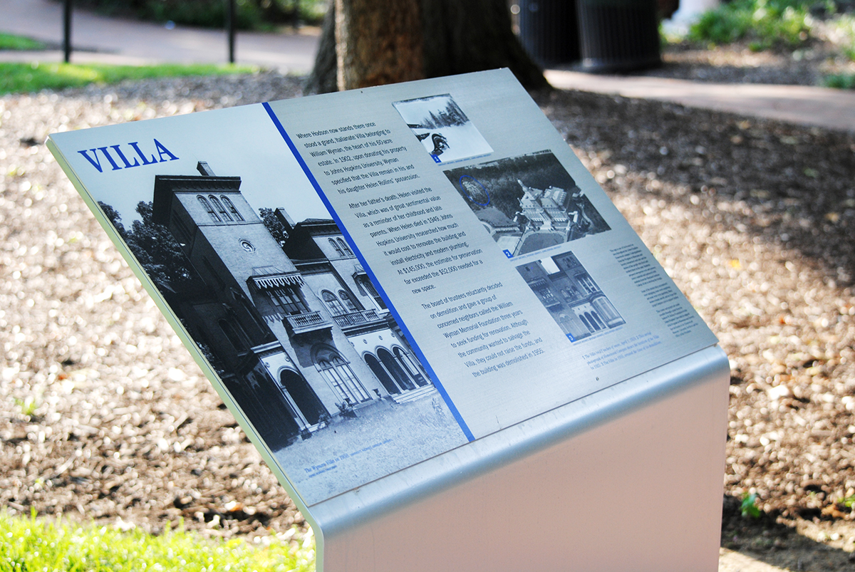
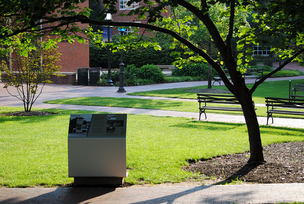
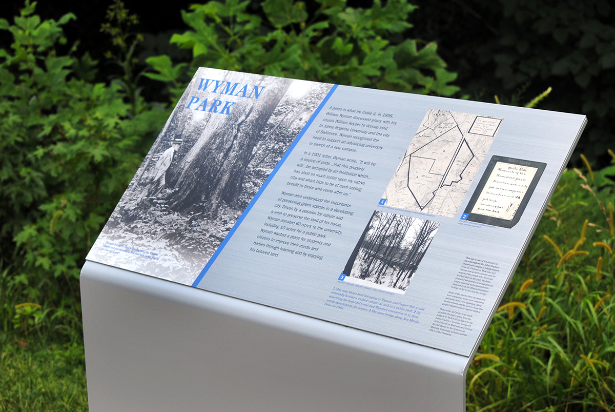
This paricular design proposal was selected by the students of the JHU Museum Studies class in which we collaborated to be utilized for their system of sites. Below are some images of the final structures and design layout during the installation process on the JHU Homewood Campus.