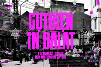
Introducing Cotdien In Dalat (English: Power Poles of Dalat), a heavy condensed sans serif typeface and a revised version of the acclaimed
Cotdien Typeface created by Manh Nguyen in 2016, with new twists and turns. Not only inheriting the distinctive diacritic system that captures the essence of retro Vietnam hand-painted panels, posters and signboards from 20th century, but Cotdien In Dalat also retains the compass-and-rulers character anatomy that was once taught in Letter Cutting Crafting classes in primary schools in the late 90s with the heavy weight, extra condensed that mimics the hand-cut red propaganda banners displayed across Vietnam streets in the 2000s. However, in this update, Cotdien In Dalat embeds new characteristics that highly align with its nameshake of the power poles: subtle contrast added between vertical and horizontal stems, clear cut strokes and sharp angles that echo the crude, geometric, industrialized Brutalism of the power poles' structure (typically made from concrete with molds), and rather than the unicase set of characters of the original, new Cotdien In Dalat has more case-sensitive characters and introduces
new symbols and marks to further broaden the versatility too.
Cotdien In Dalat is now listed available on Creative Market and Behance. Support the creator by purchasing the font from trusted platforms and
also show your appreciation for Manh's work by Liking this project.
Thank you for your support, cheers!


