Atway is for the adventurer who dares to go where a signal won't follow. Pronounced "uh-tway," the Twitter-based app publishes timed messages when a user is away from the platform for a set period of time.
The problem
A good concept with a good name, Atway needed a mark and app icon to help visualize the idea and capture its character.
The thinking
Have fun moving quickly through an accelerated design process. Don't over think it and take inspiration from Twitter.

Since Twitter is platform at the base of this app, I started thinking "birds." I imagined a vacated little bird house, empty because this little birdy was out adventuring. We'll come back to this later.
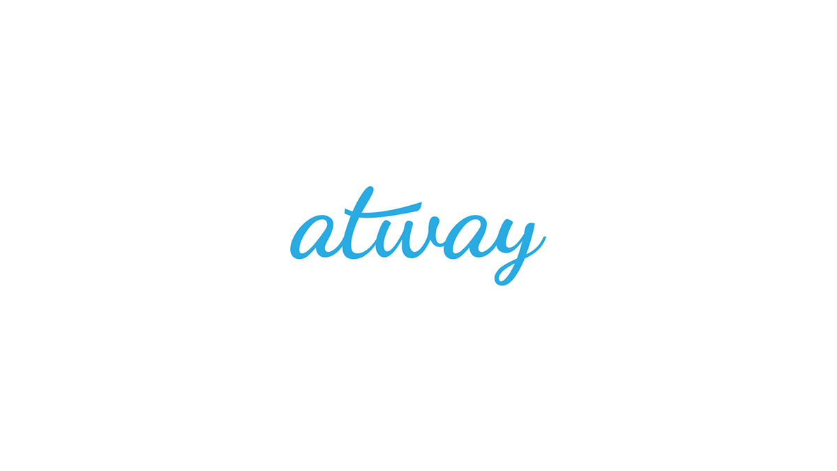
The wordmark needed to feel as cheerful as the famed Twitter bird icon, sweeping upward and appearing jovial. I used Google Font's Dancing Script as my foundation for the letterforms, making several adjustments to shapes and ligatures to give the name a whimsical feel.

Next, I thought about visual indications of someone being 'away.' Quickly, the idea of a sign temporarily hung at an entrance to inform visitors of one's unavailability. That formed the basis of the next stage of development for Atway's identity design.
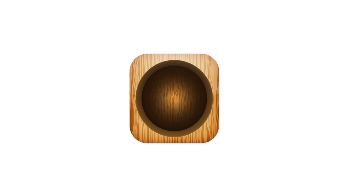
Back to the empty birdhouse inspiration. With some study of woodgrain patterns, I digitally illustrated my rendition of a birdhouse entrance for the backdrop of Atway's app icon. I really wanted the design to resemble its real world counterpart so it felt like a place where some sort of bird lived.

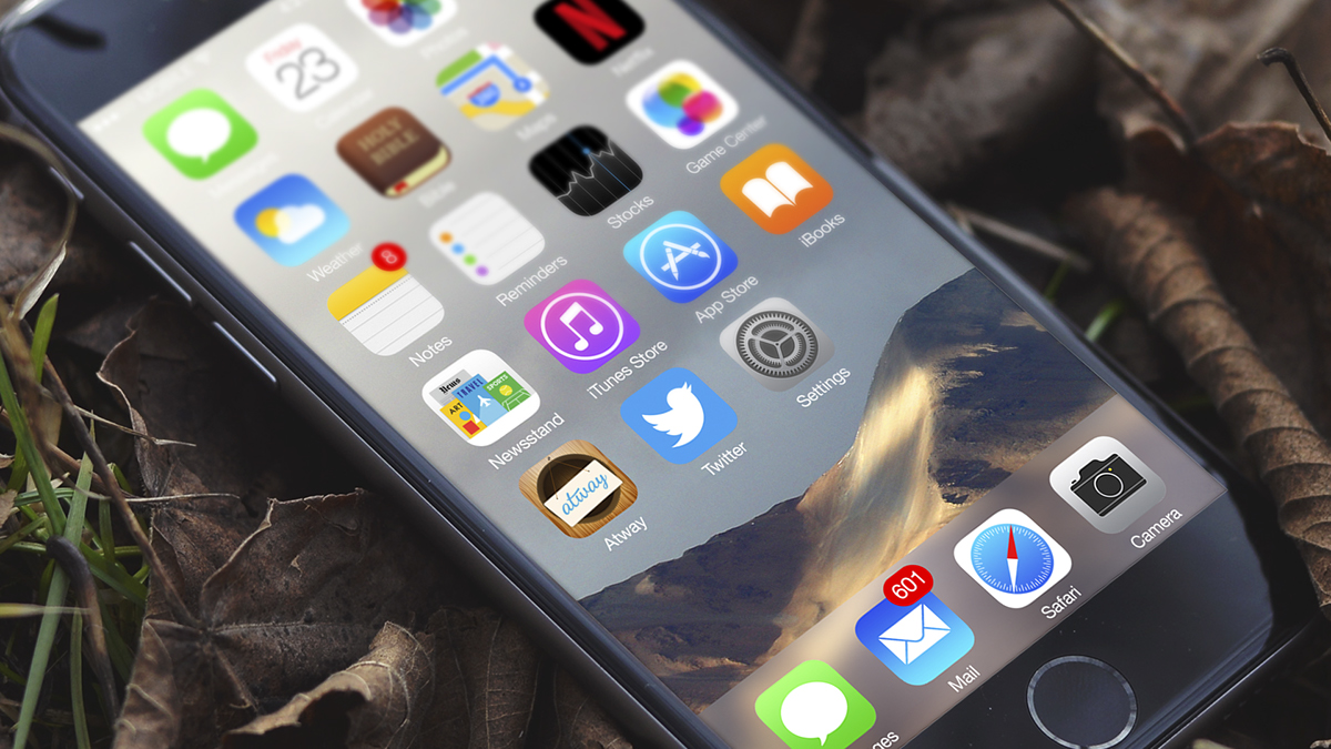
Thee wordmark, hanging sign and skeuomorphic birdhouse hole all came together nicely to form the app's icon.
Making it personal
After the design was well established, I wanted to explore another aspect of the brand—it's voice (personality) and tone (mood). Building on what was created, I designed three compositions featuring a user's note to their friends and followers. They serve to illustrate adventure-seeking personality of the brand and its would-be users.


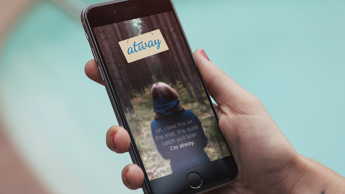
The app would even use the load screen as an opportunity to deepen the connection with its user as they prepare to disconnect with their followers for a while. In a way, Atway is saying, "I get you."


