

Selected works will be uploaded periodically.
All logos, Titles and Characters used here are property of their respective owners.
All images are not listed chronologically and have not been altered since their original creation and final approval.
The following have been either selected or considered to be printed in the Public Gaming Research Institute magazine as well as trade show events.

The image below was the first slide of a small deck to illustrate LotteryHUB history to investors. The second slide contains contains confidental data and cannot be uploaded at this time.


The following are SMMI (Social Media Marketing Images). Several have been used on the LotteryHUB facebook page: facebook.com/lotteryhub.


This image was used to spread awareness that the Wyoming lottery games would soon be featured on the LotteryHUB app. It is purposefully meant as a teaser with a "Close Encounters of the Third Kind" feel since the Devils Tower, a location in the movie, is in Wyoming.


The above two were deisnged to spread awareness of the US team in 2014's World Cup. The first image was used on the LotteryHUB Facebook page.


Spooky.

The above was designed to help illustrate that, on that day, a prized baseball card sale was announced. It has been modeled after an old baseball card: sun bleached and wrinkeled.

The above was the graphic for an article on news.lotteryhub.com to illustrate that the lottery industry is also responsible for contributing millions of dollars being put to cultural programs.


The above two SMMIs, are to illustrate that graphics can be created that incorporate existing branding. These are constantly used on LotteryHUB's Facebook page.

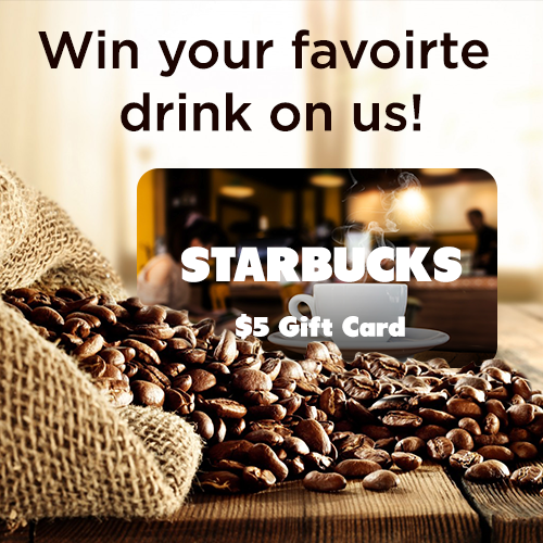
The above two were designed to spread awareness of new rewards in the LotteryHUB app; specifically gift cards from Starbucks.

The above will be used to spread awareness of the LotteryHUB rewards platform. Although unhappy with how little it says about the platform, it does conform to the 20% text rule for Facebook's SMMI guidelines.
The following Oreo image was to show that we can adapt to new partners to put foward proper SMMIs that reflect the branding of the subject matter.
Although not conforming to the standard 500x500 image for Facebook, it was later fixed and posted.
Although not conforming to the standard 500x500 image for Facebook, it was later fixed and posted.

The following three images were used on news.lotteryhub.com. The first image, "Unclamed Prizes-Noir" was designed to spread awareness that millions of dollars of unclaimed prizes are lost. This is partly due to people not checking their numbers, losing their tickets, or simply not understanding that even if a few of their numbers matched a drawing, they are entitled to a prize- no matter how small it is.
The "Air Mail" image was used in an article that illustrates how expensive it could be to buy a tropical island. Like the Baseball Card SMMI, "Air Mail" is also sun bleached and wrinkled.


The above was meant as a conceptual image to showcase who a winner is and where they live. Since, most photos of lottery winners are of a poor quality, The "Coin and Jackpot Winner" is moved over the "State, Name, and Location" square. Depending on the state, this design has been humorously called and now recognized as
"TheStateName-The Movie.png" as the design resembles the movie rating graphic.
"TheStateName-The Movie.png" as the design resembles the movie rating graphic.


The above images are just a few of the many gift card icons I have designed. In the LotteryHUB app, should users identify and constantly use the various functions, they are rewarded points. When enough are earned, these points can be cashed in for small gift cards.
A gift card should not resemble the official designs of said gift card. As such, each card was themed to portray the main product, environment or feel of each company. Fonts are a close approximation of the offical fonts, with the exception of Best Buy, Walmart and Amazon (which was meant to look like a black stamp on a cardboard box). Conversely, "The Best of Me", since LotteryHUB is marketing the film (like "Earth to Echo" and "November Man"), uses an official poster image.
A gift card should not resemble the official designs of said gift card. As such, each card was themed to portray the main product, environment or feel of each company. Fonts are a close approximation of the offical fonts, with the exception of Best Buy, Walmart and Amazon (which was meant to look like a black stamp on a cardboard box). Conversely, "The Best of Me", since LotteryHUB is marketing the film (like "Earth to Echo" and "November Man"), uses an official poster image.

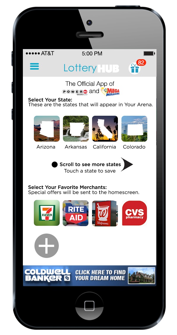
Despite these two iPhone image not showing the same rewards plaques, they show the rewards platform in its entirety as well as one Arriba rewards plaque.

The following two images are ads Fandango and Relativity approved to be used on LotteryHUB's partner websites to spread awareness of not only these movies but of the LotteryHUB Rewards system. These ads can be changed to better suit the latest upcoming movie.


The following are conceptual mockups for a potential redesign of the app for iOS 7 and now iOS8. Both the iOS and Android versions get the same care and attention to deliever unique user experiences that suit their respective operating system and hardware. If these designs are utilized, they will be a part of the 5.0 build.
Despite being purely conceptual work, I have received praise (and eagerness to implement the design) from LotteryHUB's iOS developer, and recognition from Directiors and several VPs. It is a high honor to see and hear that modern designs are recongized by my superiors.
As the senior designer, I play a large part in the design and direction of the LotteryHUB app.
No Windows Phone app is being developed at this time.


The logos listed above are property of their respective owners and used above in a purely conceptual purpose to illustrate how a new rewards page might look.
This is just one of two possible Android directions:
The second version will be added to this gallery at a later time.
The second version will be added to this gallery at a later time.


The following three images were concepts for a startup screen after the user has updated to the current build. The design ultimately changed to resemble the fourth image.


