J&J Enterprises Brand Identity, November 2022


I was commissioned to design a brand identity package for "J&J Enterprises", a parent company for a credit repair business with its own branding as well as a subset of other planned entities relating to the banking and finance industry.
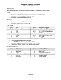
For this purpose I conducted a thorough competitive analysis (attached) to ensure that their brand would be differentiated from the crowd within their market. With this information I sketched 8 rough concepts for the company's logo, iterating on the chosen concept 1 more time before rendering a series of mock-ups for the design between 2 word-mark layouts, about 35 variants for each. These assets are shown below.
The logo outline and shape followed a triangular 'rising bar graph' motif integrated with the eponymous double 'J' of the company's name. The purpose of all of these variants was to provide the business with as much flexibility as the logo could afford for a multitude of use-cases that could be adjusted over time while preserving a strong visual identity independent of the chosen color palette.


The logo variants utilize a color palette with gold, blue, and black as its primary colors, yet also included secondary colors that were either common or complimentary.
With and without wordmarks and between both horizontal and vertical layouts, the gold logo was favored above all others, with the blue and black variants ranked behind for their appeal and ease of use across mediums. The logo variant with blue and gold fill was also accepted as a secondary full-color option, though the outline alone was still preferred.
With and without wordmarks and between both horizontal and vertical layouts, the gold logo was favored above all others, with the blue and black variants ranked behind for their appeal and ease of use across mediums. The logo variant with blue and gold fill was also accepted as a secondary full-color option, though the outline alone was still preferred.
To my knowledge, J&J Enterprises has not made use of this logo or brand identity yet, most likely due to each of its founders pivoting their focus in the years since. At the least, they did continue to operate as a north Texas credit repair company.