

REDISEÑO
BARAJA ESPAÑOLA
PROYECTO
El briefing que se propuso para este proyecto, fue hacer el rediseño de la baraja española de cartas,
siguiendo “Las Leyes de la Simplicidad” de John Maeda.
PROJECT
The briefing for this project, was to redesign the spanish deck play cards,
following "The Simplicity Laws" by John Maeda.

LEYES DE LA SIMPLICIDAD
Para realizar la conceptualización de este proyecto, se aplicaron “Las Leyes de la Simplicidad” de John Maeda.
Estas leyes plantean establecer unas leyes universales para que el diseño “Less is more” sea más eficaz,
Estas leyes plantean establecer unas leyes universales para que el diseño “Less is more” sea más eficaz,
atractivo y directo, básicamente, dicho de otra manera, que funcione mejor.
Estas leyes se centran el reducir, organizar, ahorrar tiempo, aprender, diferenciar, contextualizar, emocionar,
Estas leyes se centran el reducir, organizar, ahorrar tiempo, aprender, diferenciar, contextualizar, emocionar,
confiar, priorizar y fracasar.
LAWS OF SIMPLICITY
For the conceptualisation of this project, John Maeda's "Laws of Simplicity" were applied.
These laws propose to establish universal laws to make the "Less is more" design more efficient, attractive and direct, basically, in other words, to make it work better. and direct, basically, in other words, to make it work better.
These laws are focused on reducing, organising, saving time, learning, differentiating, contextualising, emotive,
trusting, prioritising and failing.

CONCEPTO
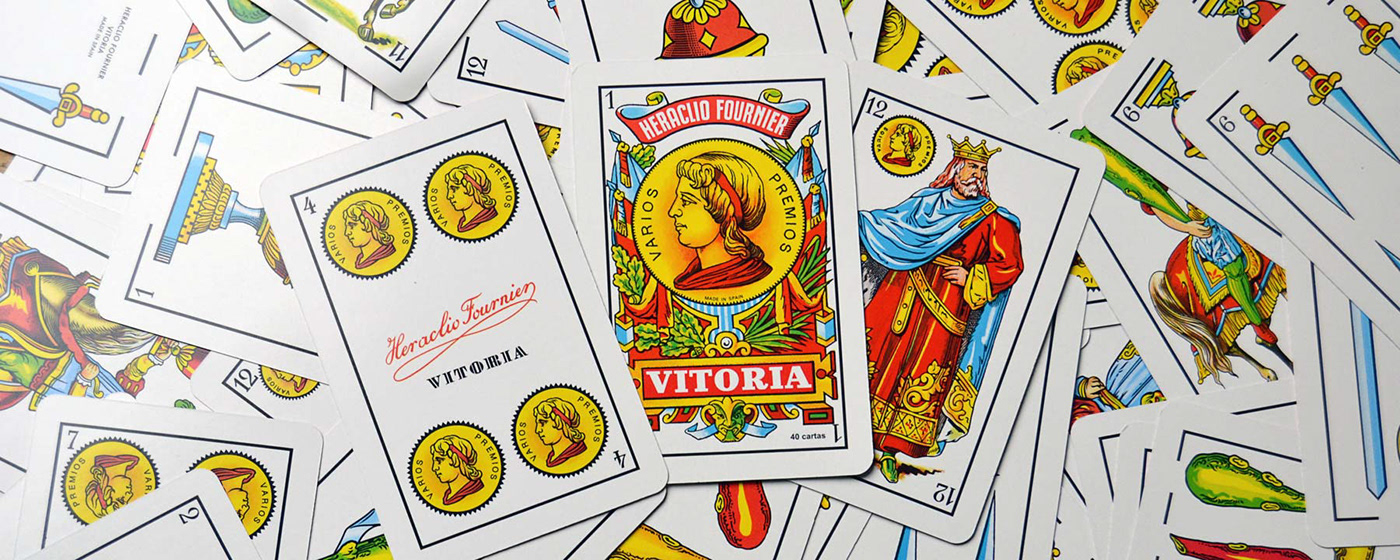
El diseño tradicional de la baraja española de cartas tiene un estilo gráfico que no refleja la personalidad y el carácter de la cultura española. Por este motivo, el concepto principal de los recursos que se han utilizado para el rediseño de estas cartas, debe reflejar o inspirarse en el folklore, carácter y espíritu español que nos diferencia y nos hace únicos.
Para reflejar esta personalidad y folklore español gráficamente, se ha recurrido a la propia lengua española,
Para reflejar esta personalidad y folklore español gráficamente, se ha recurrido a la propia lengua española,
concretamente a esas letras de nuestro abecedario que nos hacen singulares como país.
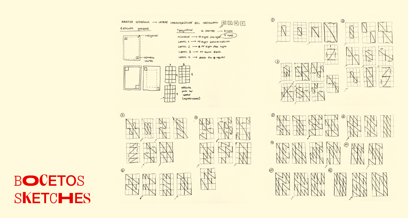
La letras escogidas son la “Ñ”, la “J”, la “R” y la “Z”, para representar los cuatro palos de la baraja, oros,
La letras escogidas son la “Ñ”, la “J”, la “R” y la “Z”, para representar los cuatro palos de la baraja, oros,
bastos, espadas, y copas. Para el rediseño, de momento solo se ha planteado la elaboración de uno
de los cuatro palos, la “Ñ”.
CONCEPT
The traditional design of the Spanish pack of cards has a graphic style that does not reflect the personality and character of Spanish culture. For this reason, the main focus of the resources that have been used for the redesign of these cards should reflect or be inspired by the Spanish folklore, character and spirit that sets us apart and makes us unique.
To reflect this personality and Spanish folklore graphically, we have resorted to the Spanish language itself,
To reflect this personality and Spanish folklore graphically, we have resorted to the Spanish language itself,
specifically to those letters of our alphabet that make us unique as a country.
The letters chosen are the "Ñ", the "J", the "R" and the "Z", to represent the four suits of the deck, golds, clubs,
The letters chosen are the "Ñ", the "J", the "R" and the "Z", to represent the four suits of the deck, golds, clubs,
swords and cups. For the redesign, for the moment only one of the four suits, the "Ñ", has been considered.
DIRECCIÓN CREATIVA
Las bases sobre las que se trabaja esta propuesta son las formas geométricas, a través de una retícula o layout,
ya que ayuda mucho a organizar la información para que el mensaje sea mucho más claro y directo.
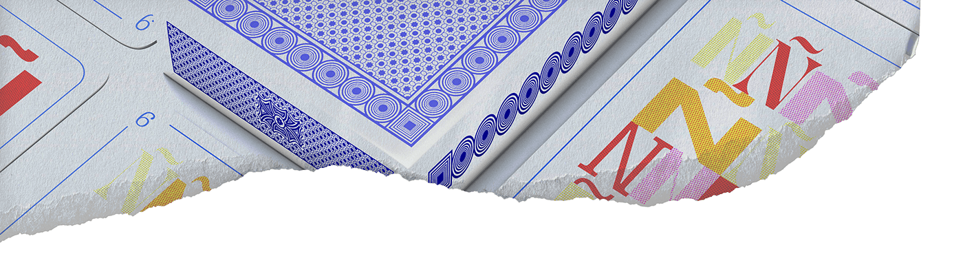
Por otra parte, para dar más impacto visual, se trabaja con una textura de puntos haciendo el efecto de impresión offset, para hacer elogio al estampado tradicional de lunares, tan característico de los vestidos de faralaes andaluces.
CREATIVE DIRECTION
The bases on which this proposal is based on the geometric shapes, through a grid or layout,
as it helps to organise the information so that the message is much clearer and direct.
On the other hand, to give more visual impact, a texture of dots is used to give the effect of offset printing,
On the other hand, to give more visual impact, a texture of dots is used to give the effect of offset printing,
in praise of the traditional polka dot pattern, so characteristic of Andalusian "faralaes" dresses.

GRÁFICA
Para el layout de cada carta que se usa en la composición de la baraja, se ha realizado una retícula de 4x4,
para permitir una composición más dinámica. Para las tipografías usadas, se han buscado fuentes que creen
un juego tipográfico con su cuerpo y contraste, y por último la gama cromática, que hace alegoría al carácter español,
es alegre con colores saturados, combina cuatro colores cálidos y un color frío como color complementario.
GRAPHIC
For the layout of each card used in the composition of the deck, a 4x4 grid has been created to allow for a more
dynamic composition. For the typefaces used, we have looked for fonts that create a typographic play with their body and contrast, and finally the chromatic range, which makes allegory to the Spanish character, is cheerful with saturated colours, combining four warm colours and a cold colour as a complementary colour.


