TOUGH
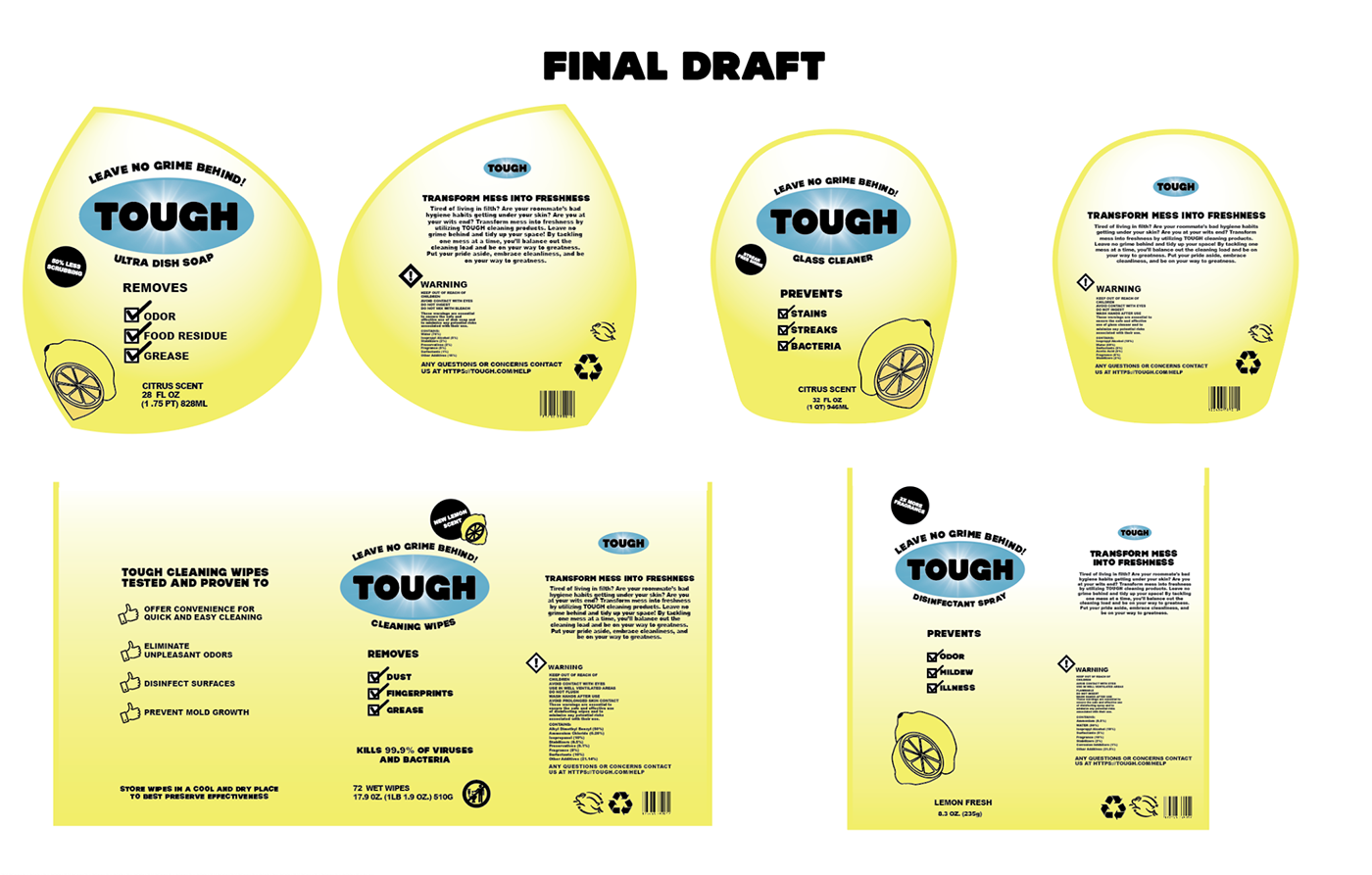
The project TOUGH Cleaning Products required me to develop a logo as well as packaging designs for a cleaning product company, fighting against the stereotype that house chores are a women's responsibility. To fight against this social norm, I had to create cohesive labels for a company targeted towards young men who want to live in a cleaner environment. To push these compositions to their fullest, I had to step out of my comfort zone and connect with my target audience on a deeper level.

Design Aspects
To fully connect with my target audience I had to do some heavy research. In my research I noticed various commonalities mens body care products shared, and I then decided to integrate some of those aspects into my labels to ensure they're grabbing the attention of the intended market. I noticed most mens products include all capitalized type, minimal color palettes, and taglines that are very straight to the point. As you continue to scroll, you can see how my designs maintained a consistency in these previously discussed design elements.


What Did TOUGH Teach Me?
In all, this project helped me to gain new tactics to connect with my target audience, which results in better production as I'm stepping into the shoes of my market. This process also taught me how anything rarely looks good the first time around. To develop a log and cohesive packaging for a product takes time and I think throughout this journey I neglected that. Because I couldn't relate to my audience too well I struggled developing strong designs, but essentially I just had to do more research to really push my designs to their full potential. It's easy to get overwhelmed with a lot of information and such small shapes, but it's all just a matter of finding that connect.


