The globe in the middle belongs to MPI, and an orange dot was to be included somewhere

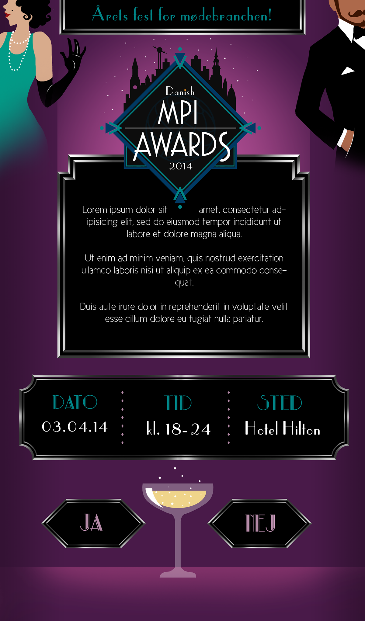
Draft for the e-mail invitation

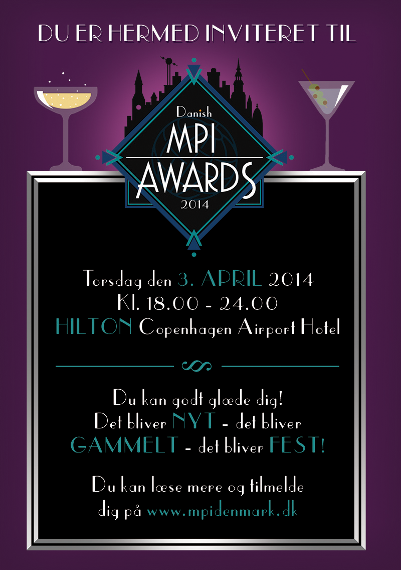
Flyer to be handed out at a convention
The visual identity for Danish MPI Awards 2014.
It was my primary project during my multimedia designer internship. I came up with the idea for an art deco/1920’s inspired party and thus went crazy with geometric design, skylines and tall, light fonts.
It was my primary project during my multimedia designer internship. I came up with the idea for an art deco/1920’s inspired party and thus went crazy with geometric design, skylines and tall, light fonts.
The colour scheme for the last two was, sadly, not used. After the presentation for the customer, the company I worked for changed their mind out of nowhere and demanded that I changed the colours. It ended up being white instead of black and a weird, pink/purple instead of dark purple. My protests went unheard and therefore I only show the original designs because the final colour palette wasn’t my decision.


