Building Dreams, Crafting Futures
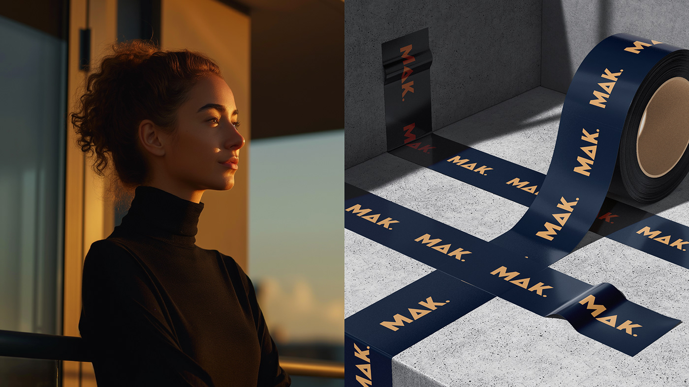
The creation of MAK logo was a fusion of simplicity and professionalism. By replacing the "A" with a sleek rectangle, the logo immediately captures attention and embodies the essence of property development – precision and structure. The addition of a full stop at the end not only punctuates the brand name but also signifies completeness and confidence in their services. This subtle yet impactful design choice reflects MAK commitment to delivering quality and reliability in every project they undertake.